

Coya’s Café | restaurant branding

Project: Restaurant Branding & Visual Identity
Client: Coya’s Café
Industry: Food & Hospitality
Role: Freelance Graphic Designer & Illustrator
Scope: Logo Design, Custom Pattern Design, Illustration, Typography, Packaging Applications & Production-Ready Artwork, Digital Design
A visual identity rooted in family, tradition, and the art of making things by hand.
Coya’s Café is a family-owned Mexican restaurant in Moline, Illinois, named after Grandma Coya. Rather than building the identity around familiar restaurant clichés, the rebrand started with something much more personal: Coya herself. Her signature, her love of traditional aesthetics, and the warmth of family became the foundation for a visual identity that feels expressive, nostalgic, and unmistakably human.
THE CHALLENGE
How do you modernize a family tradition without losing what makes it special? The existing brand didn't fully capture the personality behind the restaurant. The opportunity was to create something that could feel contemporary while still honoring the visual language and traditions that inspired Coya’s Café in the first place. The identity needed to balance two things: Heritage + personality.
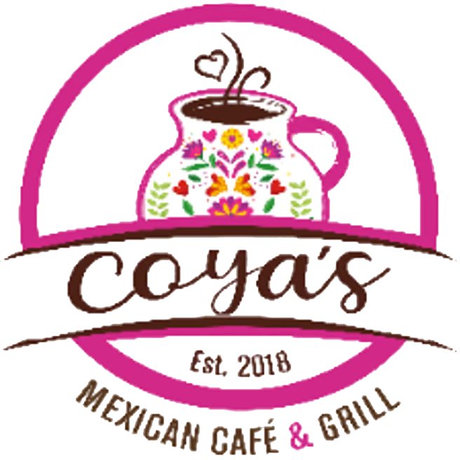
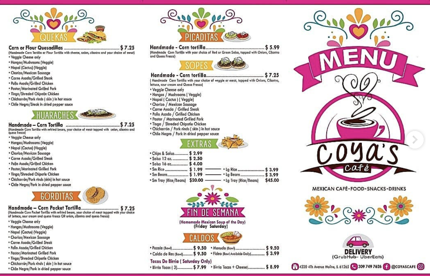
Before:
![]()
After:
![]()
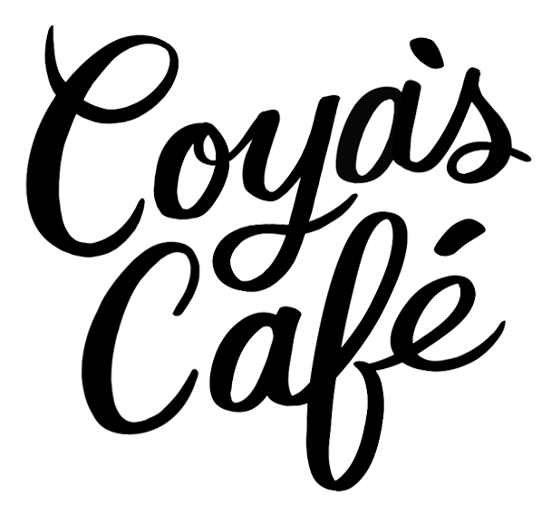
In designing the logo I wanted it to be inspired by traditional sign-painting and Coya’s signature.
Rather than creating a polished, overly contemporary restaurant mark, I looked toward traditional sign-painting and Coya’s own signature to create something that felt personal, handmade, and rooted in the restaurant's history. The result is a wordmark with the character of something that could have existed for generations—while still feeling fresh enough to define the new identity.
MOOD BOARD

INITIAL LOGO EXPLORATION


With Mexican doilies as visual inspiration, I illustrated and designed patterns that embody and modernize Coya’s Café.
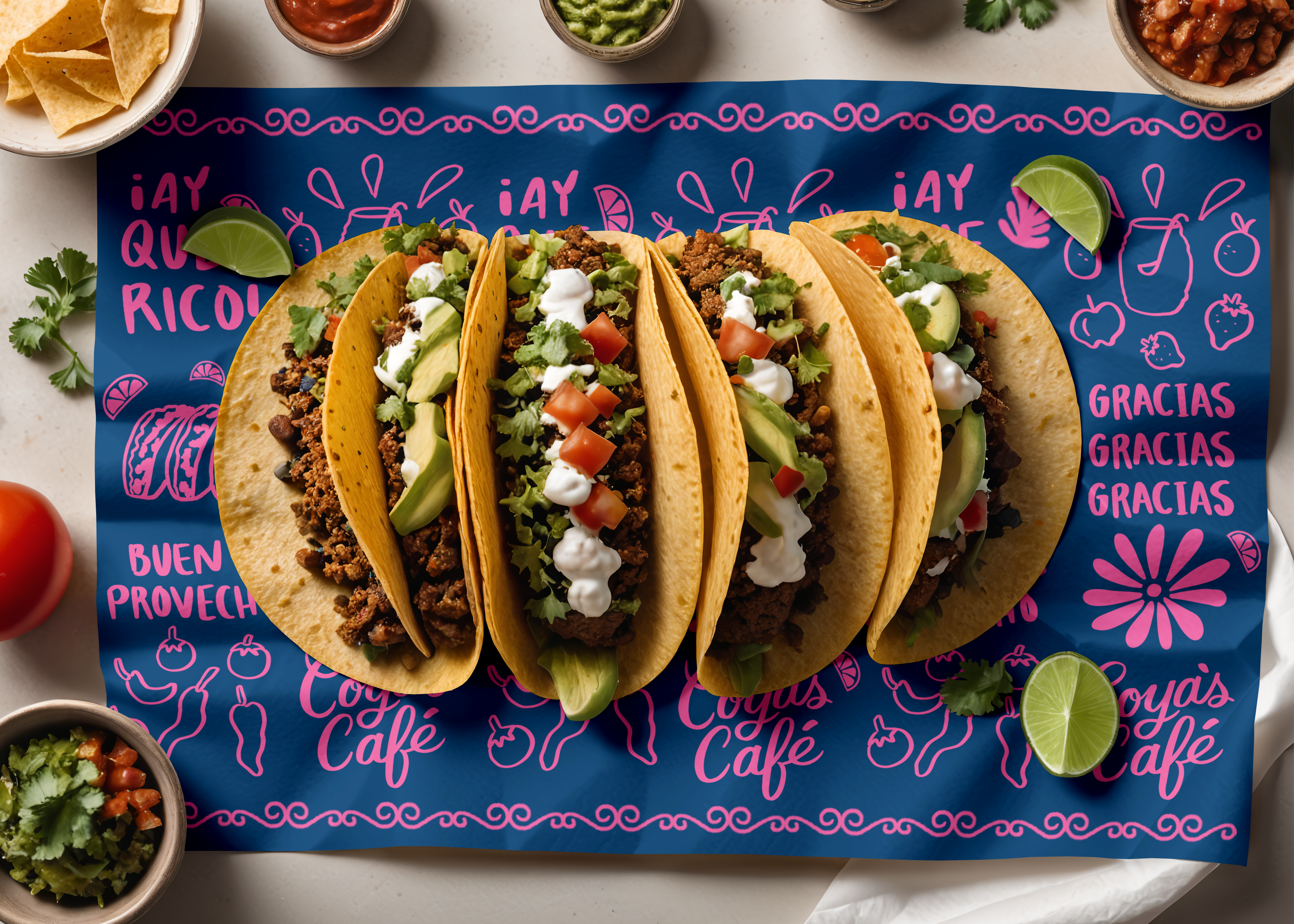
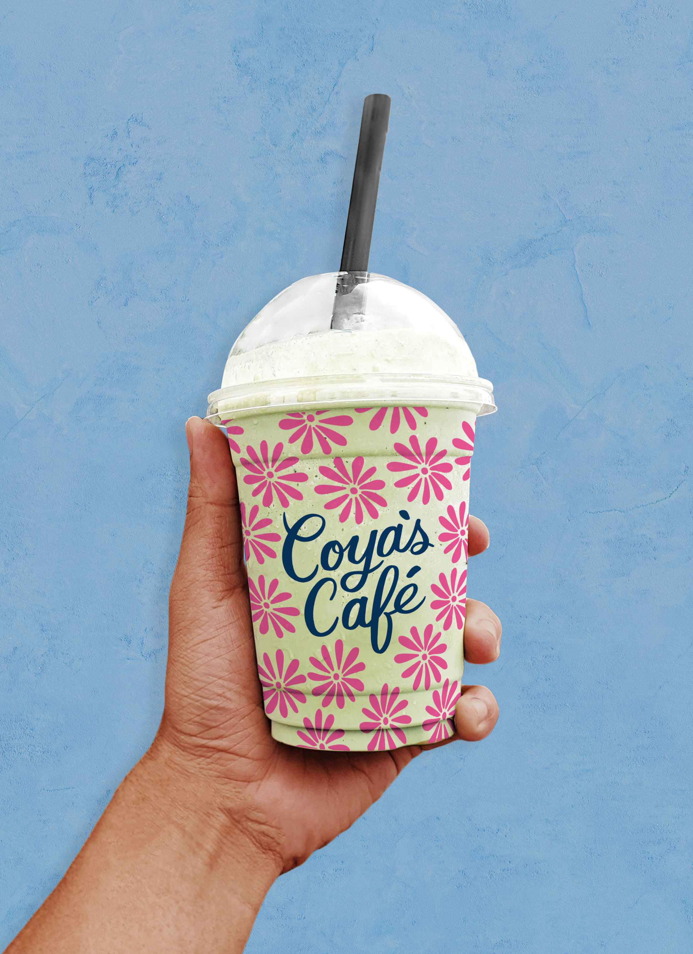
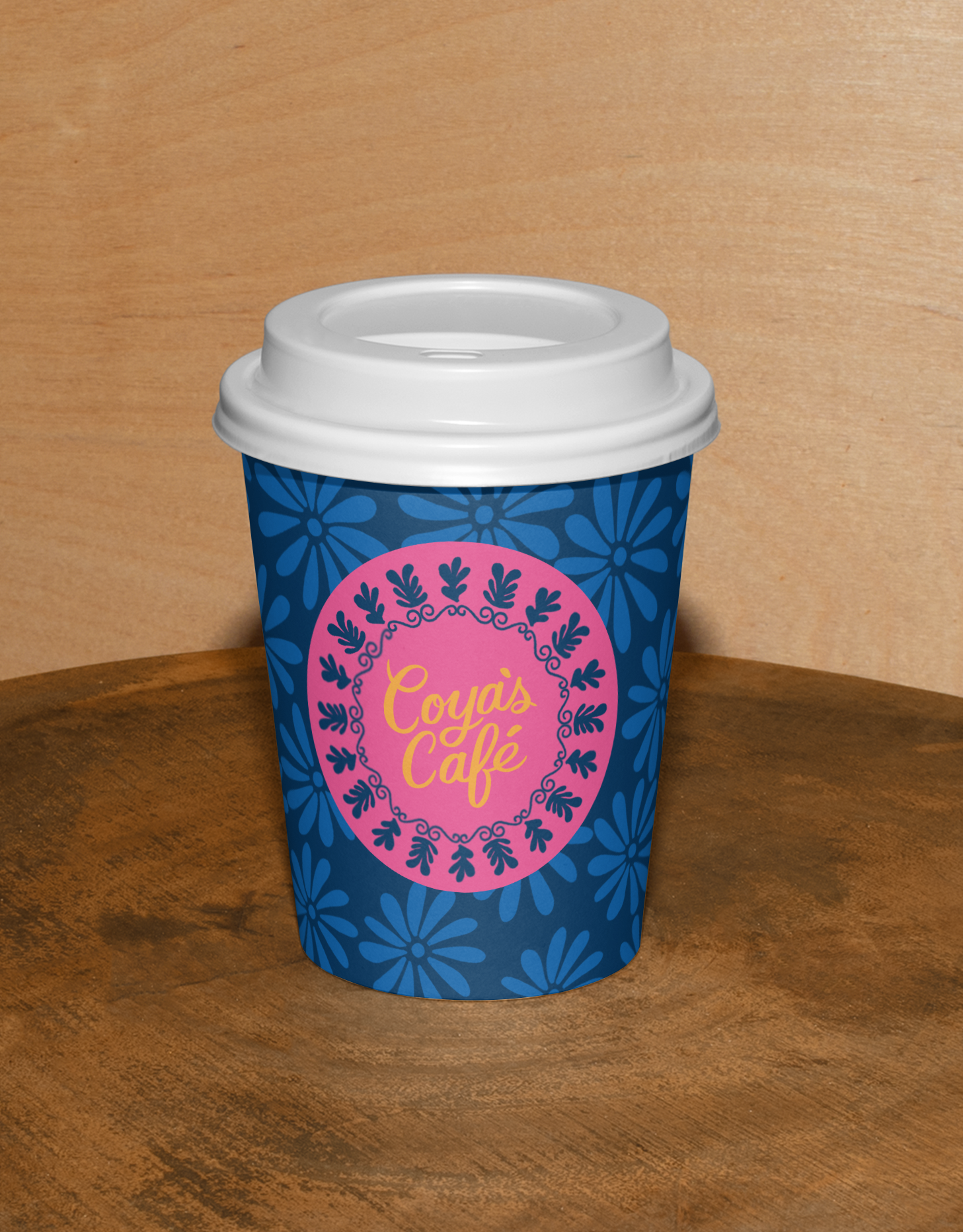
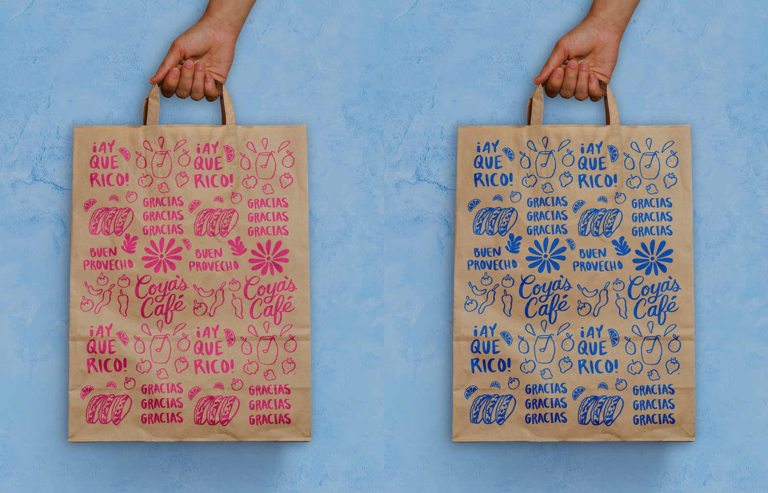
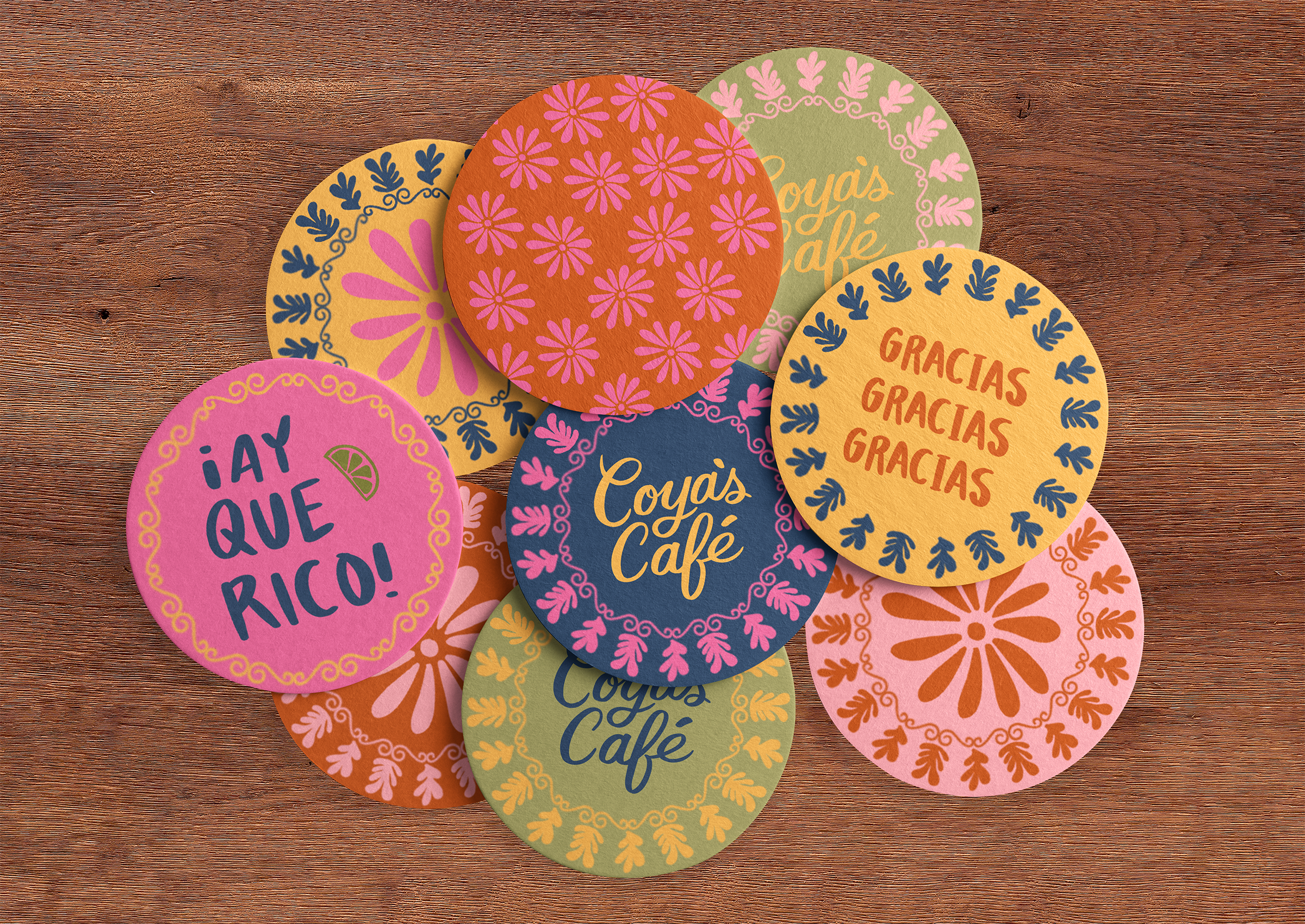
Mexican doilies became a starting point for developing a pattern system that could carry the personality of the brand beyond the logo. I translated their ornamental qualities into simplified, playful illustrations—creating a collection of patterns that reference tradition without feeling overly literal. The patterns give the identity a sense of rhythm and movement, while creating flexible assets that can live across packaging, menus, print, and digital touchpoints.


Before:
![]()
After:
![]()
![]()



THE OUTCOME
![]()
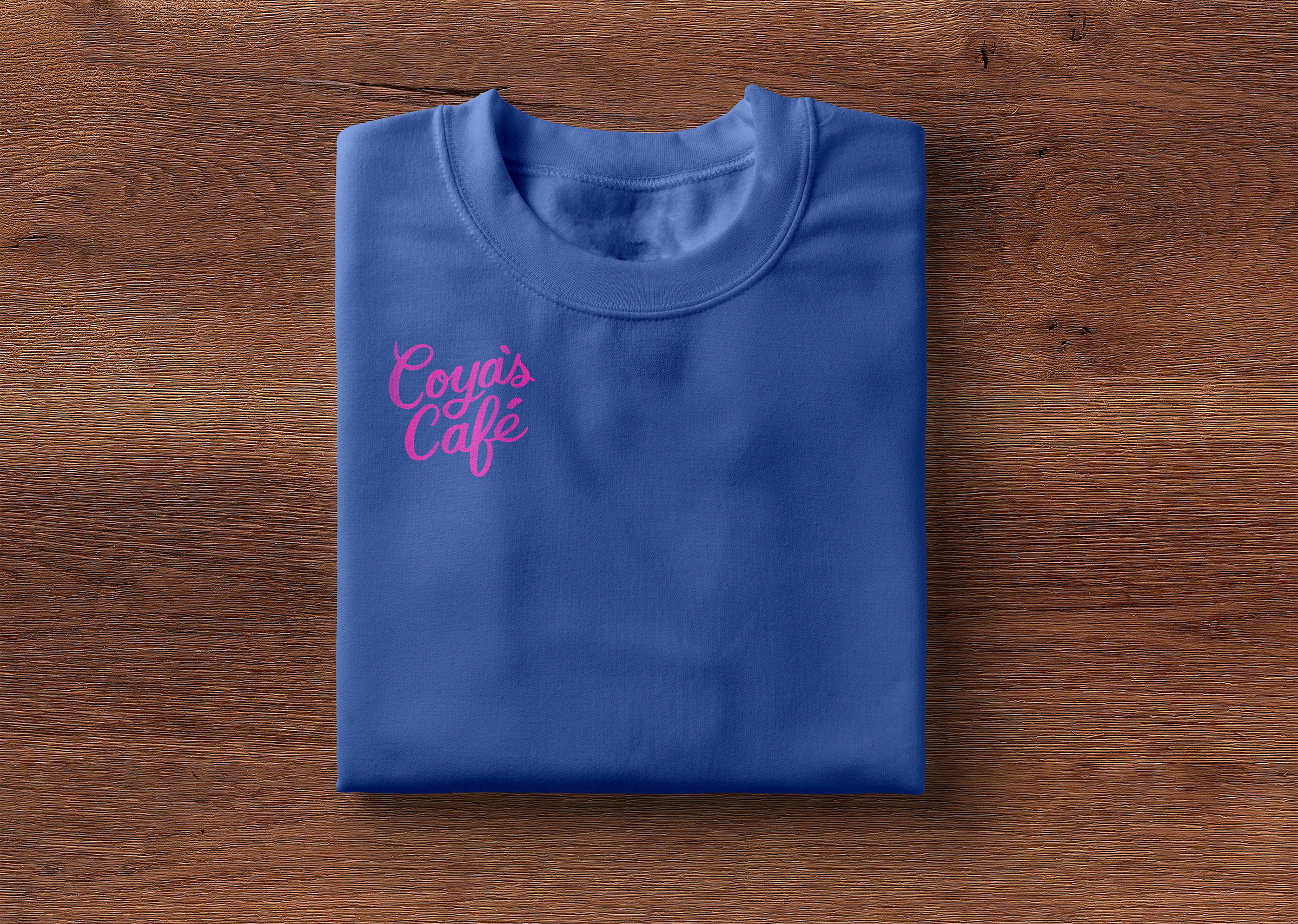
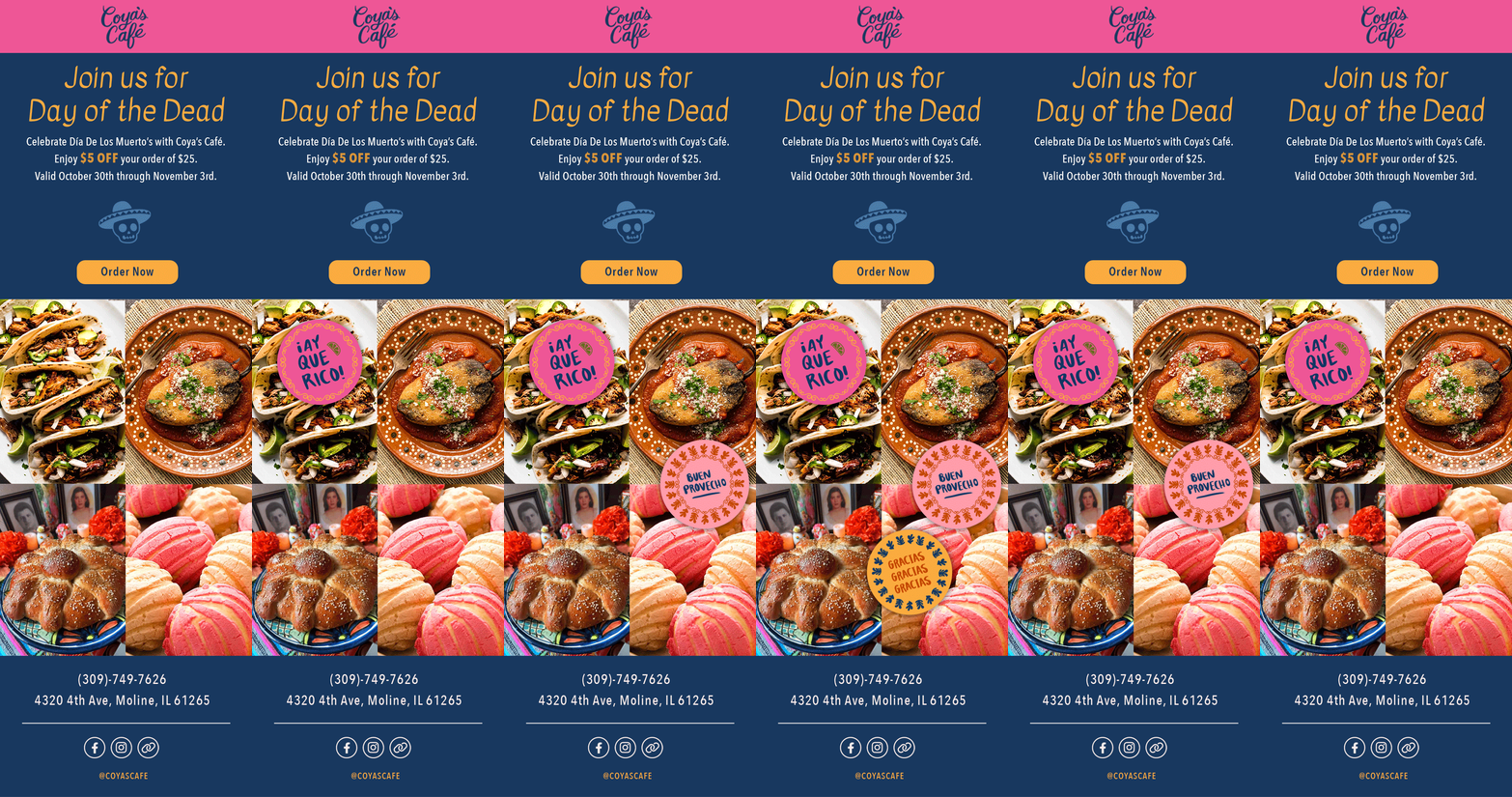
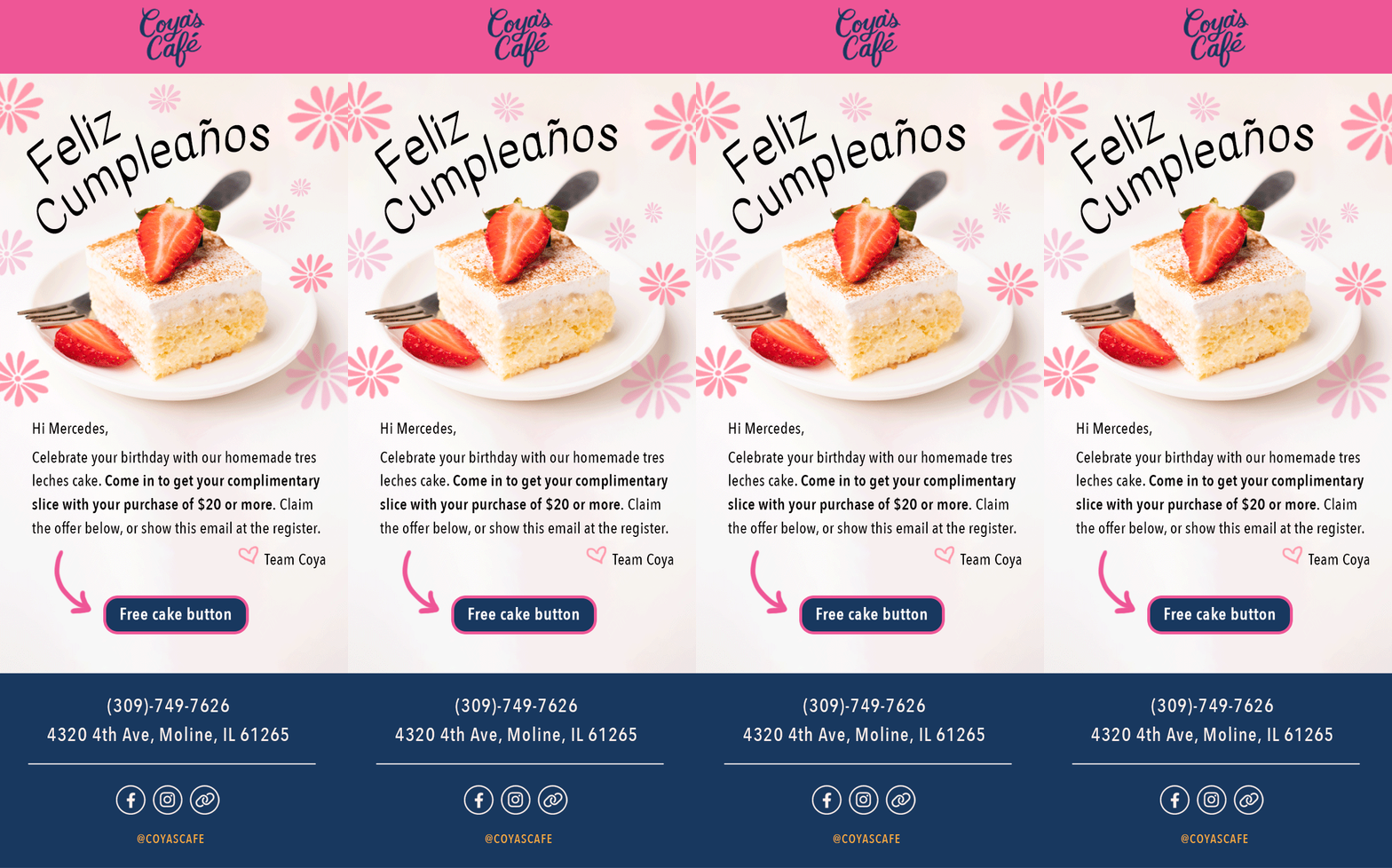
The resulting identity gives Coya’s Café a visual language that feels both personal and recognizable—rooted in the history of the restaurant while giving the brand room to evolve. By building the identity around Coya’s story, hand-crafted lettering, and a flexible illustration and pattern system, the rebrand extends beyond a new logo to create a cohesive experience across print, packaging, and digital.



©2026 Mercedes Padró. All rights reserved.