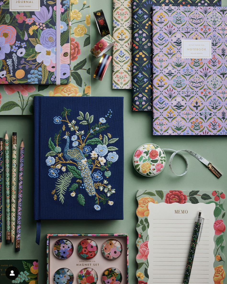
Rifle Paper Co. | product design

Project: Product Design & Development
Client: Rifle Paper Co.
Industry: Consumer Goods, Lifestyle & Retail
Role: Product Graphic Designer
Scope: Product Concept Development, Illustration Adaptation, Surface Pattern Design, Typography & Hand-Lettering, Colorway Exploration, Packaging Design, Production Artwork & Licensed Collaborations
As a Product Graphic Designer at Rifle Paper Co., I translated distinctive illustration and surface pattern artwork into thoughtfully designed products across stationery, accessories, footwear, and home. My work spanned concept development, layout and color exploration, hand lettering, embroidery applications, packaging, and production-ready artwork. Collaborating across product categories and licensed partnerships, I focused on preserving the character of the original artwork while adapting it to the materials, formats, and technical requirements of each product.
THE CHALLENGE
Rifle Paper Co.’s visual identity is rooted in expressive illustration, vibrant color, and intricate decorative details. The challenge was to translate this established visual language across a diverse product assortment while accounting for the unique requirements of each material, manufacturing process, and product format. Artwork that works beautifully on paper may require a different treatment when applied to embroidery, textiles, drinkware, or ceramics. Each application needed to preserve the integrity of the original illustration while ensuring that the final product felt intentional, functional, and true to the brand.

DESIGN APPROACH
I developed product concepts and adapted existing illustrations into designs suited to their intended applications. Depending on the project, this involved sketching, hand-lettering, painting, vectorizing artwork, exploring colorways, and refining the placement of patterns and decorative elements. For new product concepts, I considered how the artwork would interact with the product’s shape, scale, and intended use from the beginning.
02. Design for materials and manufacturing
Each product required a different approach to translating artwork into a production-ready design.
- Embroidery: I vectorized Anna Bond’s Peacock pattern and designed an embroidered journal layout, selecting techniques such as French knots and satin stitch, along with thread colors for production reference.
- Paper goods: I developed greeting cards, stationery layouts, and packaging dielines, accounting for print specifications, color, custom pattern placement, and gold foil.
- Textiles: I adapted illustrations and lettering to textile formats, considering folds, cropping, and how patterns would appear on the finished product.
- Accessories and drinkware: I customized artwork placement and colorways to suit different product shapes and materials.
Across these applications, the goal was to preserve the character of the artwork while making practical decisions that supported the final product. 03. Refine composition and product details I explored variations in layout, color, pattern placement, and decorative treatments to find the strongest solution for each product.
03. Refine composition and product details
I explored variations in layout, color, pattern placement, and decorative treatments to find the strongest solution for each product. For the fall-patterned ring dish, I experimented with multiple layouts and color schemes before arriving at the selected design. For the Spring 2024 Keds collaboration, I contributed to initial shoe concepts, including considered cherry embroidery placement and a delicate cherry charm on the shoelace. These details helped create products that felt distinctive without overwhelming the overall design.
04. Prepare designs for production
I translated approved concepts into production-ready artwork and technical files, including vector artwork, card and packaging dielines, embroidery references, and layouts tailored to individual product specifications. I also considered how a design would appear across its full range of applications. For 3M sticky notes, for example, I designed both the notes and their backer layout so the composition remained visually balanced with and without the notes attached. This attention to production details helped bridge the gap between the initial creative concept and the finished product.
Rifle Paper Co. | peacock embroidered journal
Using the Peacock pattern created by Anna Bond, I vectorized the artwork and designed the layout of the embroidered journal.
Working with Anna Bond’s existing illustrations, I adapted artwork for embroidered products by vectorizing designs, planning their placement, and preparing files for embroidery. This included the Peacock journal and embroidered accessories. I chose specific embroidery techniques that compliment the artwork such as “french knots” and “satin stitch.” I thoughtfully selected thread colors for the prep-house to reference for the final embroidered peacock journal.


Rifle Paper Co. | roses stationery
I designed greeting cards and stationery from concept through final artwork, including sketching, illustration, hand-lettering, and layout. For the Roses Stationery card set, I also developed the card and packaging layouts, dielines, color palette, gold foil specifications, and custom pattern placement.


Rifle Paper Co. | greeting cards
I led the creative development of the following greeting cards and stationery, overseeing each project from initial concept development and sketching through to illustration, hand lettering, and final design. This end-to-end process allowed me to create cohesive, thoughtfully crafted designs that bring together visual storytelling, typography, and distinctive illustrative details.

Rifle Paper Co. | nutcracker
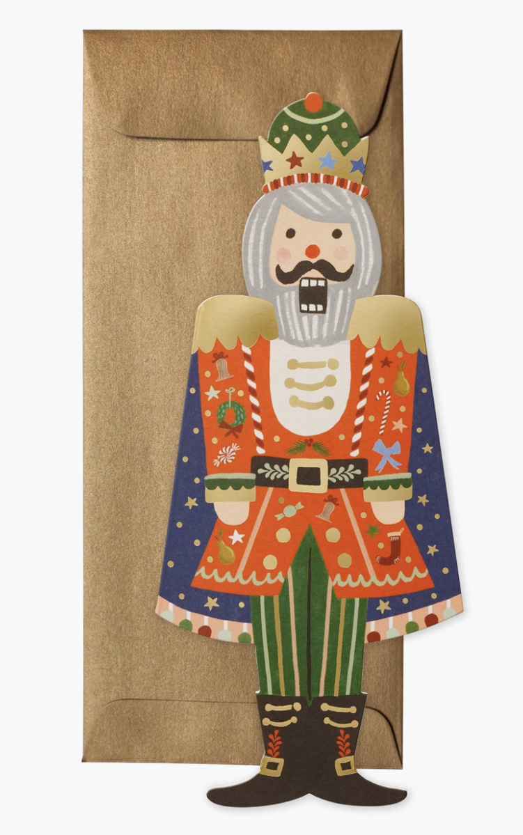
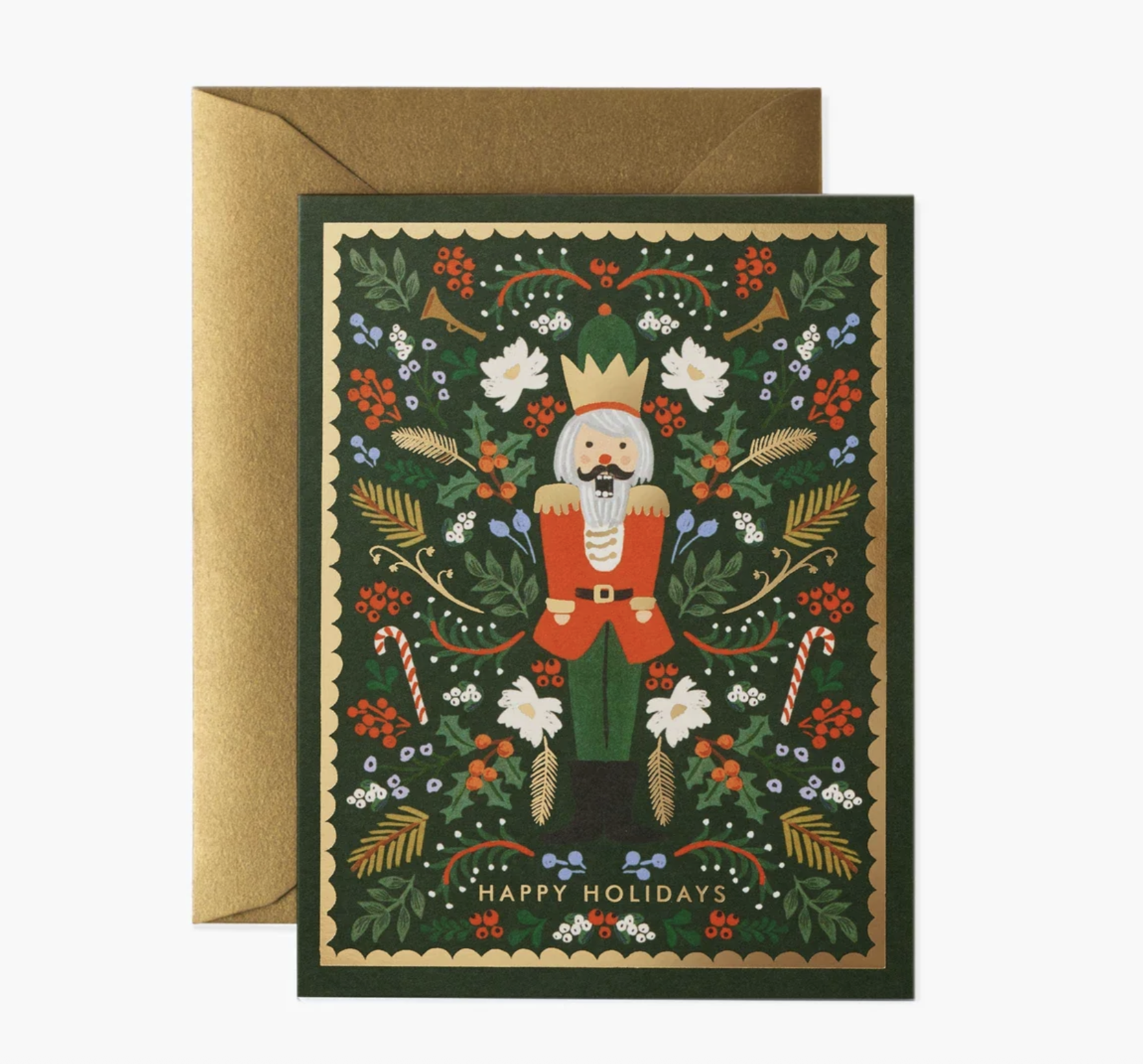
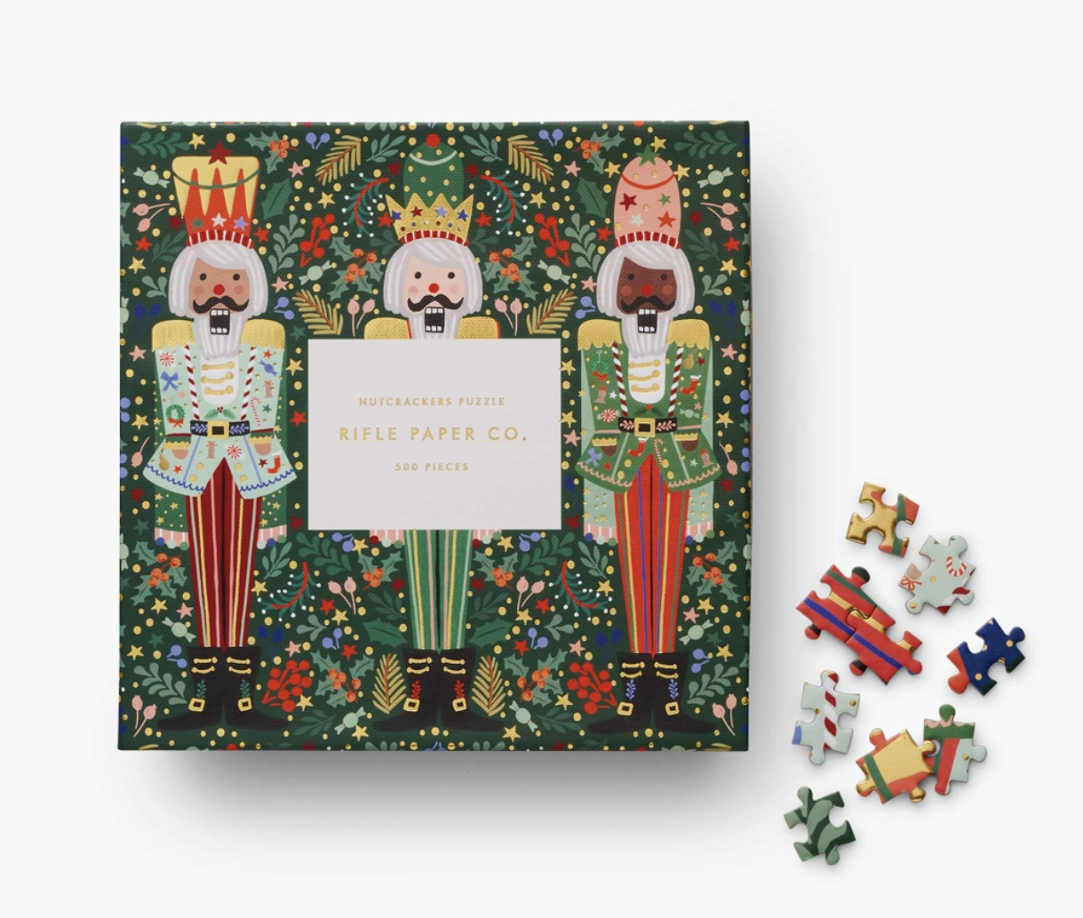
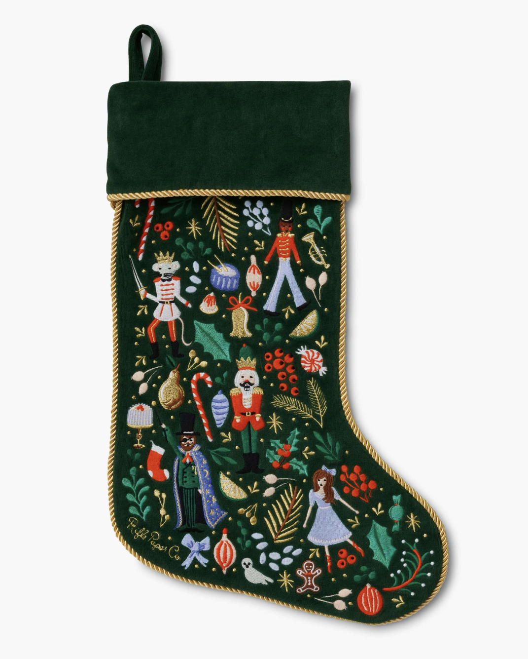
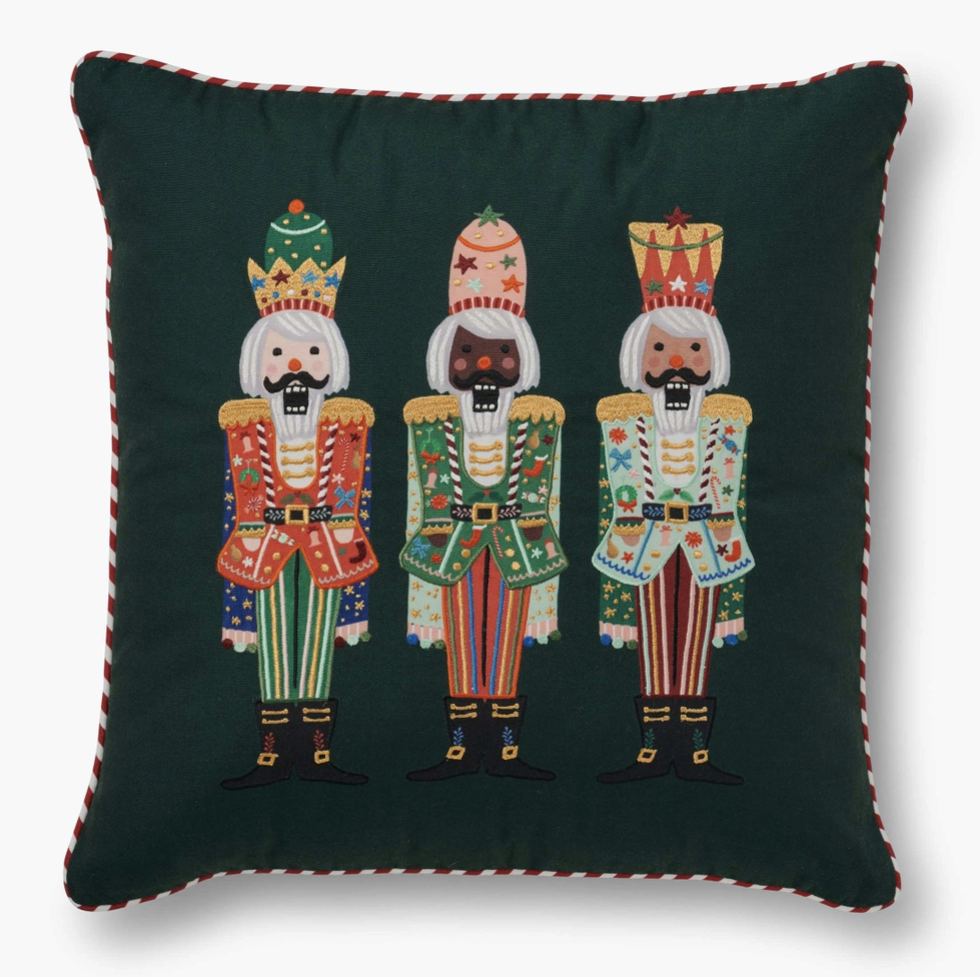
Working with Anna’s initial illustration of the nutcracker, I painted and designed the nutcracker trio. Illustrating and designing the three nutcrackers entailed designing the head-ware and patterns within the characters, ensuring that they work well for a variety of applications and formats. After the design of the illustration was established, I applied the characters to the products shown below.


Sticky Notes | 3M
In collaboration with 3M, the post-it company, I designed the following sticky notes. I worked on the layout of the backer and sticky note, so that the placement looks well-design with and without the sticky note on the backer. Feautured as a best-seller on Rifle’s website.

Bottle Design | Corkcicle
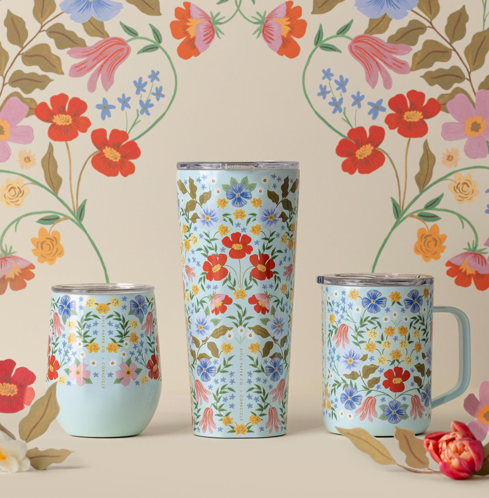
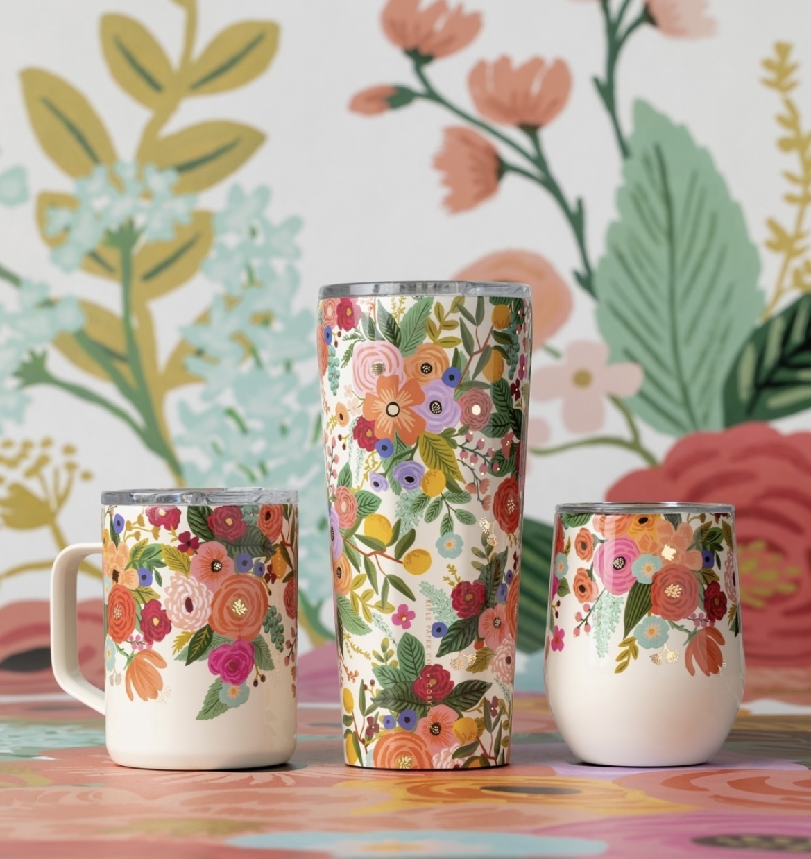
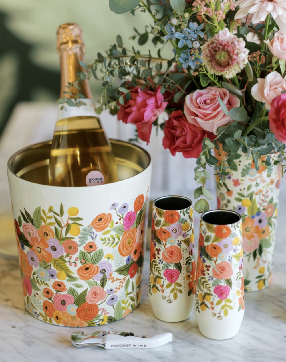
I utilized existing Bramble and Garden Party illustrations created by Anna Bond and customized the layouts for Corkcicle’s drinkware. While each format varies, it comes together for a whimsical and seamless pattern experience. Feautured as a best-seller on Rifle’s website.
Woodland Wallpaper Design | York
In collaboration with York, I contributed to the illustration and design of the Woodland wallpaper collection, developing a nature-inspired pattern that brings a sense of warmth and organic character to interior spaces. The design is available in three colourways.


Shoe Design | Keds
In collaboration with Keds, I worked on the initial concepting and design of the Spring 2024 shoes. Apart of my responsibilities included coming up with innovative techniques for the shoes. This included thoughtful placement of the cherry embroidery and a dainty cherry charm on the shoe lace.


Platter Design | Pottery Barn
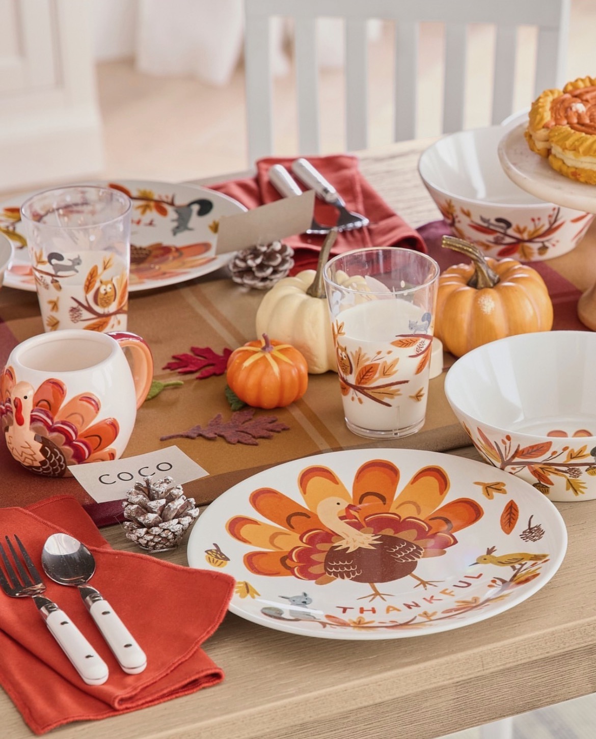
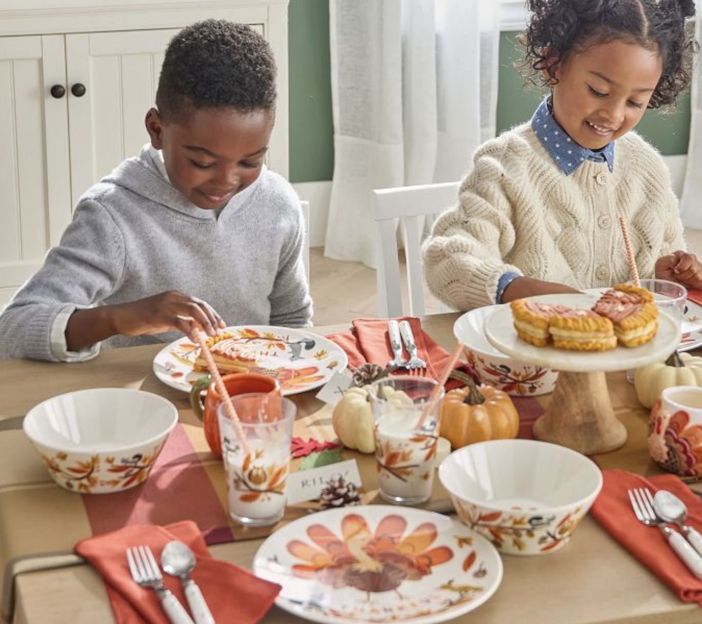
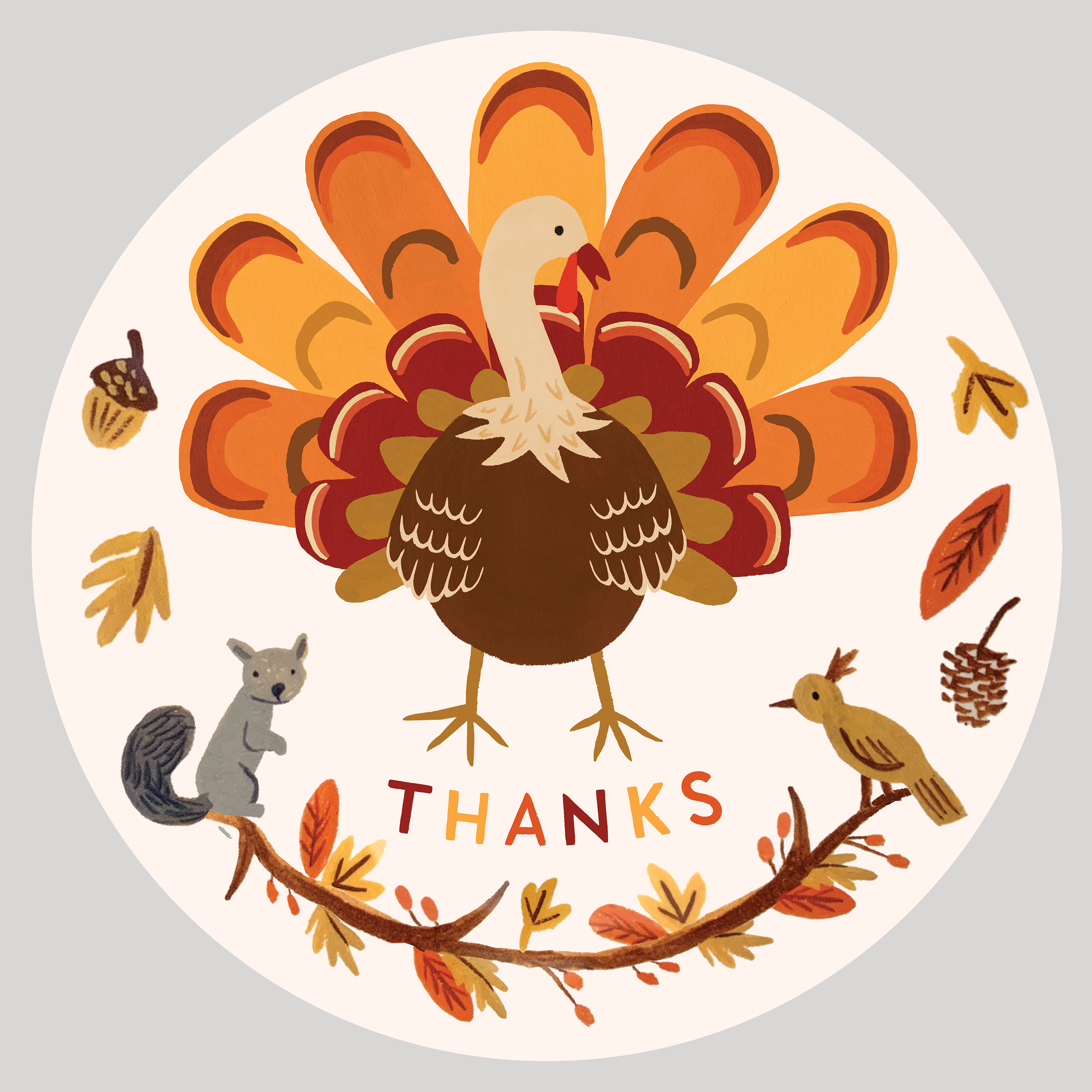
In collaboration with Pottery Barn, I worked on illustrating and designing the turkey for their Thanksgiving platterware.
Rifle Paper Co. | beach towel
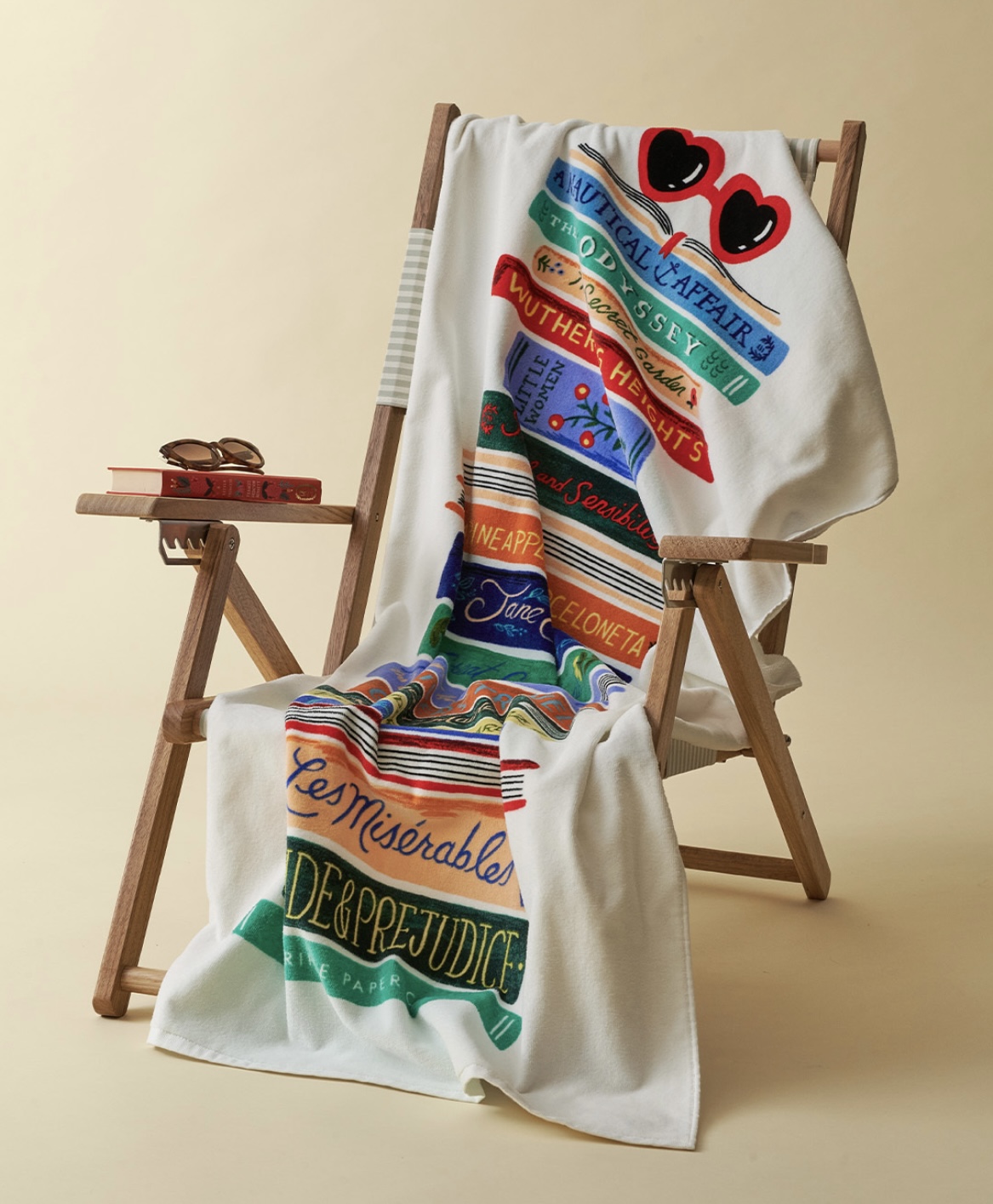
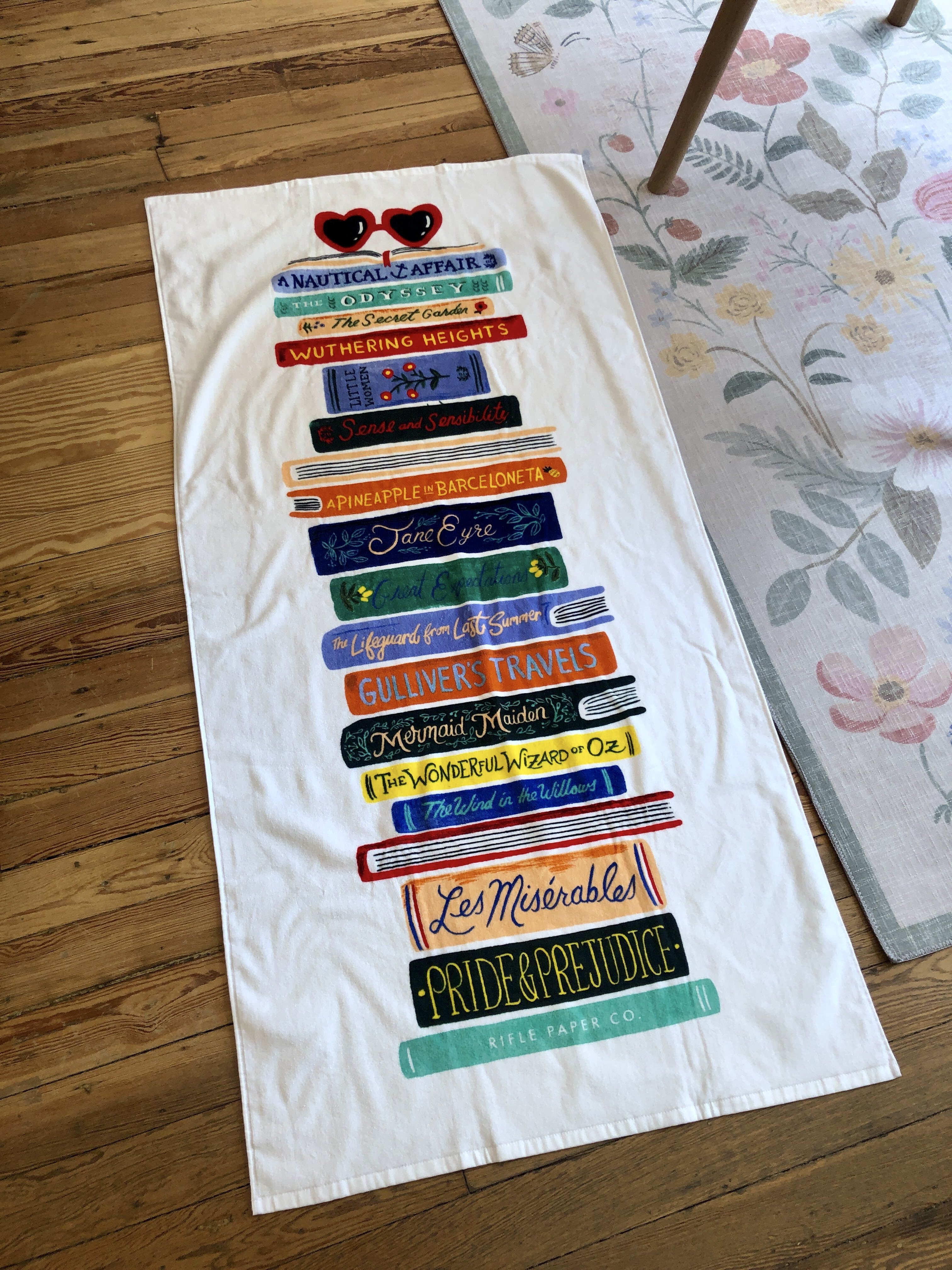
For the Book Club beach towel, I developed the concept, sketches, hand-lettering, and final design. The product was featured as a bestseller on Rifle Paper Co.’s website.
![]()
![]()
![]()



Rifle Paper Co. | tea towel
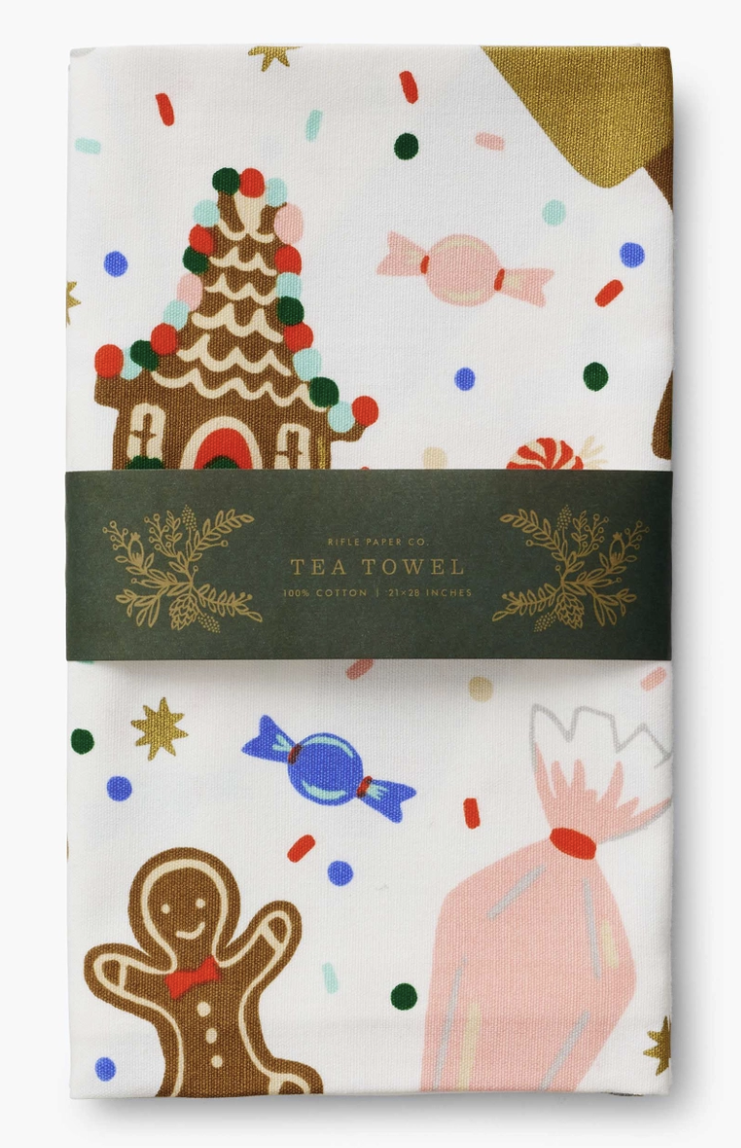
For the Christmas Cookie tea towel I worked on illustrating, vectorizing, and designing the layout. For this project I considered the typical folds in a tea towel, so that each crop is visually appealing. The illustration to the right was a near-final layout of the towel.


Rifle Paper Co. | embroidered accessories
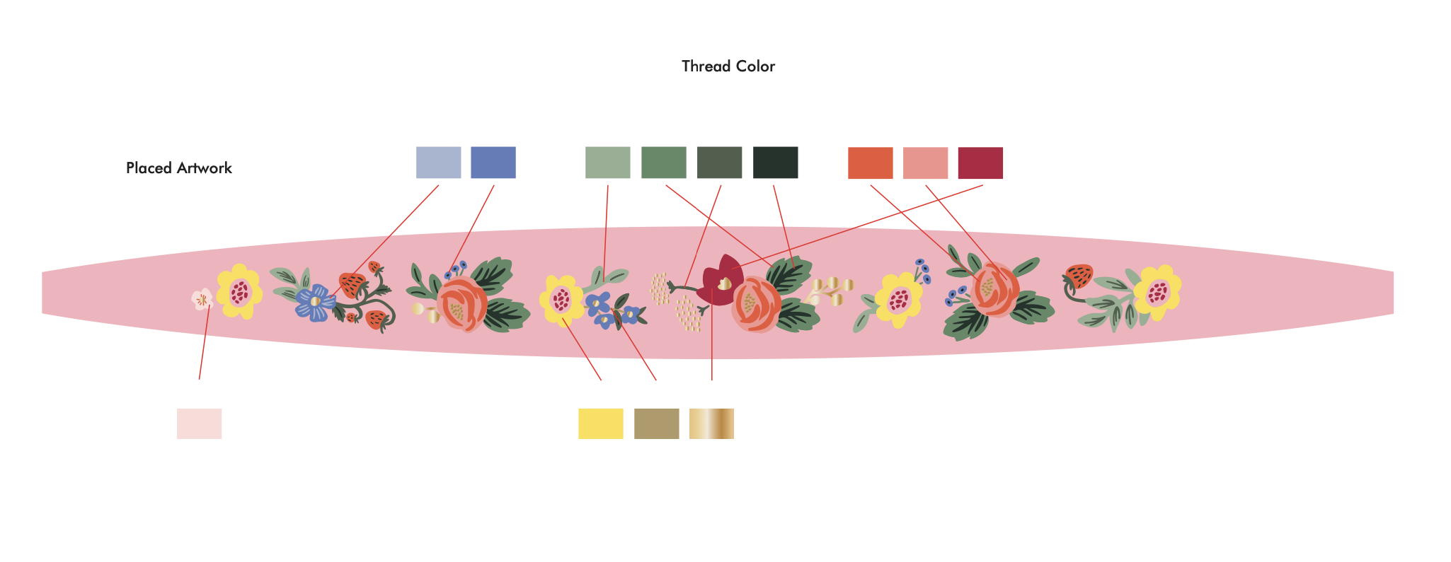
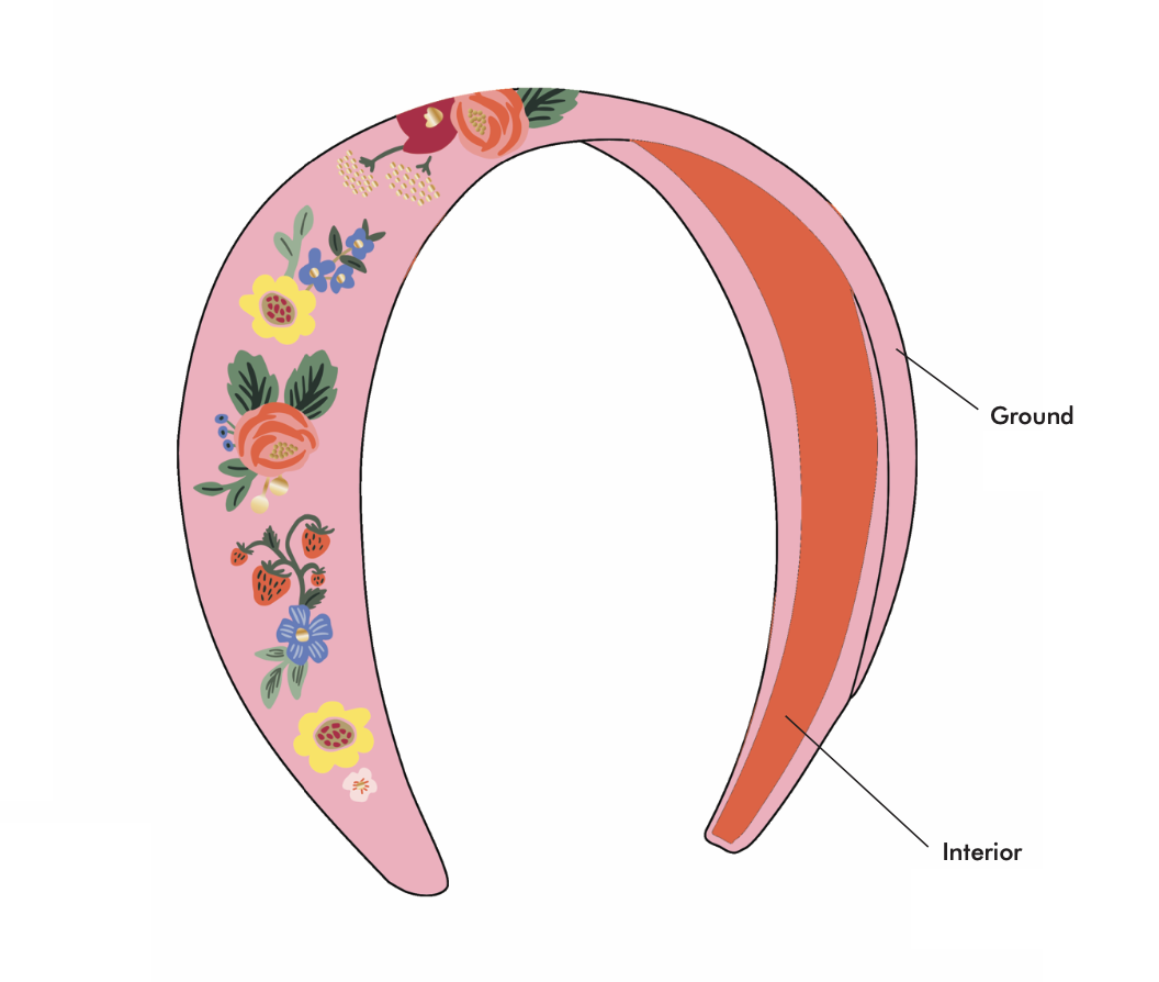
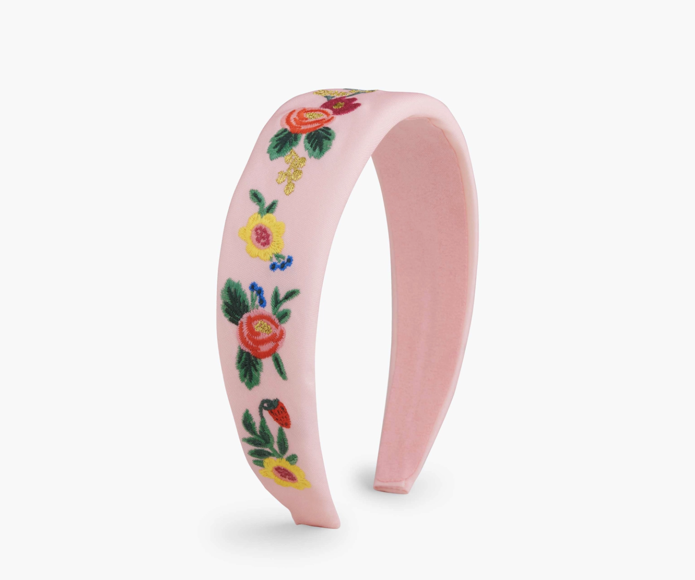
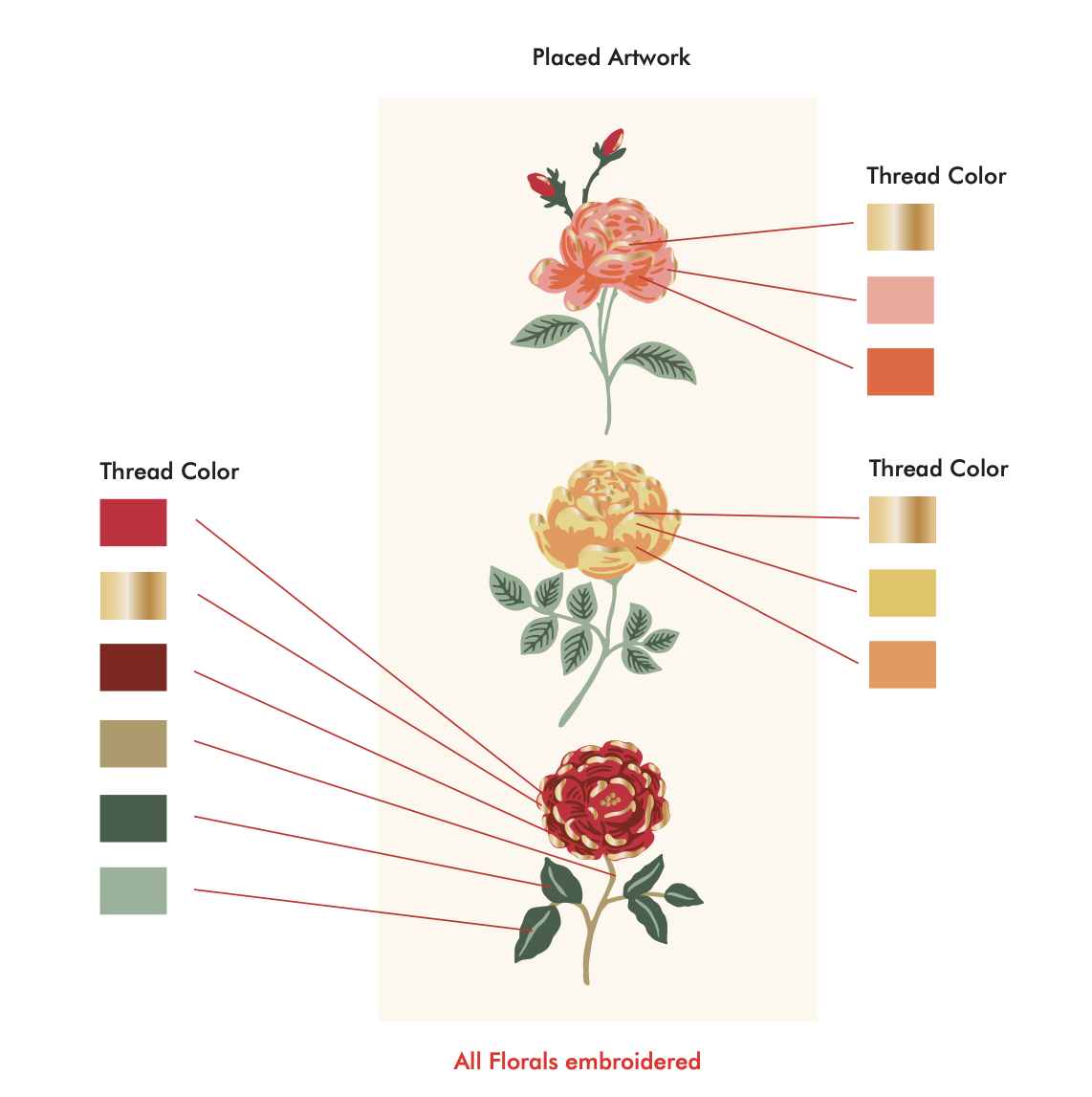
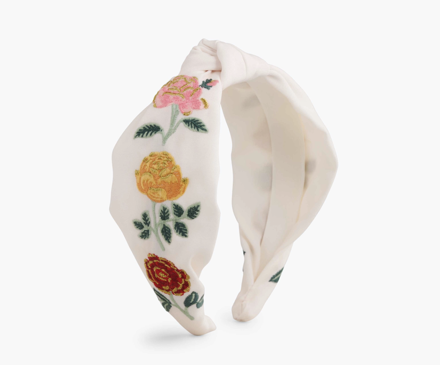
I designed the following headbands and accessories. My responsibilities included vectorizing Anna’s existing artwork, so that it could be applied to the headband and the files prepped for embroidery.

Rifle Paper Co. | ring dish
I designed the following ring dish utilizing Anna’s fall pattern design. We settled on this design after I experimented with a variety of layout, color scheme, and pattern options.

Rifle Paper Co. | jewelry design
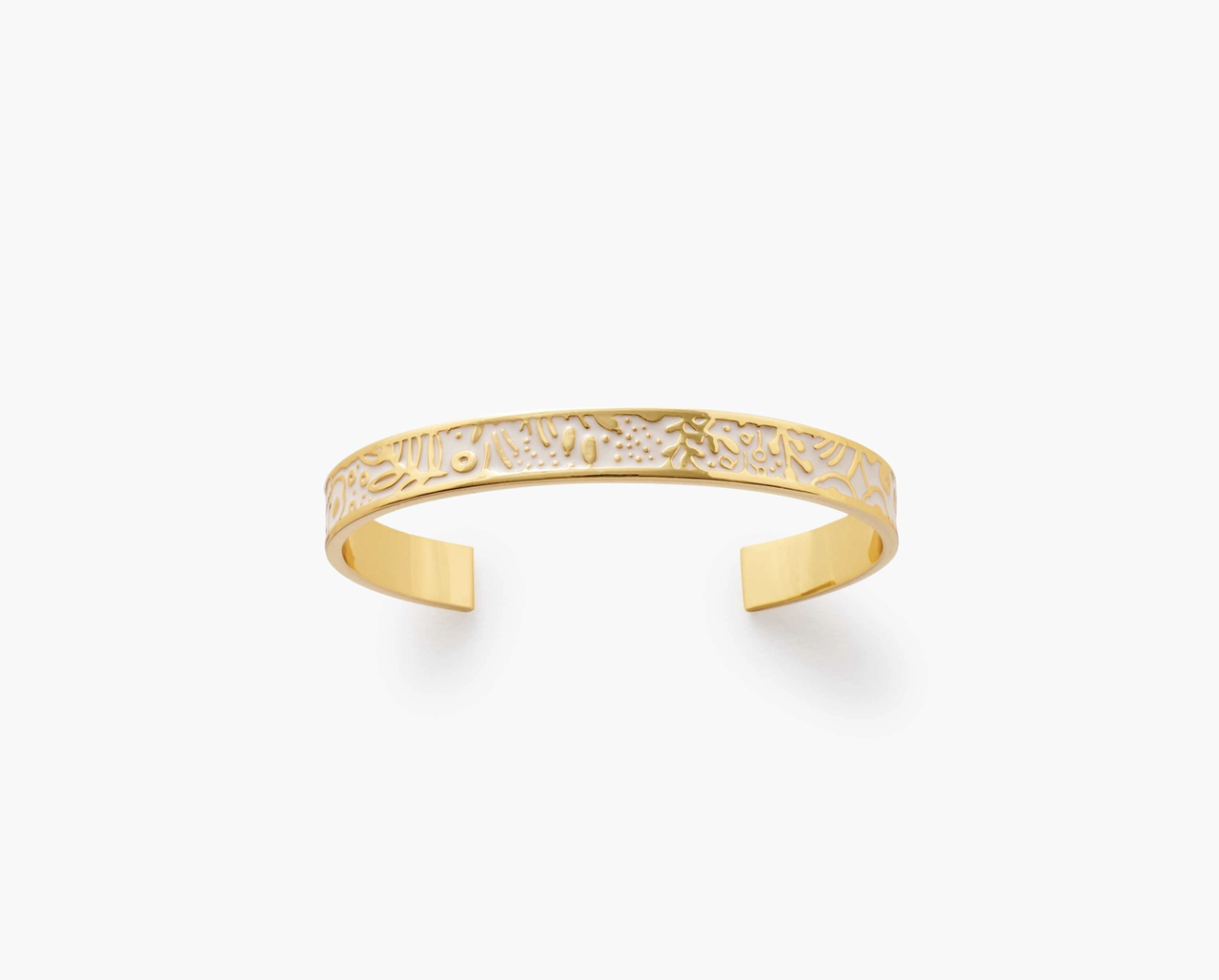
I developed the designs for the following bracelet collection, incorporating Anna’s original artwork into wearable pieces. My role included creating the hand lettering, selecting complementary colourways, and thoughtfully positioning the artwork to ensure each design felt cohesive and visually balanced. Through these elements, I helped translate the original illustrations into distinctive accessories that maintained the integrity of the artwork while adapting it for a new format.


Rifle Paper Co. | totebags
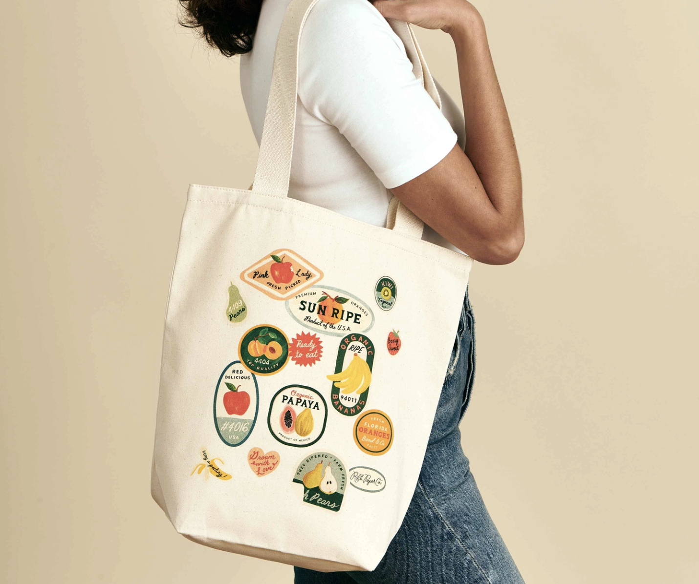
Totebags I worked on while at Rifle which included layout, color, and type design.


THE OUTCOME
The work contributed to a broad range of products spanning stationery, home décor, textiles, footwear, drinkware, and accessories. By adapting illustrations to different materials and production methods, I helped extend Rifle Paper Co.’s recognizable visual identity across multiple product categories.I contributed to multiple best-selling products on Rifle’s website including the Peacock Embroidered Journal, Book Club towel, and Nutcracker series.




©2026 Mercedes Padró. All rights reserved.