
Pedro’s Heladería | packaging design

Client: Pedro’s Heladería
(conceptual brand developed during a workshop)
Project: Brand Identity & Packaging Design
Role: Graphic Designer & Illustrator
Industry: Food & Beverage
Scope: Visual Identity, Typography, Logo Design, Illustration, Packaging Design, Business Cards, Social Media Graphics
Context: One-day Typography for the Senses workshop led by Ellen Lupton at Cooper Design School
Recognition: Featured in the 2024 edition of Thinking with Type by Ellen Lupton
OVERVIEW
Pedro’s Heladería is a conceptual ice cream brand exploring the relationship between typography, sensory perception, and visual identity. The project investigates how graphic design can communicate the experience of taste, texture, and flavor without relying on the senses themselves. Developed during Ellen Lupton’s Typography for the Senses workshop at Cooper Design School, the project transformed an everyday indulgence into an opportunity for visual experimentation.  THE CHALLENGE
THE DESIGN SOLUTION
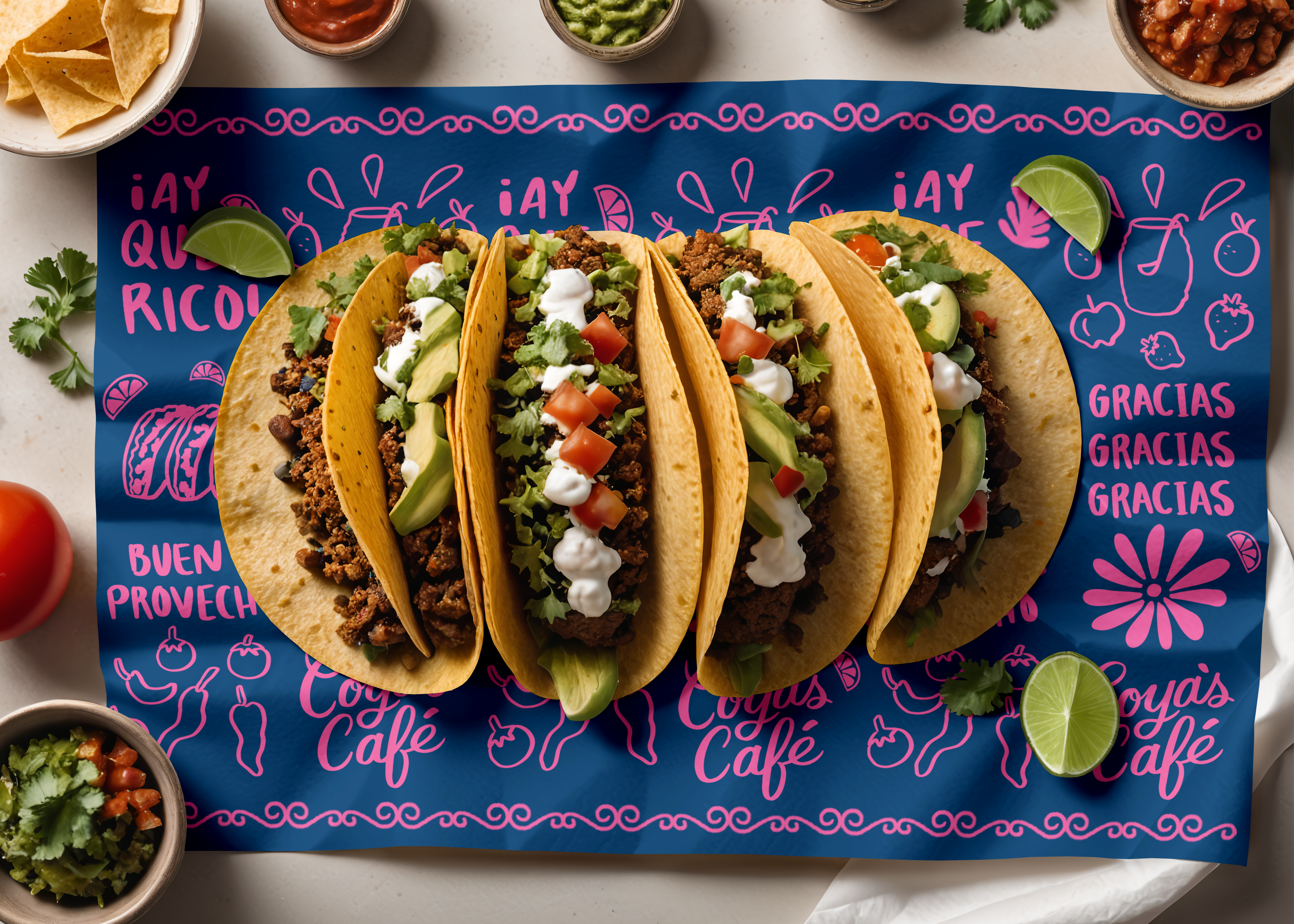
The resulting identity brings together typography, illustration, and packaging to create a cohesive brand experience for Pedro’s Heladería.- Brand identity: A visual direction built around the expressive potential of typography and its relationship to the senses.
- Packaging design: An application of the identity to product packaging, translating the brand concept into a tangible visual experience.
Pedro’s Heladería creates a visual language designed to evoke the pleasure and personality of a latin ice cream parlor.


Business Cards:
Branded collateral that extends the identity into printed touchpoints.


Social Design:
Across these touchpoints, the project explores how a consistent graphic language can give a product personality and make a sensory experience visually recognizable.
Across these touchpoints, the project explores how a consistent graphic language can give a product personality and make a sensory experience visually recognizable.


THE OUTCOME
Pedro’s Heladería demonstrates how typography can move beyond its conventional informational role to become an expressive design tool. By connecting letterforms, color, illustration, and packaging, the project explores how visual communication can evoke qualities that are otherwise experienced through taste and touch.The project was also featured in the 2024 edition of Ellen Lupton’s Thinking with Type, providing a notable connection between this experimental exploration and the broader study of typography and graphic design.


©2026 Mercedes Padró. All rights reserved.