

Character design
Pabst Blue Ribbon | beer packaging

Client: Pabst Blue Ribbon
Project: Packaging Design Contest
Industry: Beverage & Alcohol
Role: Packaging Designer & Illustrator
Scope: Packaging Design, Illustration, Character Design, Visual Concept Development
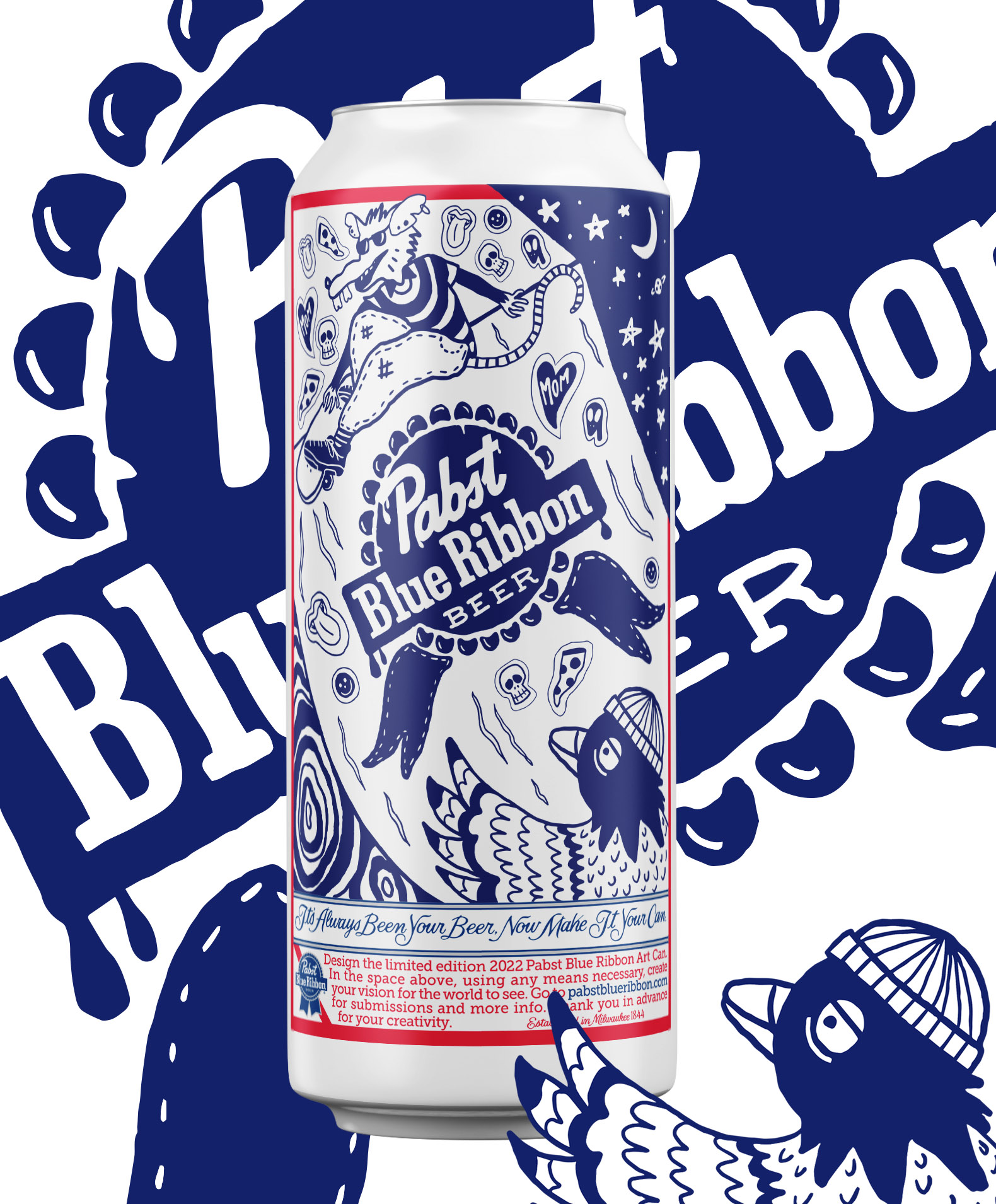
Pabst Blue Ribbon is an iconic beer brand with a long-standing connection to independent culture and self-expression. For its annual packaging design contest, I developed an original concept that brought together the brand’s recognizable identity and the raw, creative energy of skateboarding.
The goal was to create a visually distinctive packaging design that felt bold, contemporary, and rooted in skate culture while celebrating the rebellious spirit that connects both worlds.
THE CHALLENGE
How can an established beer brand connect with skate culture through packaging that feels authentic, expressive, and visually compelling?
The challenge was to create a design that balanced Pabst Blue Ribbon’s iconic brand identity with the individuality and urban aesthetics of skateboarding. Rather than simply applying skate-inspired graphics, the concept aimed to build a visual narrative that reflected the culture’s creativity, attitude, and sense of community.
Inspired by skate culture’s DIY mentality, street aesthetics, and creative freedom, I explored a visual direction that brought character and personality to the packaging.
The concept centered on merging the familiarity of Pabst Blue Ribbon with the expressive language of skateboarding. Through illustration and character design, the packaging became an opportunity to tell a story — one that celebrated individuality, movement, and the unconventional spirit shared by the brand and the skate community.
A visual tribute to the rebellious spirit of skateboarding.
VISUAL DIRECTION
The visual approach focused on creating a bold, urban aesthetic with a strong illustrative identity.
- Illustration: Custom artwork helped establish a distinctive visual language and bring personality to the packaging.
- Character design: Character-driven elements added narrative depth and reinforced the playful, rebellious energy of skate culture.
- Brand integration: The concept sought to balance the expressive artwork with Pabst Blue Ribbon’s established visual identity.
- Packaging design: The illustrations and graphic elements were developed as part of a cohesive packaging concept, connecting the brand with the culture that inspired it.
Each element contributed to a design direction intended to feel energetic, authentic, and rooted in the creative spirit of skateboarding. The OutcomeThe result was an original packaging design submission for Pabst Blue Ribbon’s annual packaging contest, translating the influence of skate culture into a distinctive illustrated concept.
By combining packaging design, character development, and illustration, the project explored how visual storytelling can give a familiar product a fresh cultural perspective while maintaining a connection to its existing brand identity.



©2026 Mercedes Padró. All rights reserved.