Rifle Paper Co. | product design

Brief:
I worked as a Product Graphic Designer for Rifle Paper Co. I played an integral role in designing best-selling products across stationery, home, and gift categories adherent to high design standards. I created original illustrations and surface patterns, ensuring seamless and custom designs. I also contributed to high-profile licensed collaborations with Anthropologie, Pottery Barn, Keds, York, and Target.
Client:
Rifle Paper Co.
Role:
Product Graphic Designer
Skills: Textile design, pattern design, embroidery, shoe design, jewelry design, hand-lettering, illustration, color theory
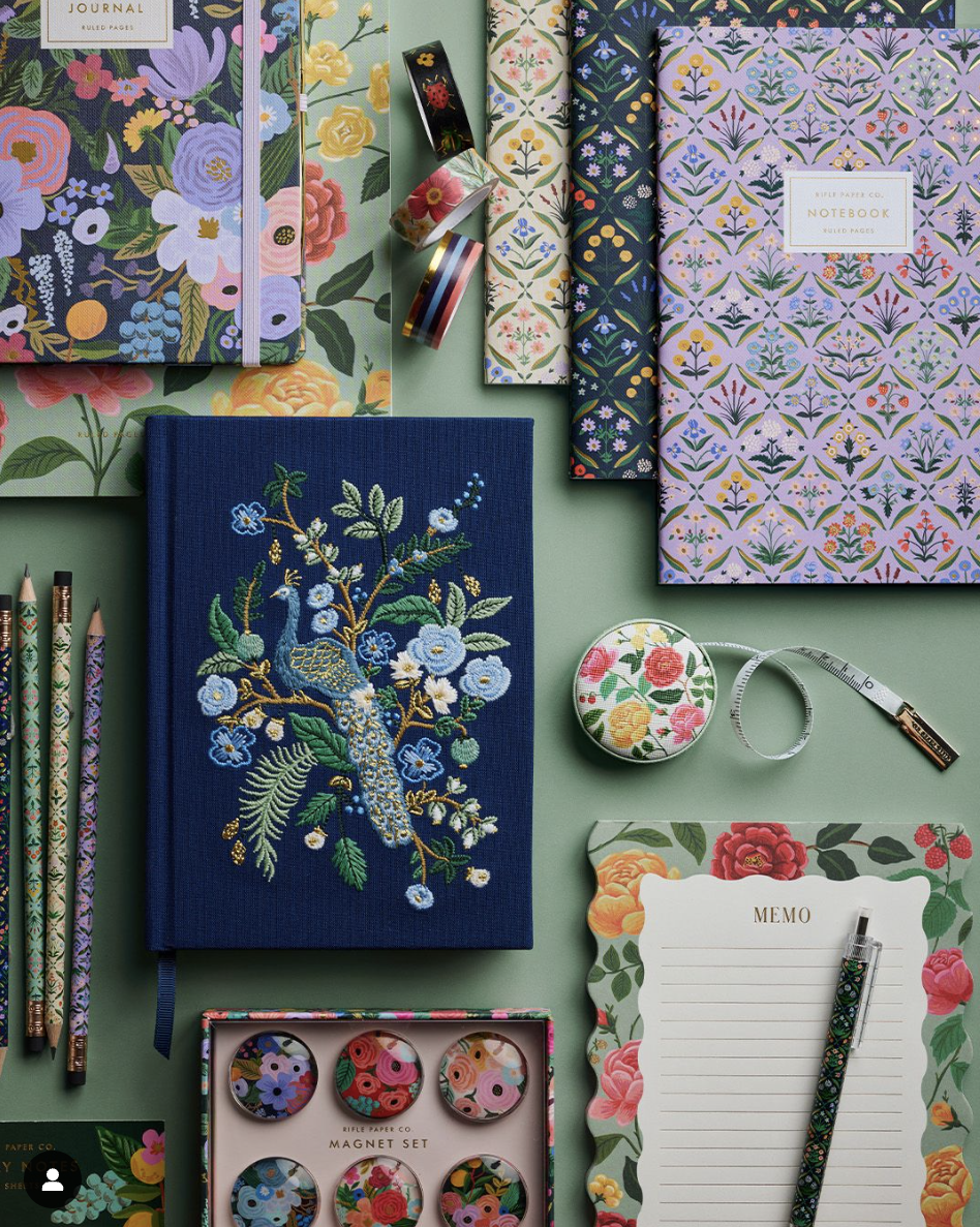
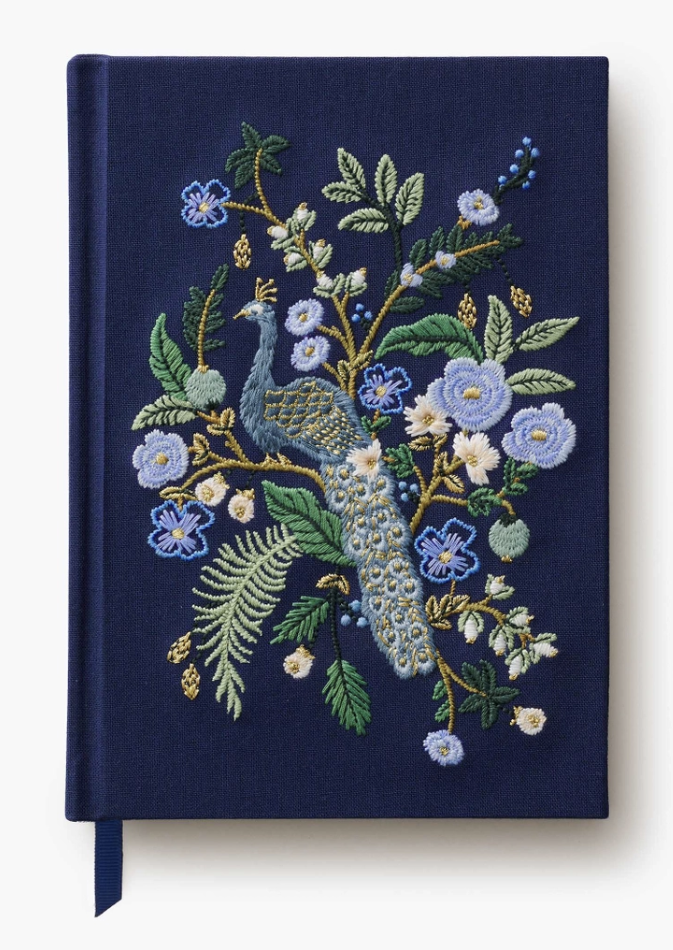
“Using the Peacock pattern created by Anna Bond, I vectorized the artwork and designed the layout of the embroidered journal.”
I chose specific embroidery techniques that compliment the artwork such as “french knots” and “satin stitch.” I thoughtfully selected thread colors for the prep-house to reference for the final embroidered peacock journal.

Rifle Paper Co. | roses stationery
I designed the Roses Stationery card set which entailed setting up the mechanicals and card dieline, designing the box packaging including the layout, color palette, gold foil set up, dieline, and custom pattern placement.


Rifle Paper Co. | stationery
I was responsible for the concept, sketching, illustration, hand lettering, and final design of the following greeting cards and stationery.

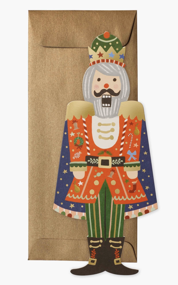
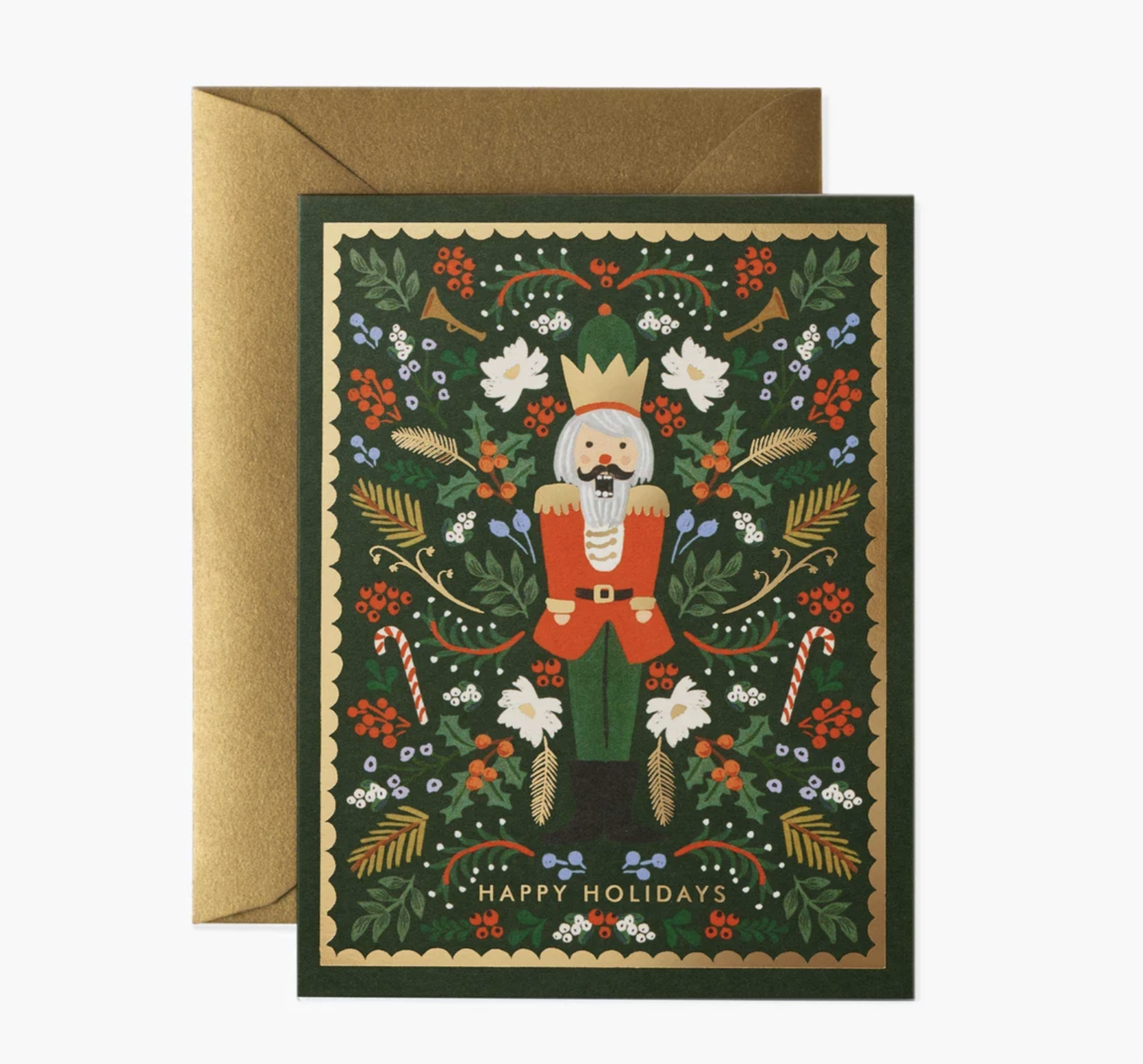
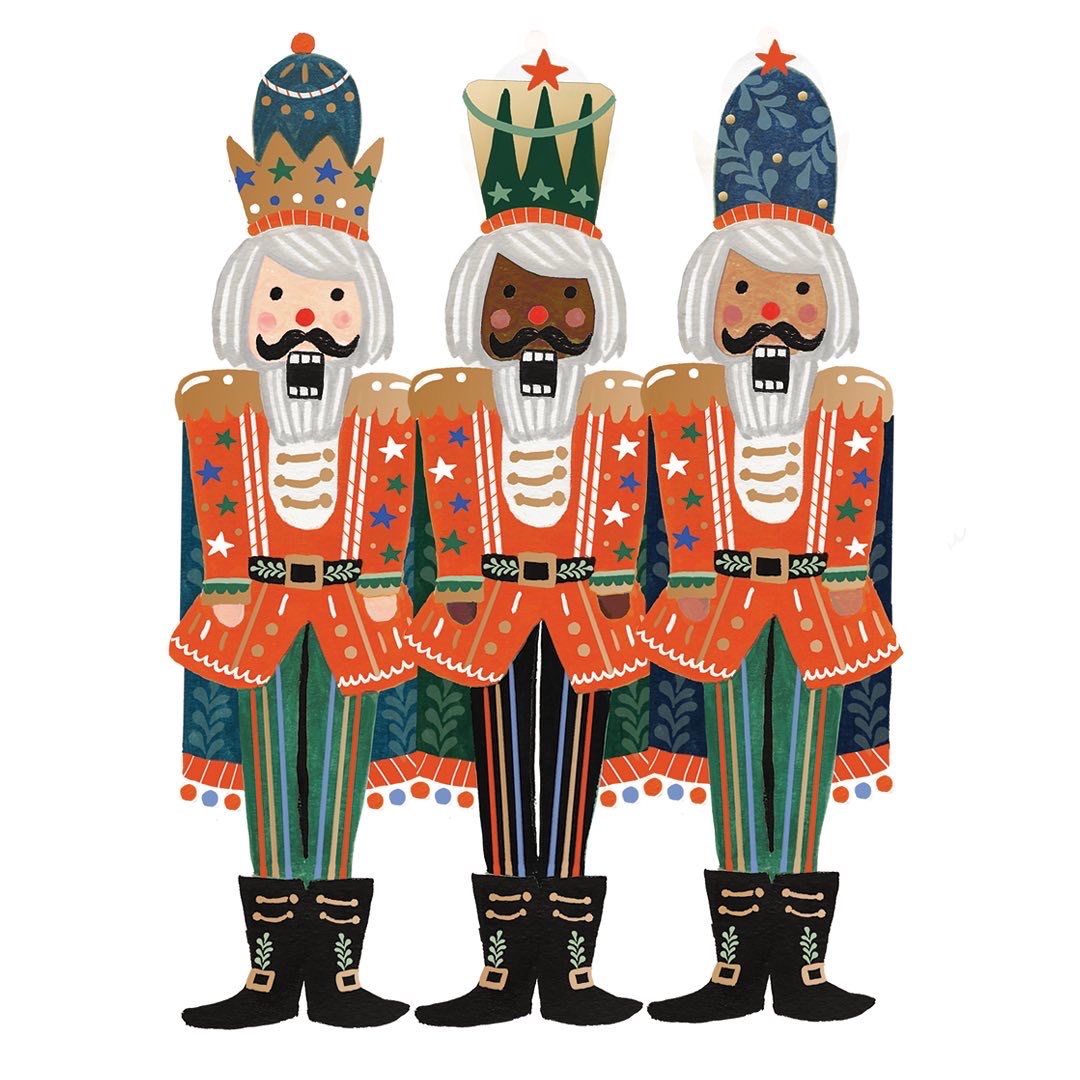
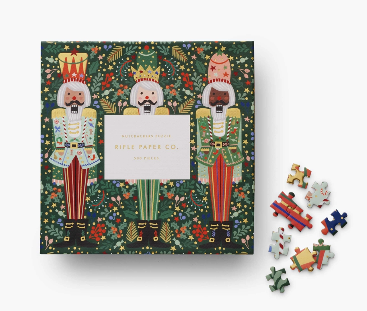
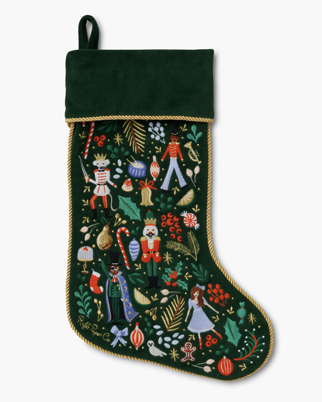
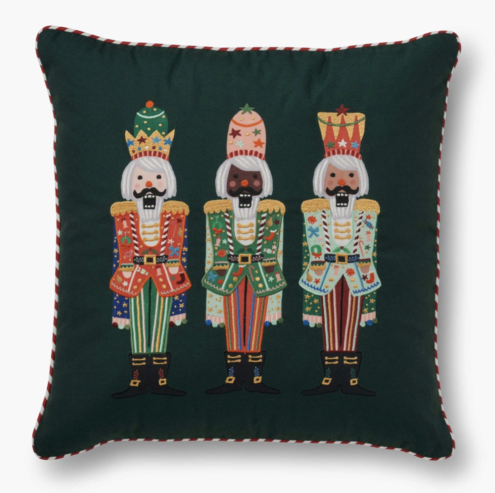
Rifle Paper Co. | nutcracker
Working with Anna’s initial illustration of the nutcracker, I painted and designed the nutcracker trio. Illustrating and designing the three nutcrackers entailed designing the head-ware and patterns within the characters, ensuring that they work well for a variety of applications and formats. After the design of the illustration was established, I applied the characters to the products shown below.

Sticky Notes | 3M
In collaboration with 3M, the post-it company, I designed the following sticky notes. I worked on the layout of the backer and sticky note, so that the placement looks well-design with and without the sticky note on the backer.

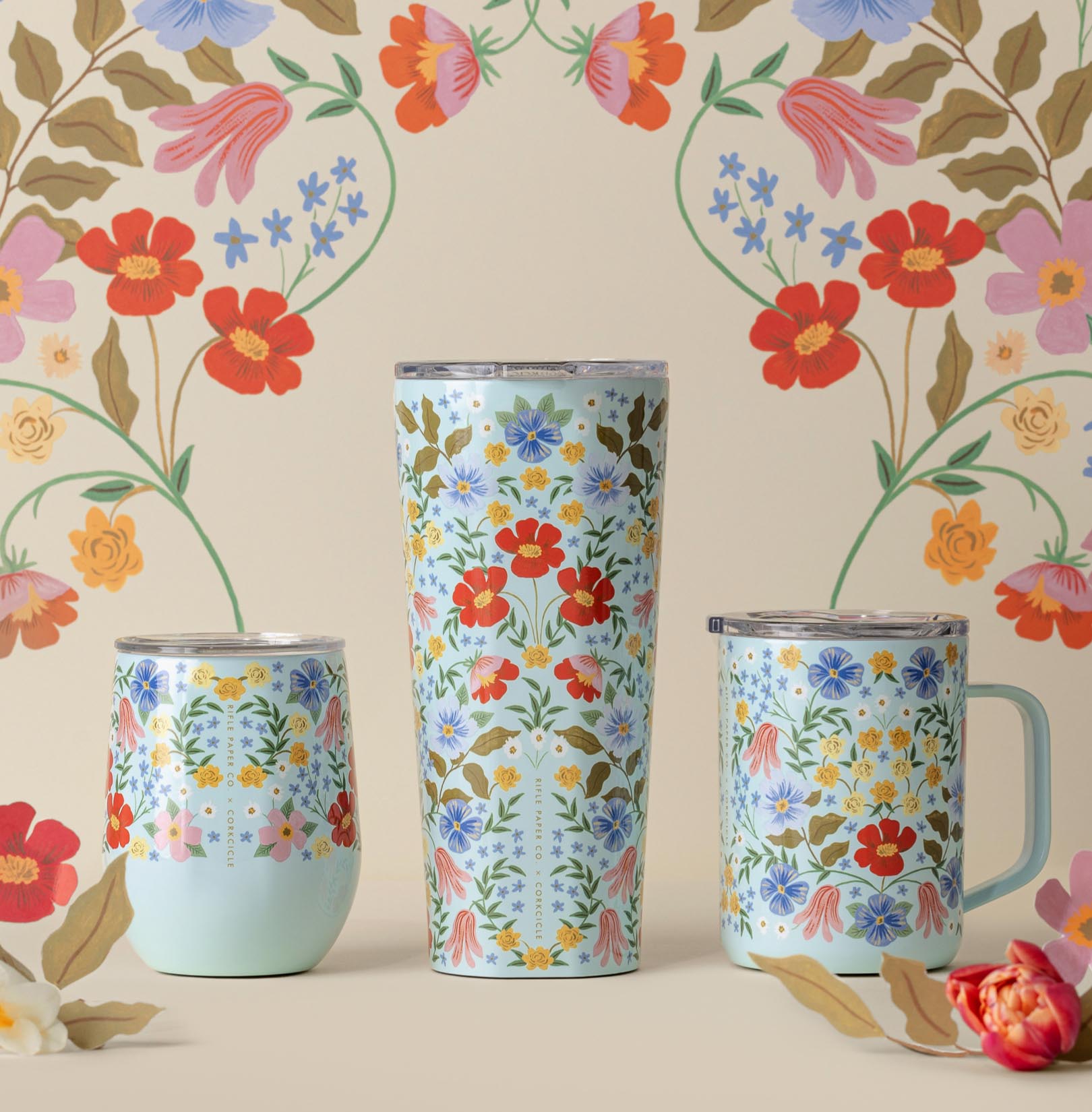
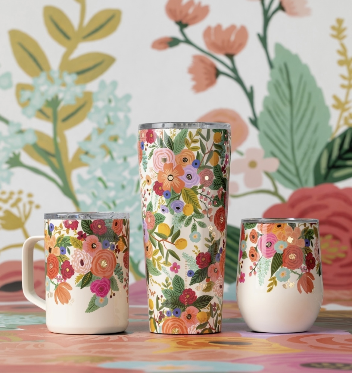
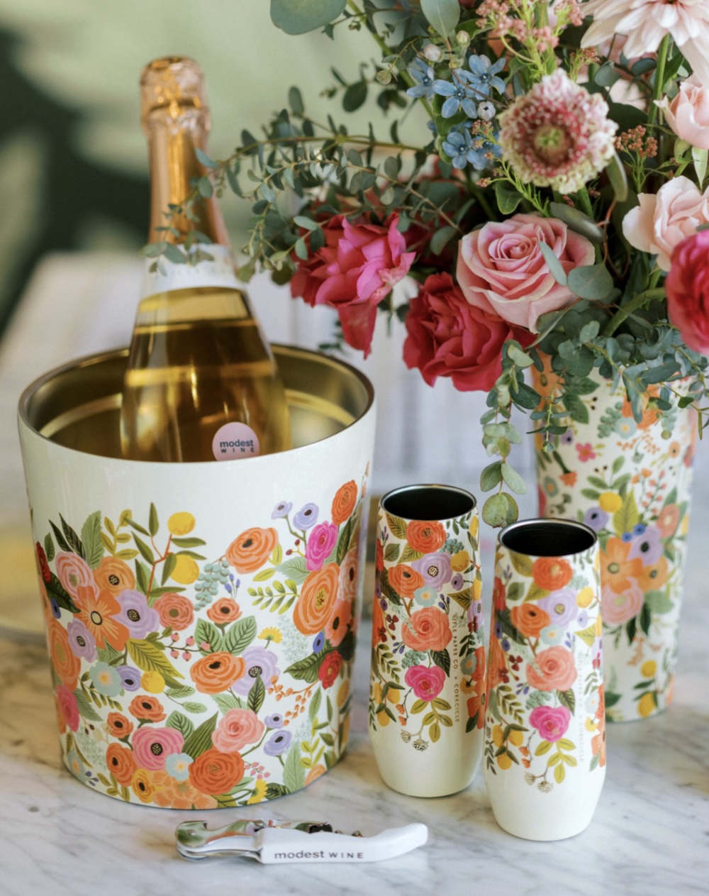
Bottle Design | Corkcicle
I utilized existing Bramble and Garden Party illustrations created by Anna Bond and customized the layouts for Corkcicle’s drinkware. While each format varies, it comes together for a whimsical and seamless pattern experience.
Shoe Design | Keds
In collaboration with Keds, I worked on the initial concepting and design of the Spring 2024 shoes. Apart of my responsibilities included coming up with innovative techniques for the shoes. This included thoughtful placement of the cherry embroidery and a dainty cherry charm on the shoe lace.


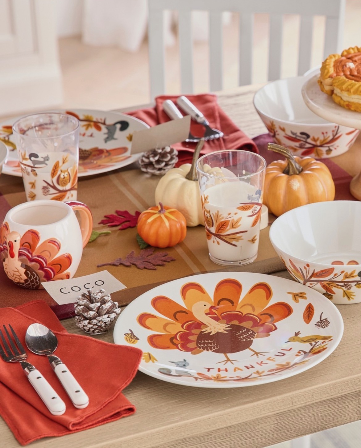
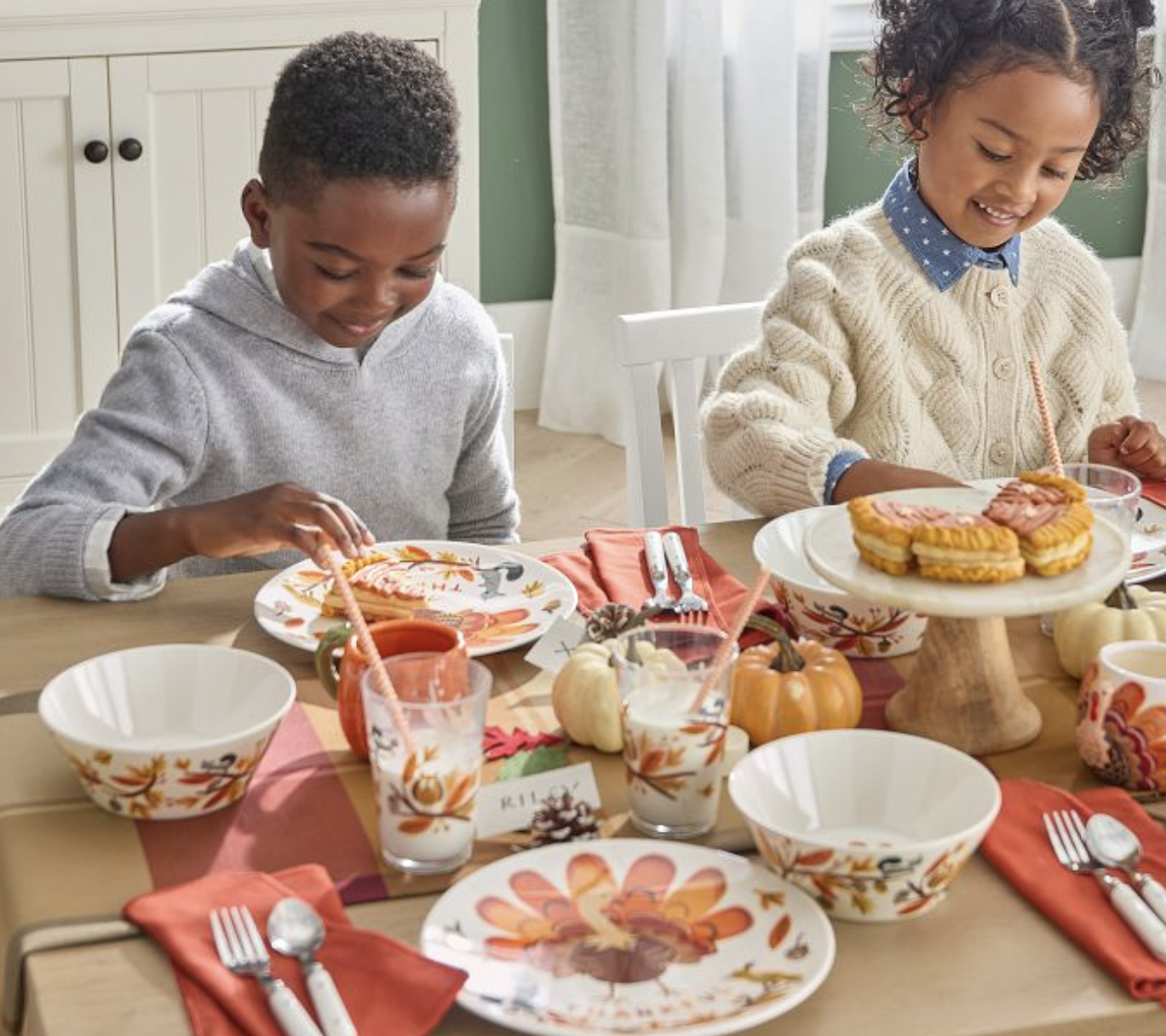
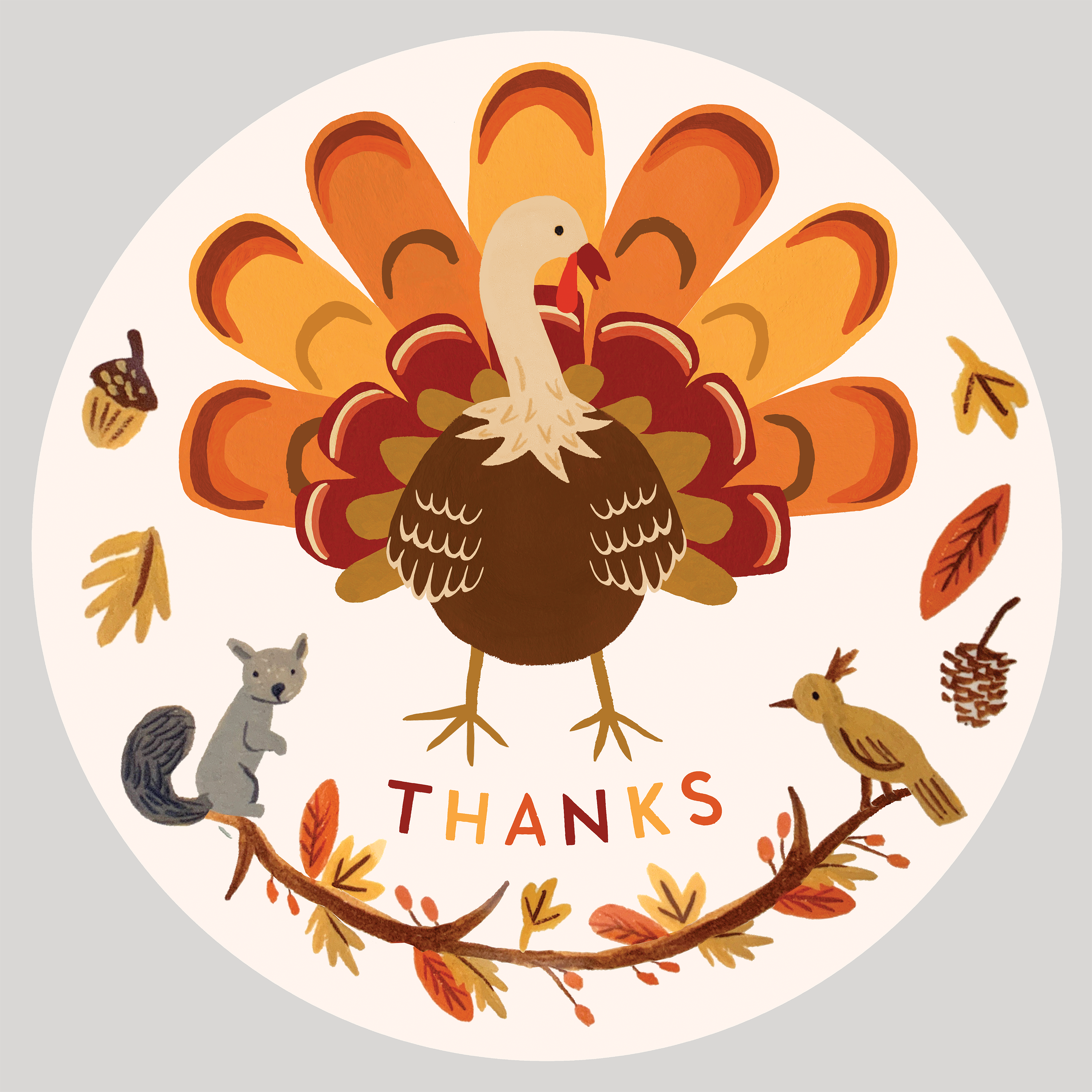
Platter Design | Pottery Barn
In collaboration with Pottery Barn, I worked on illustrating and designing the turkey for their Thanksgiving platterware.
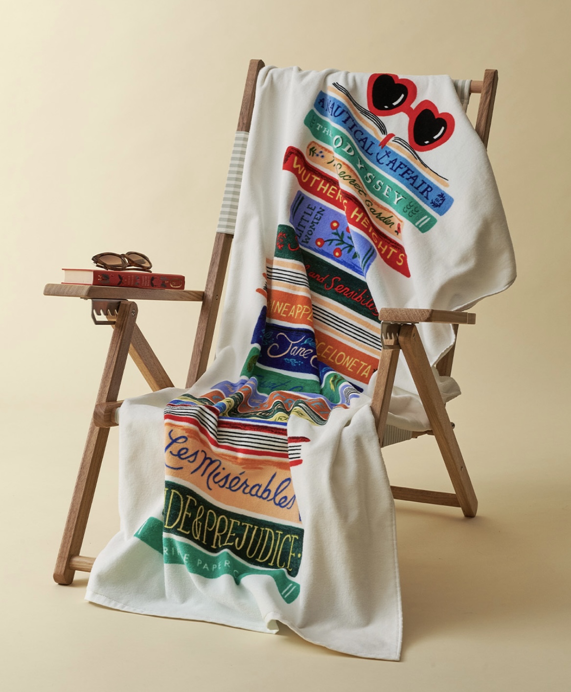
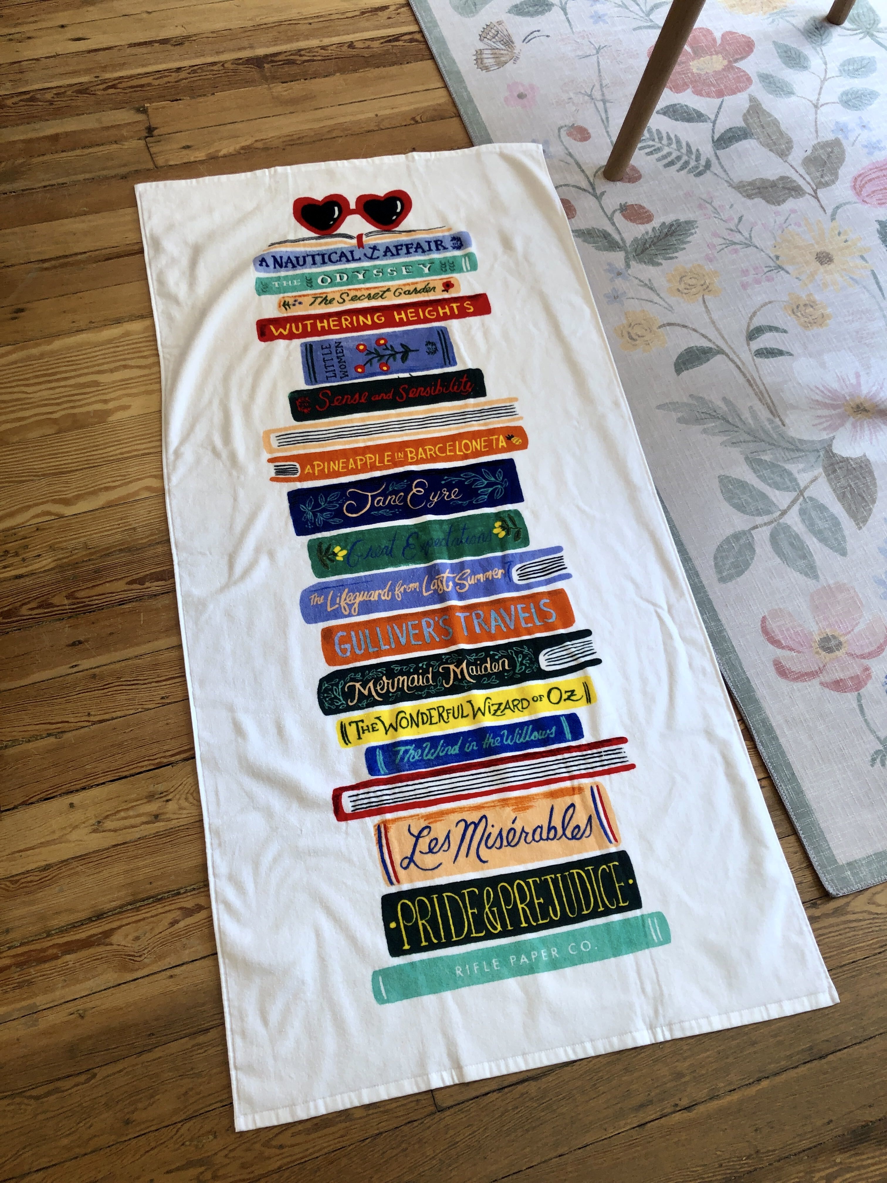
Rifle Paper Co. | beach towel
For the Book Club beach towel I was responsible for the concept, sketching, hand-lettering, and design. This towel was featured as a best seller on Rifle’s website.
![]()
![]()
![]()


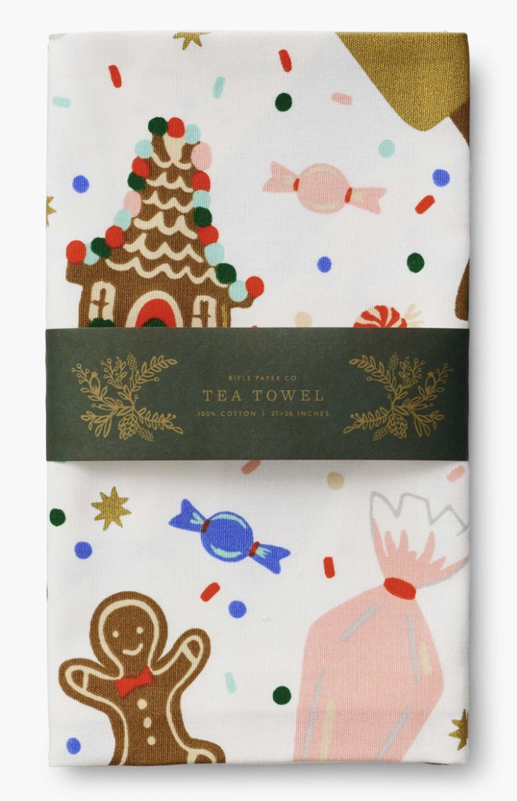
Rifle Paper Co. | tea towel
For the Christmas Cookie tea towel I worked on illustrating, vectorizing, and designing the layout. For this project I considered the typical folds in a tea towel, so that each crop is visually appealing. The illustration to the right was a near-final layout of the towel.


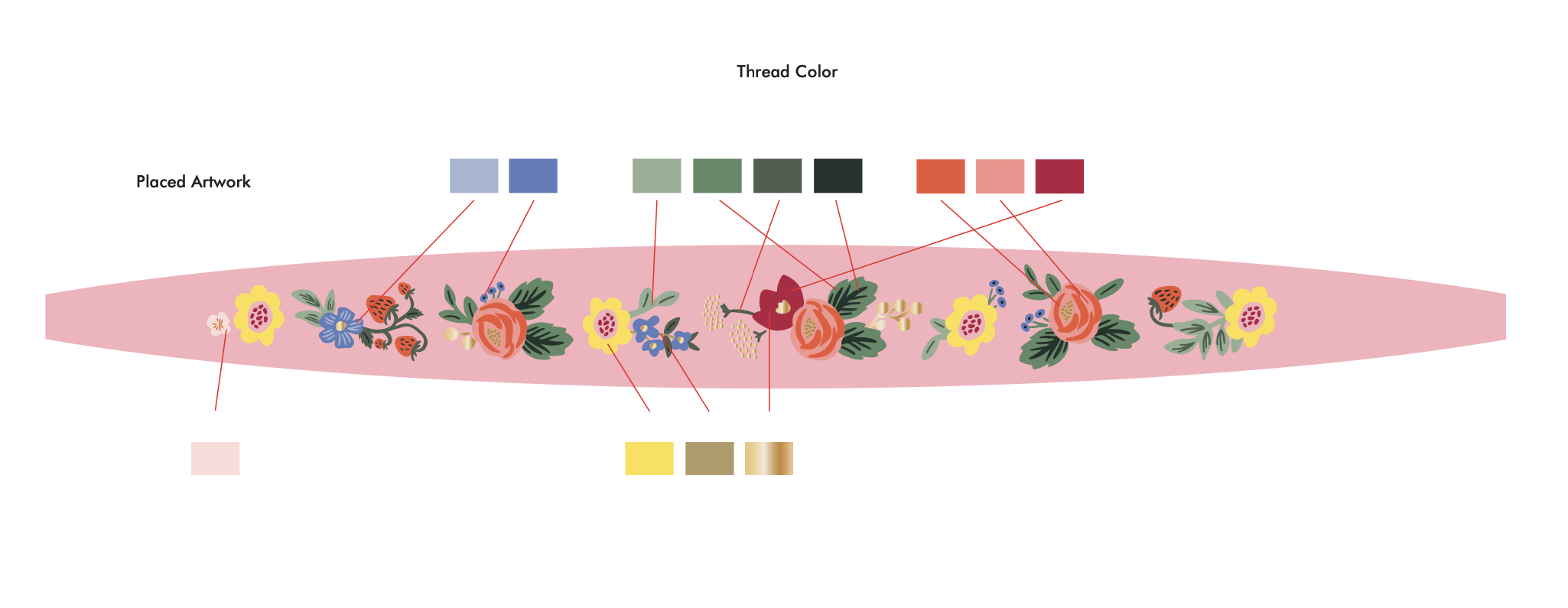
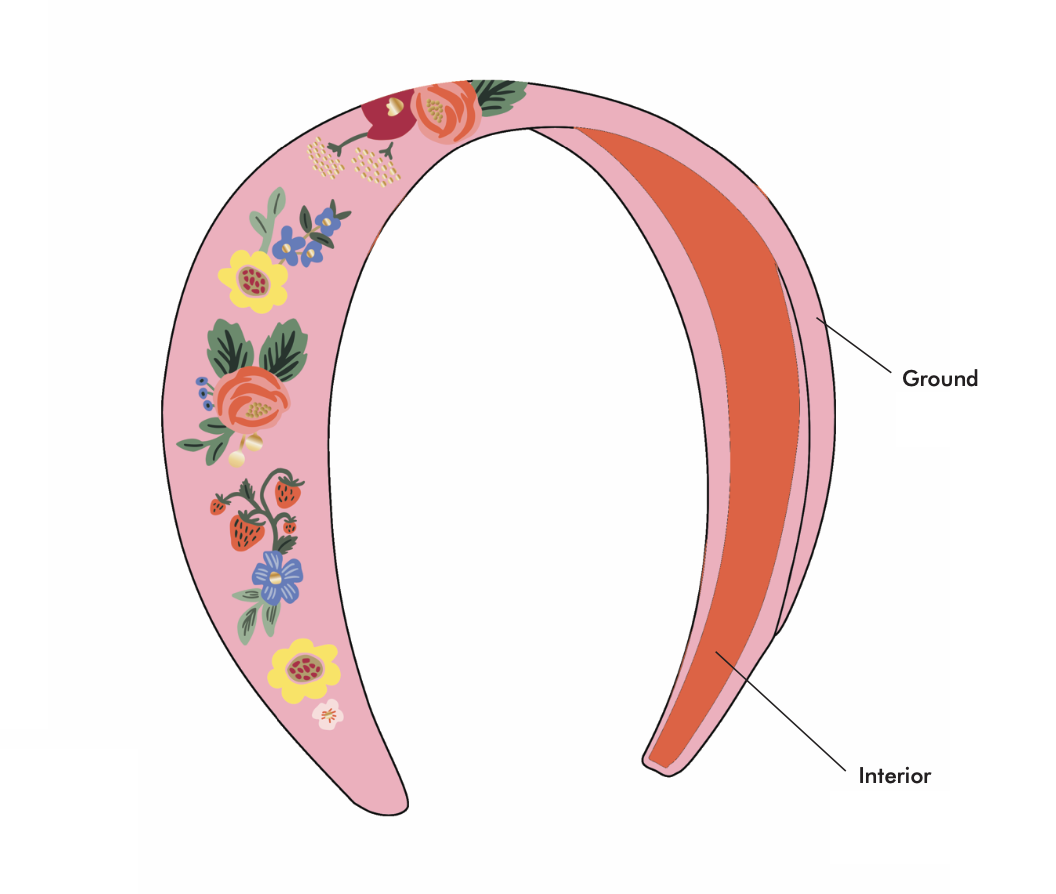
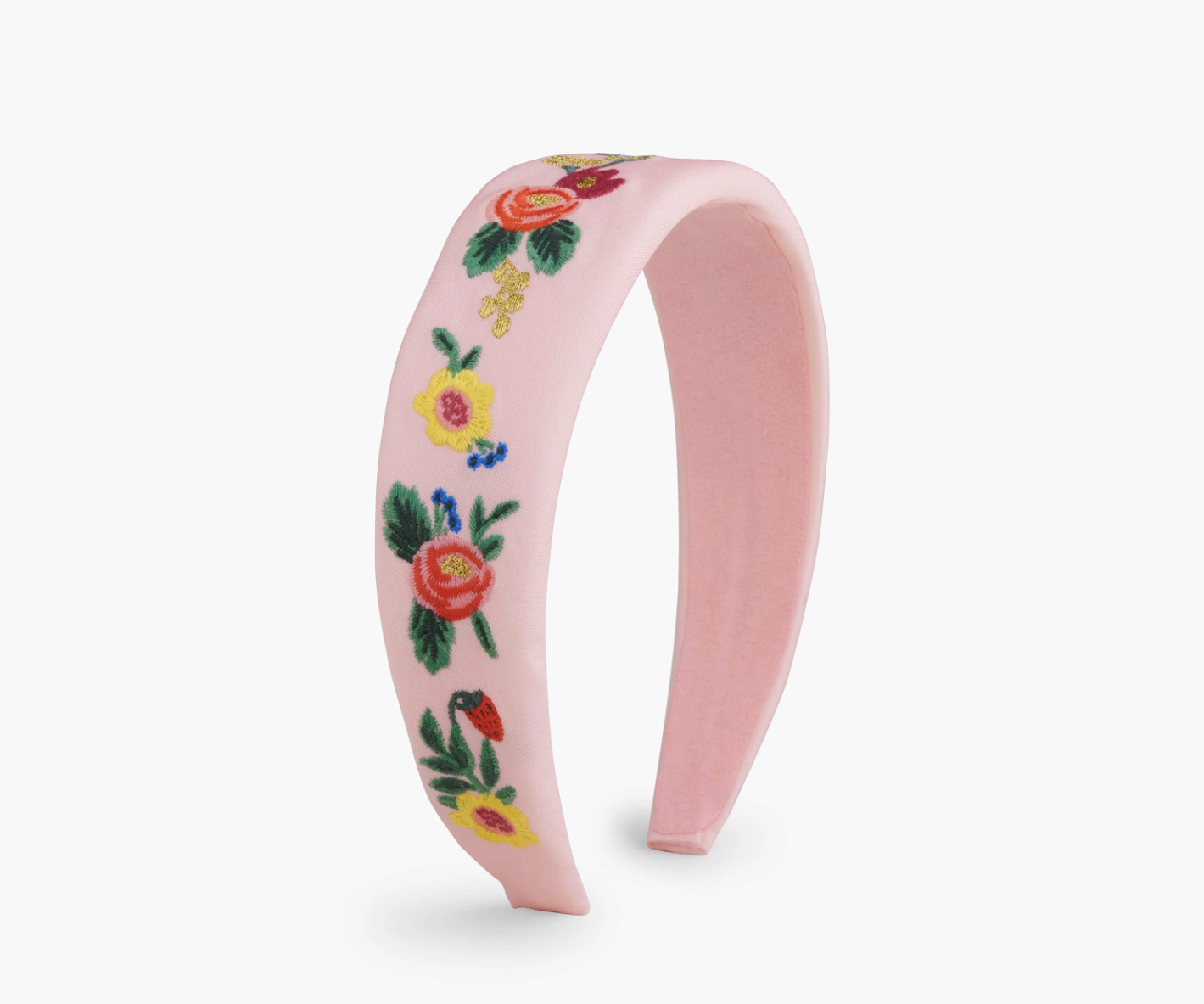
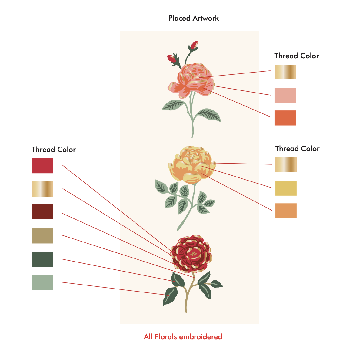
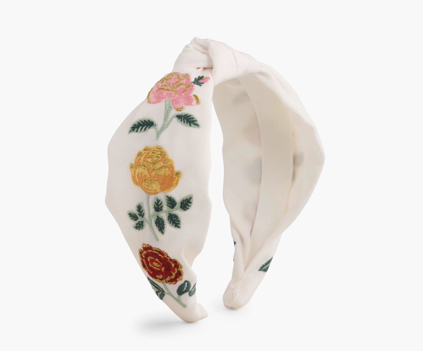
Rifle Paper Co. | embroidered accessories
I designed the following headbands and accessories. My responsibilities included vectorizing Anna’s existing artwork, so that it could be applied to the headband and the files prepped for embroidery.

Rifle Paper Co. | ring dish
I designed the following ring dish utilizing Anna’s fall pattern design. We settled on this design after I experimented with a variety of layout, color scheme, and pattern options.

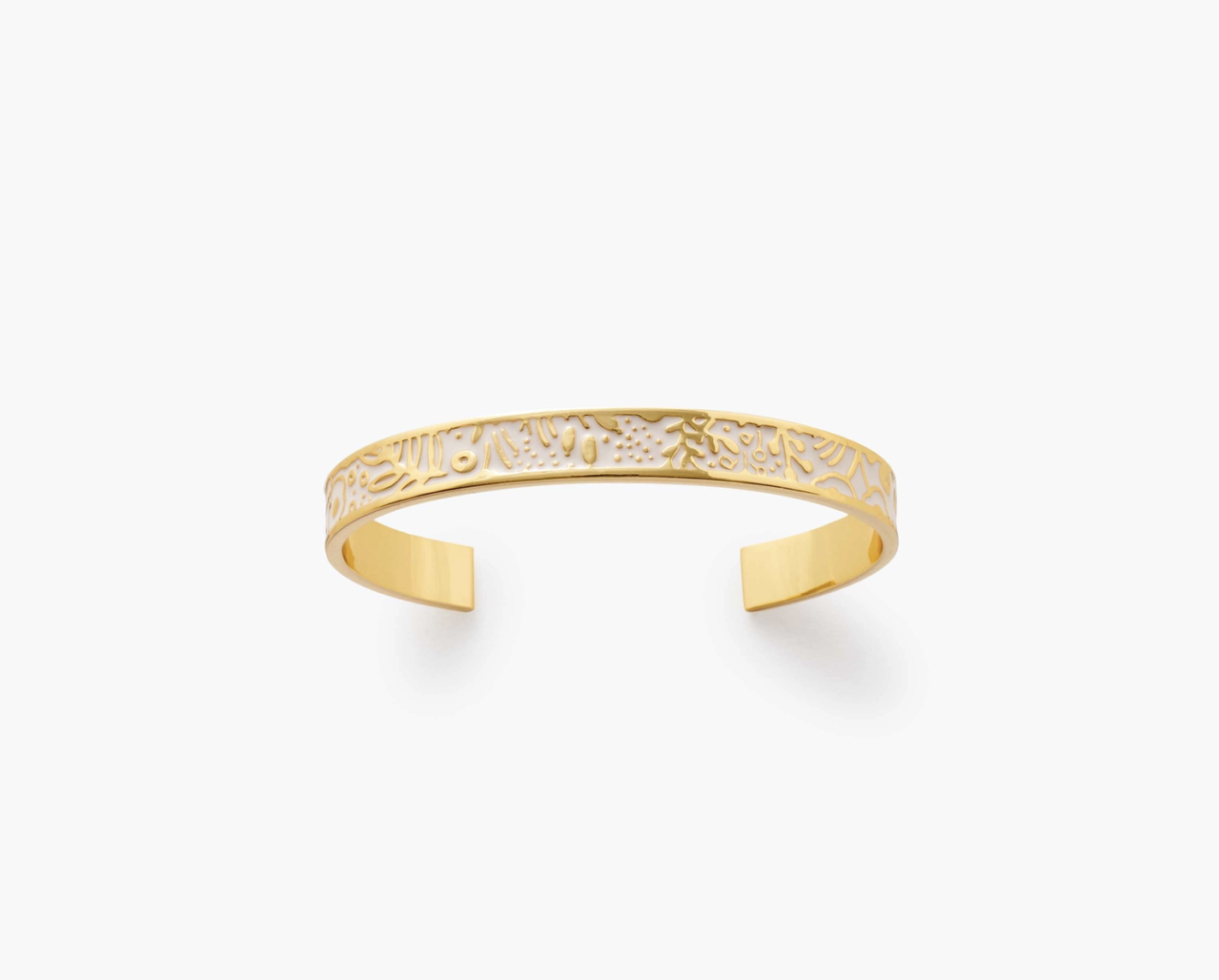
Rifle Paper Co. | jewelry design
I designed the following bracelets utilizing Anna’s artwork. I was responsible for the lettering, colorways, and placement of the art.


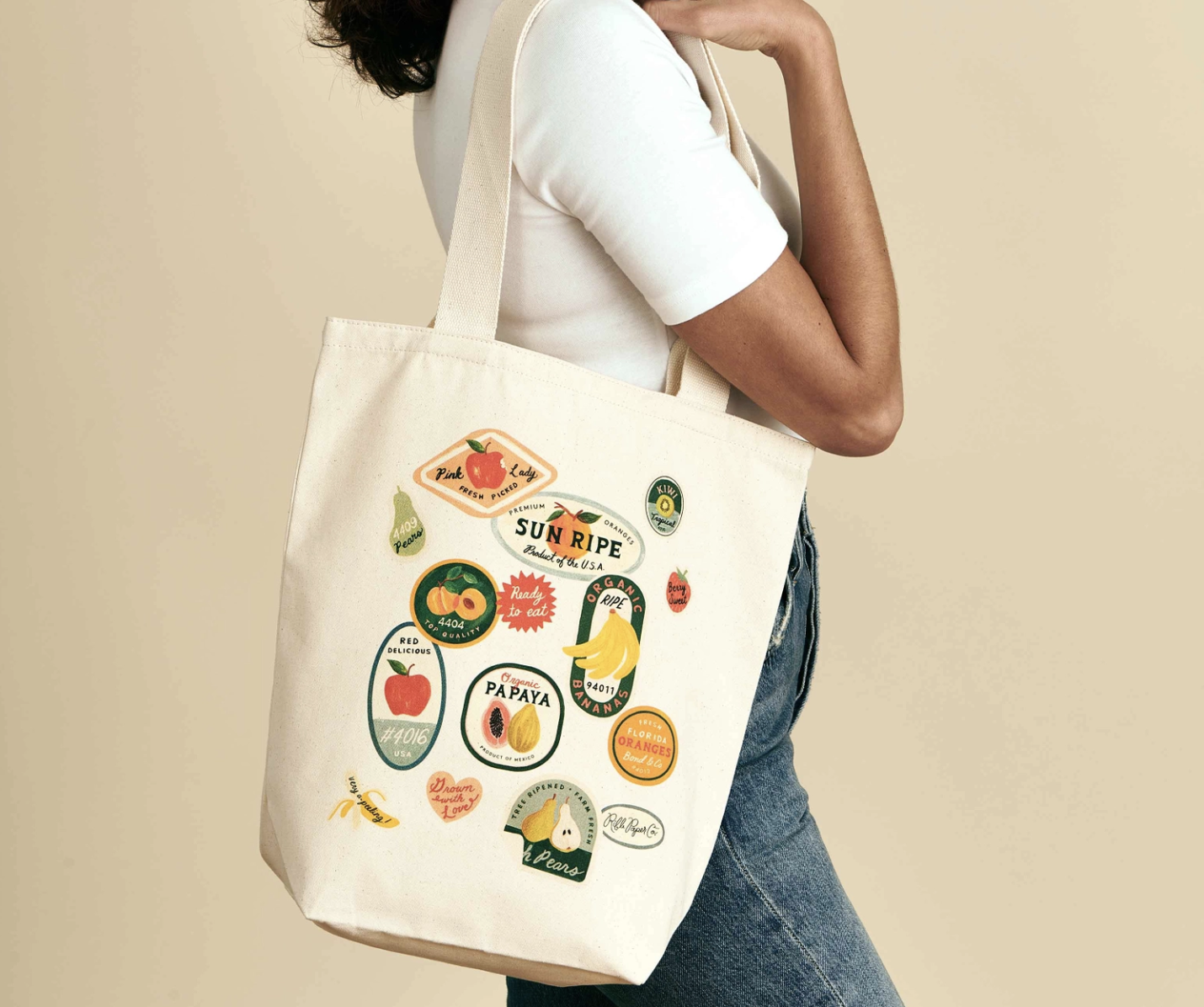
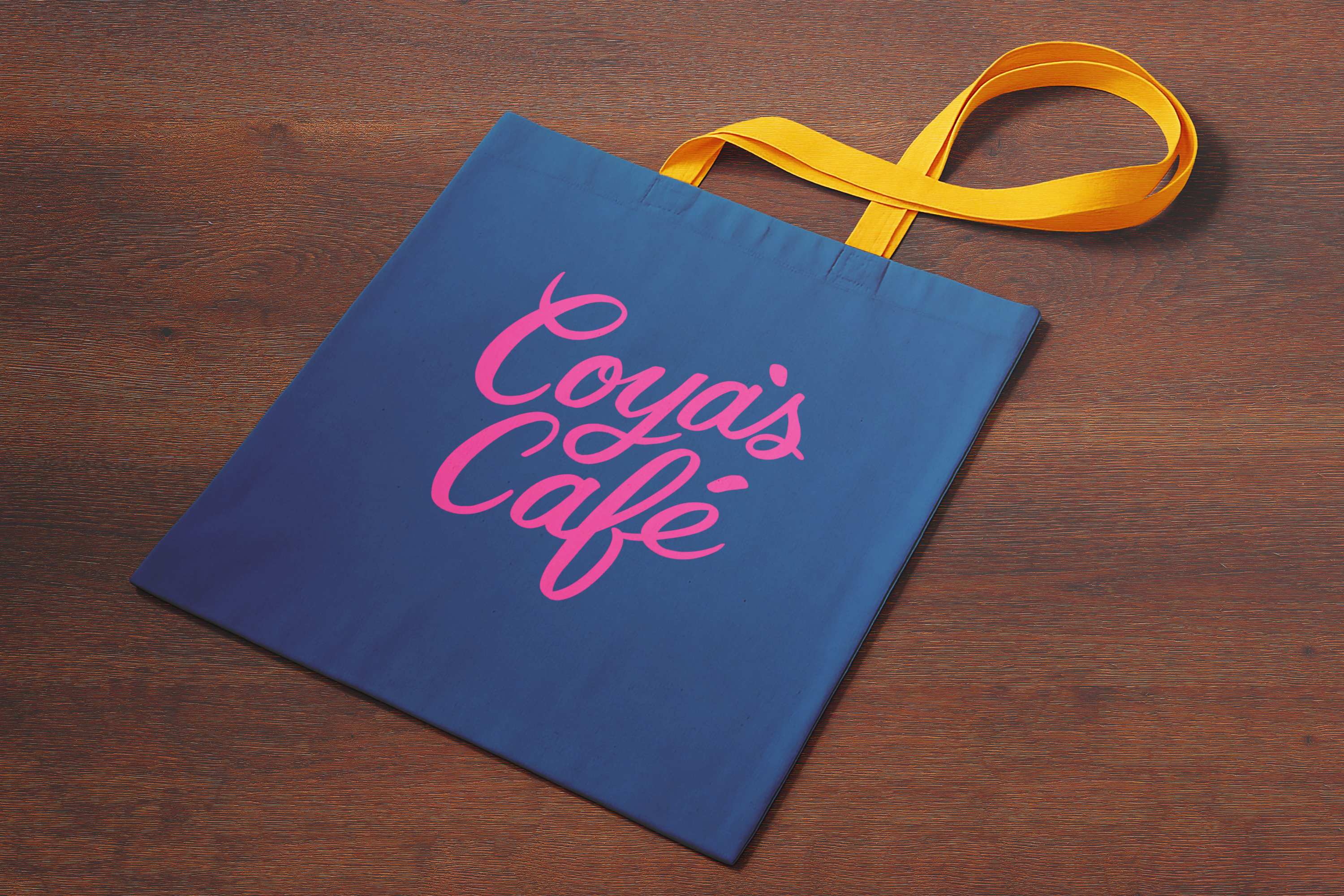
Rifle Paper Co. | totebags
Totebags I worked on while at Rifle which included layout, color, and type design.


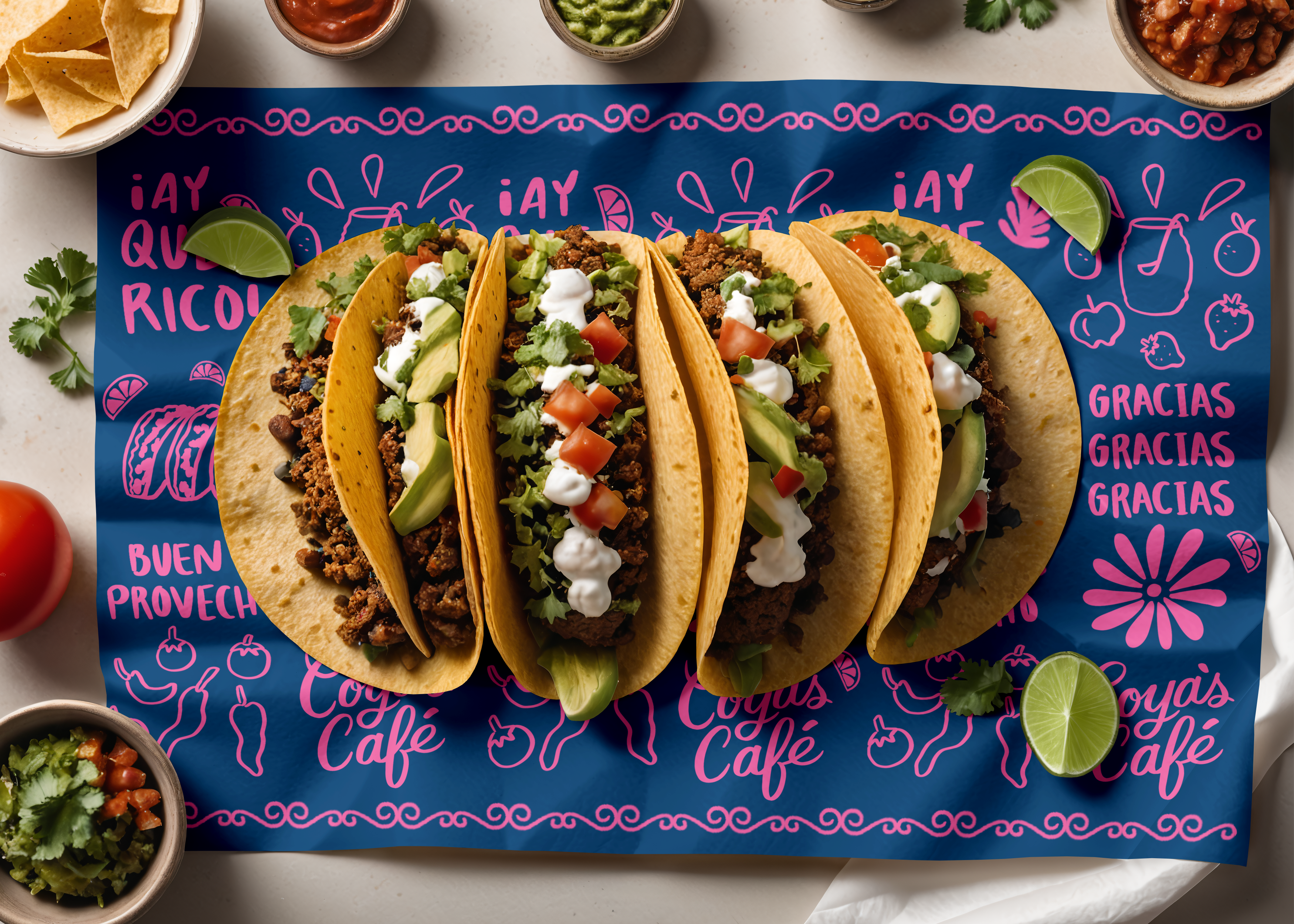


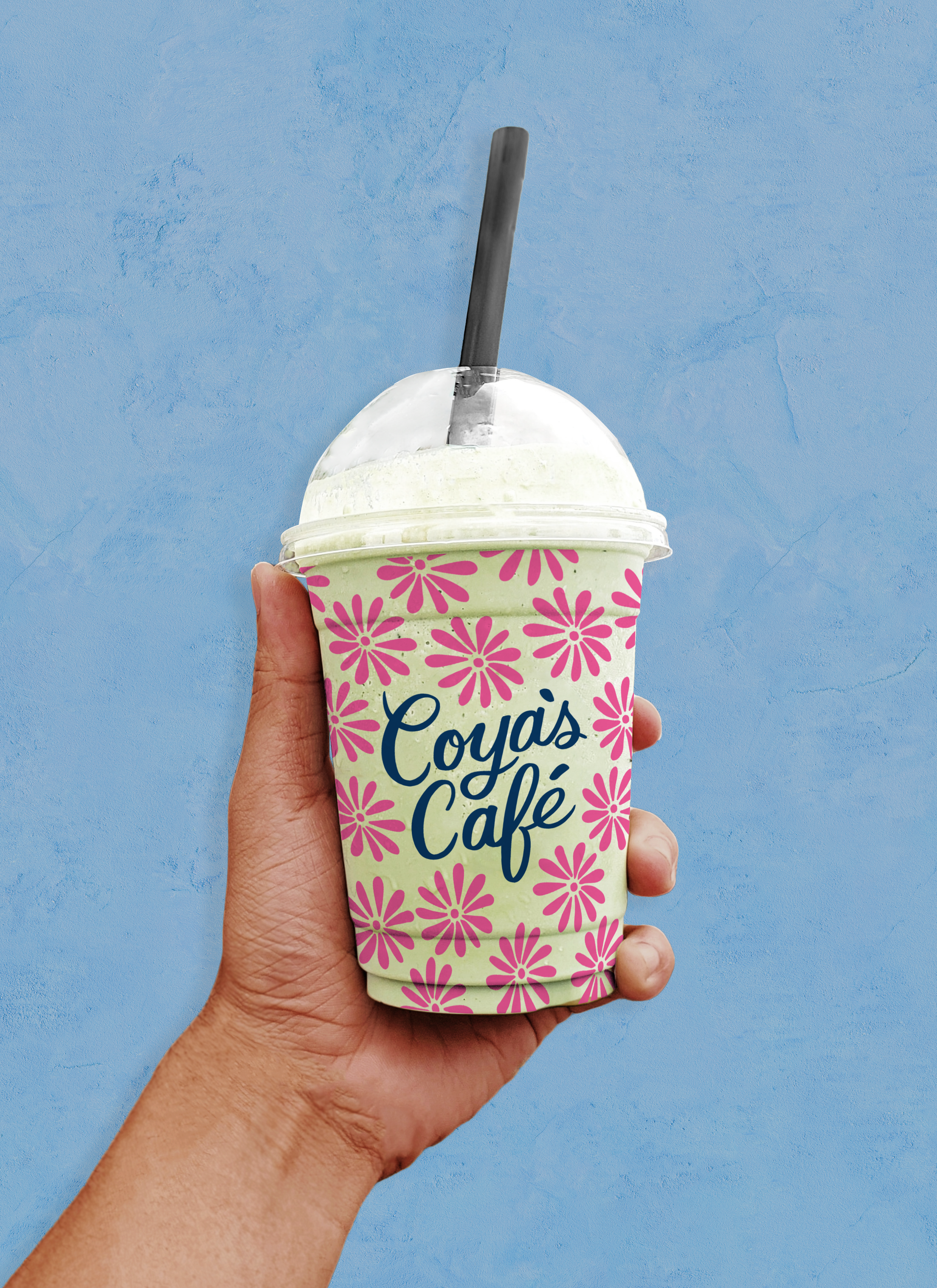
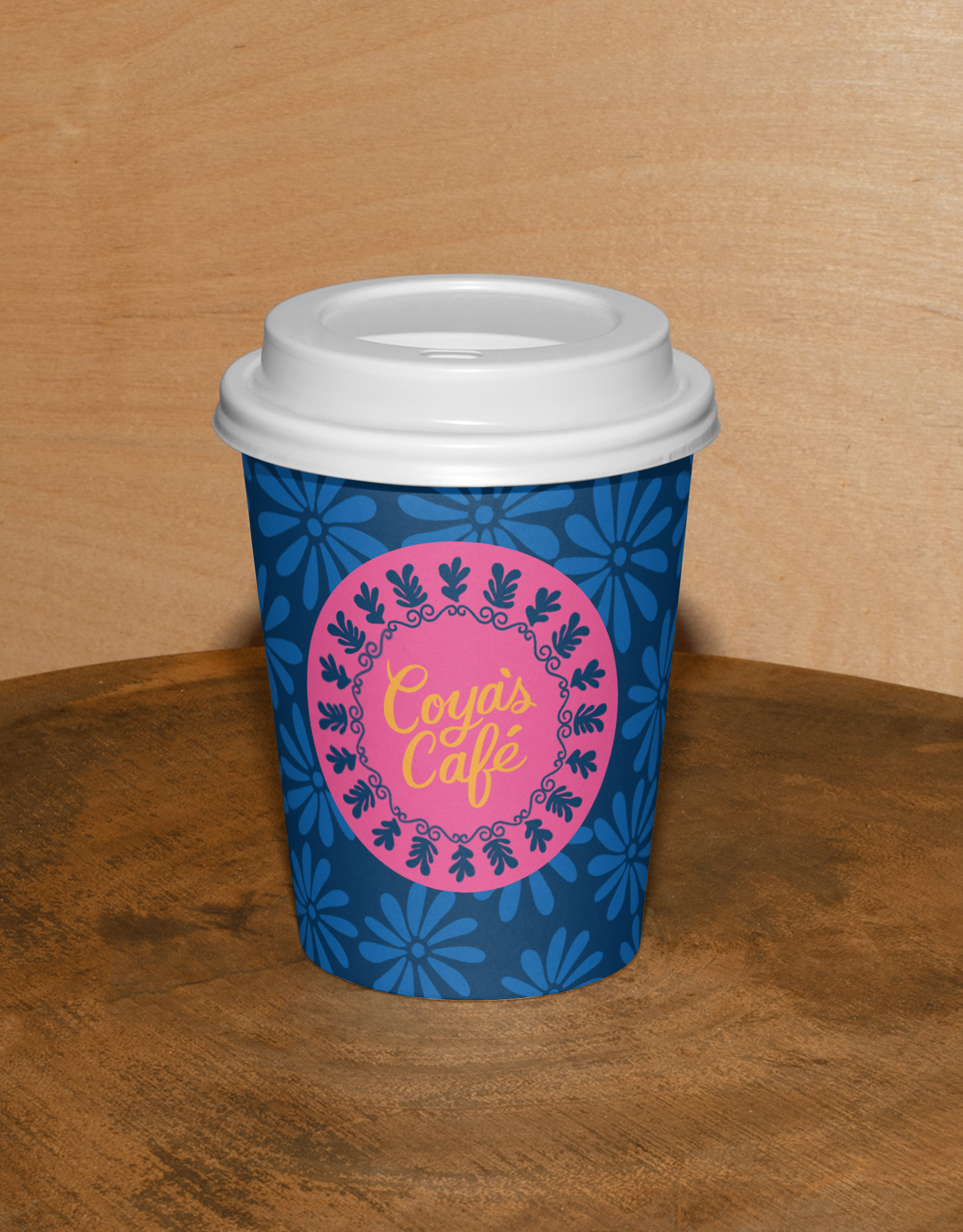
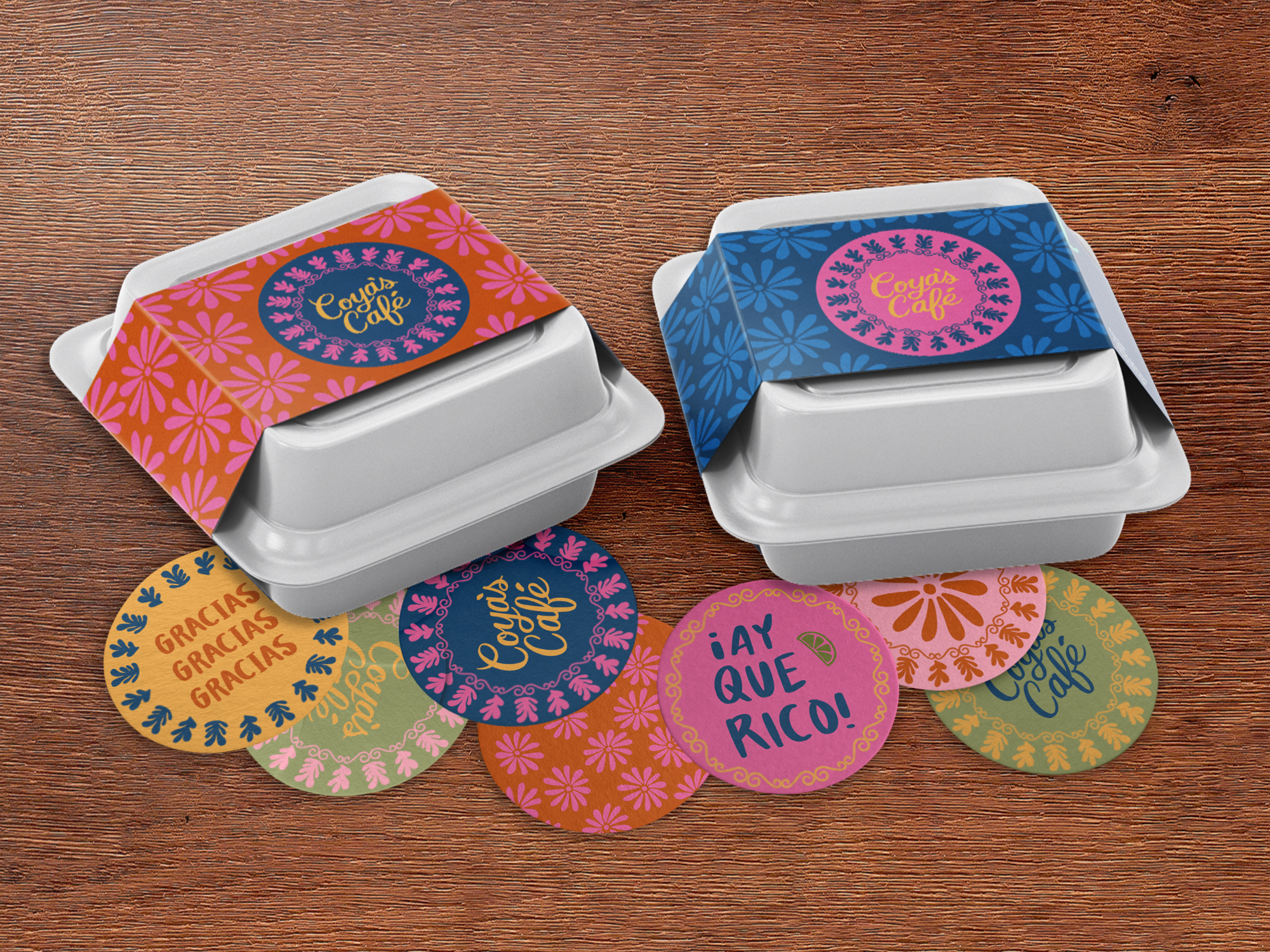
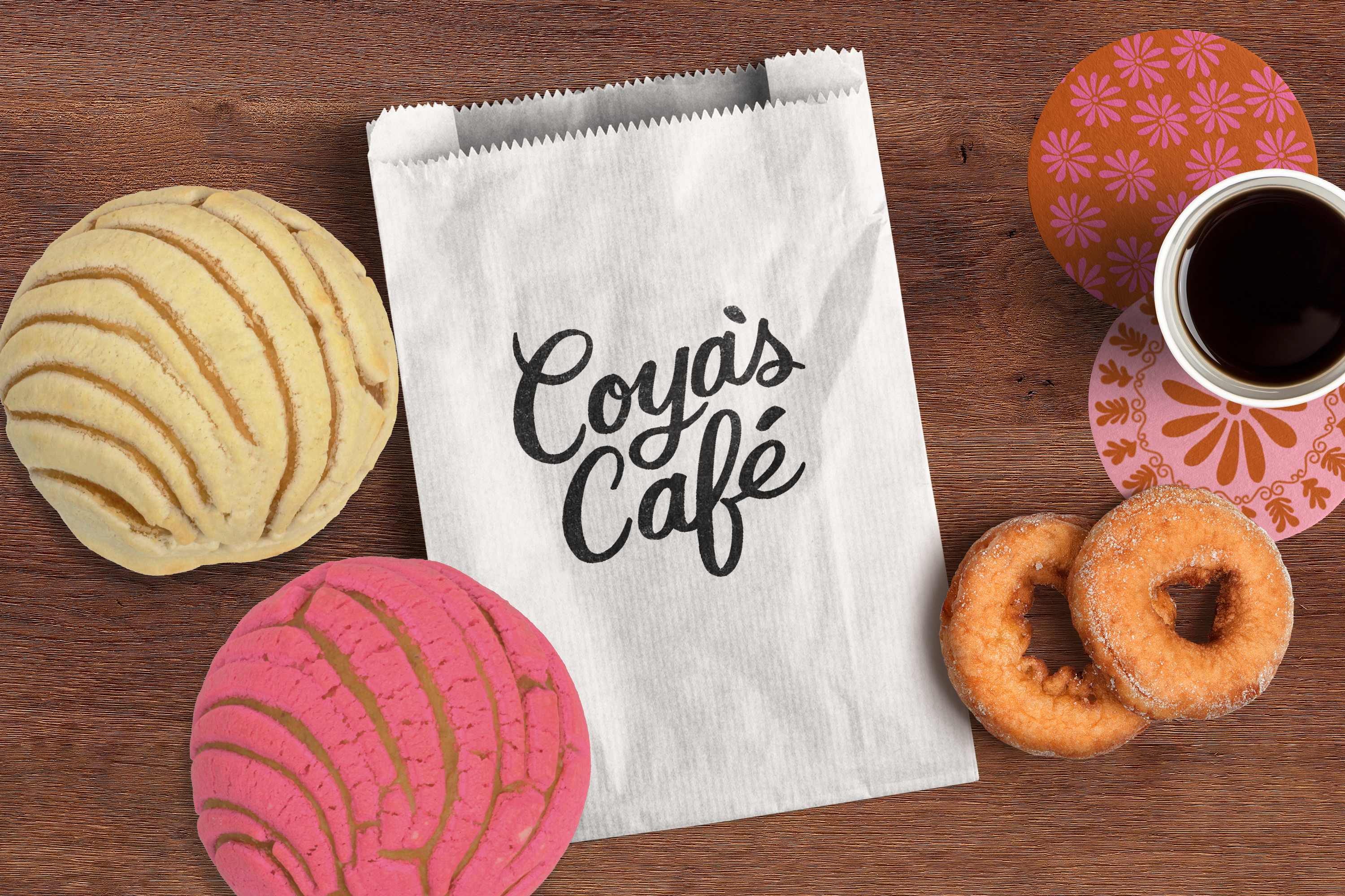
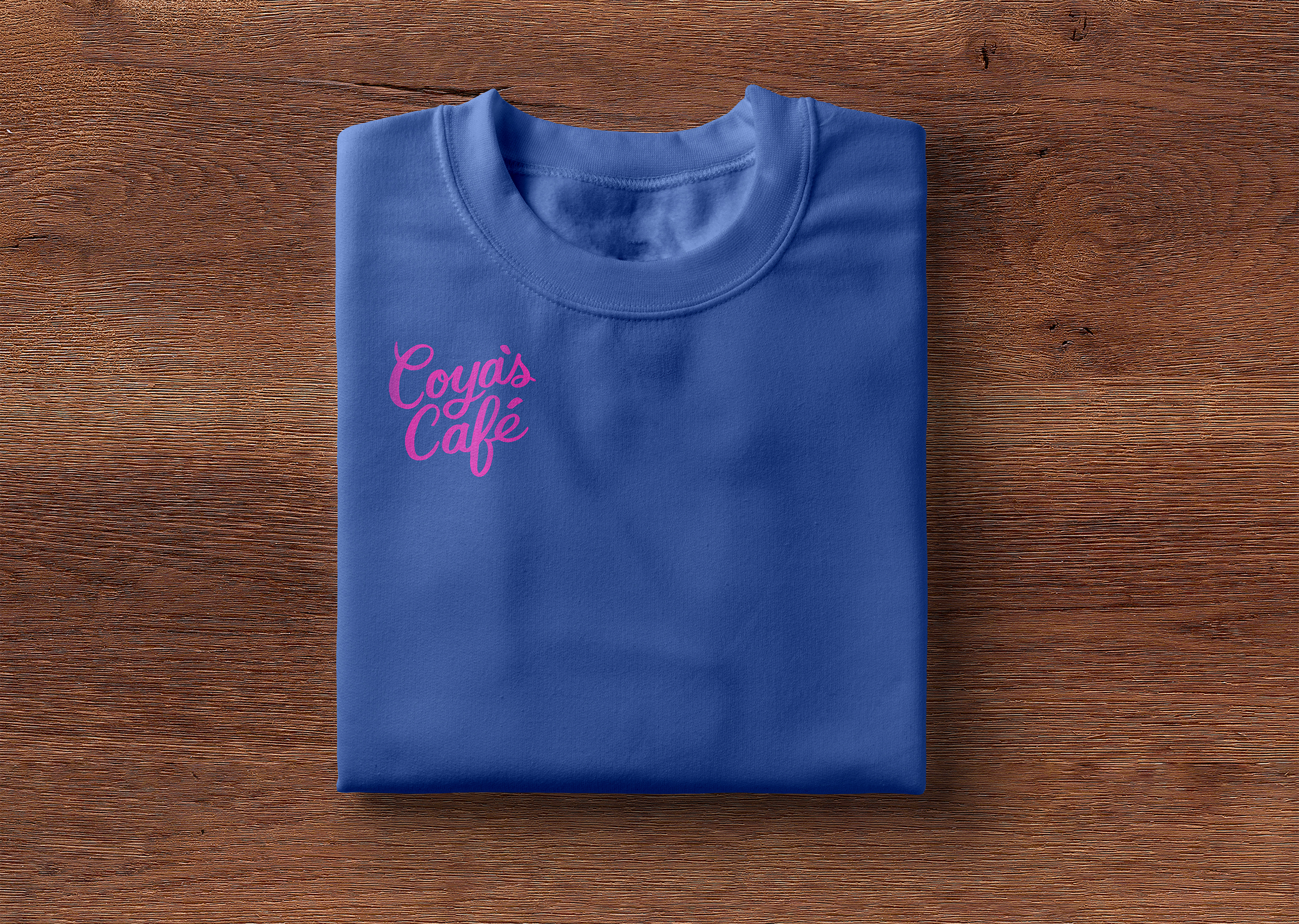
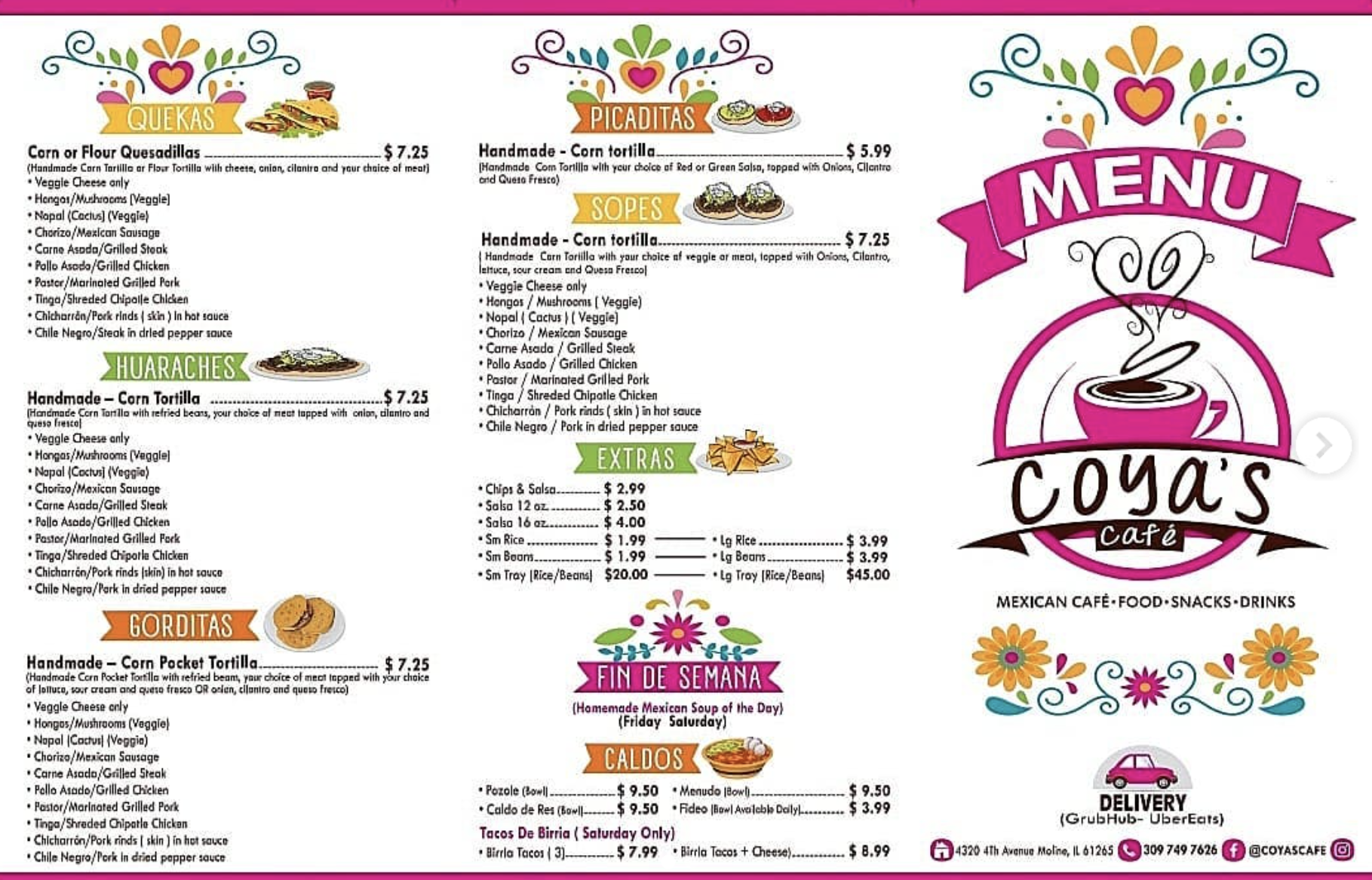
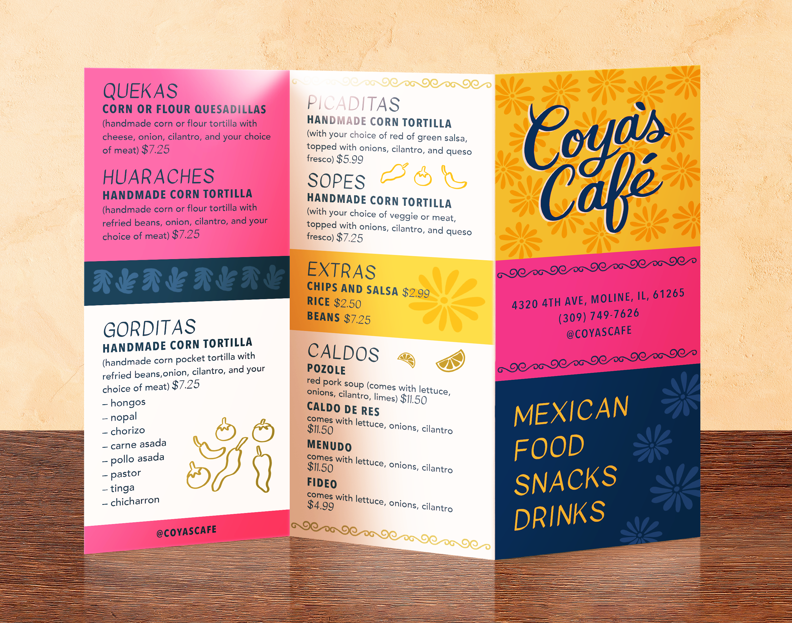
Coya’s Café | restaurant branding
Brief: I worked on rebranding Coya’s Café, a family owned Mexican restaurant based in my home-town Moline, Illinois. Coya’s Café was named after Grandma Coya, who was known for her fun and traditional aesthetic.
Client:
Coya’s Café
Role:
Freelance Graphic Designer
Skills: Branding and Identity, logo design, hand-lettering, pattern design, packaging design, illustration, email design, and menu design.
Before:
![]()
︎︎︎
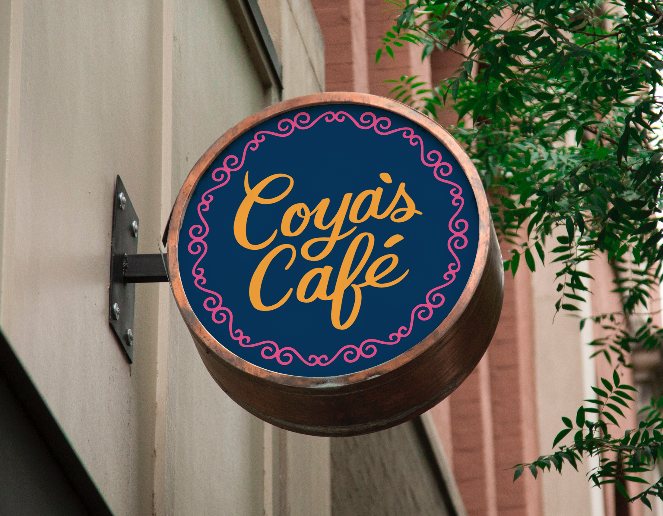
After:
![]()
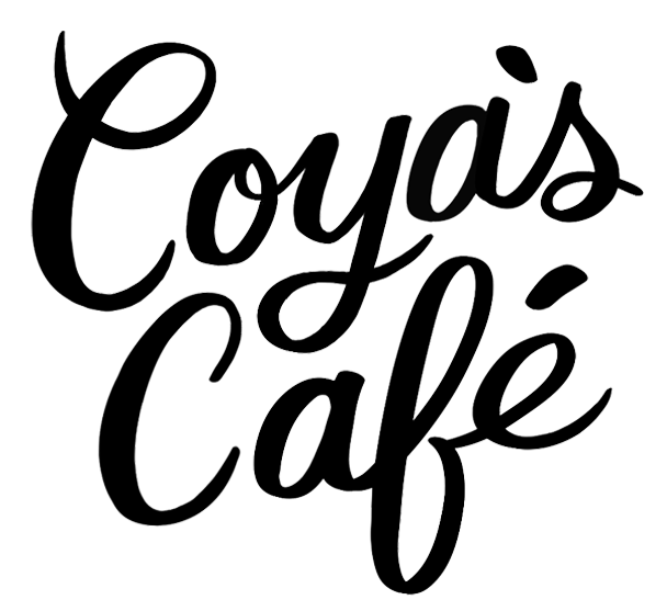
“In designing the logo I wanted it to be inspired by traditional sign-painting and Coya’s signature”
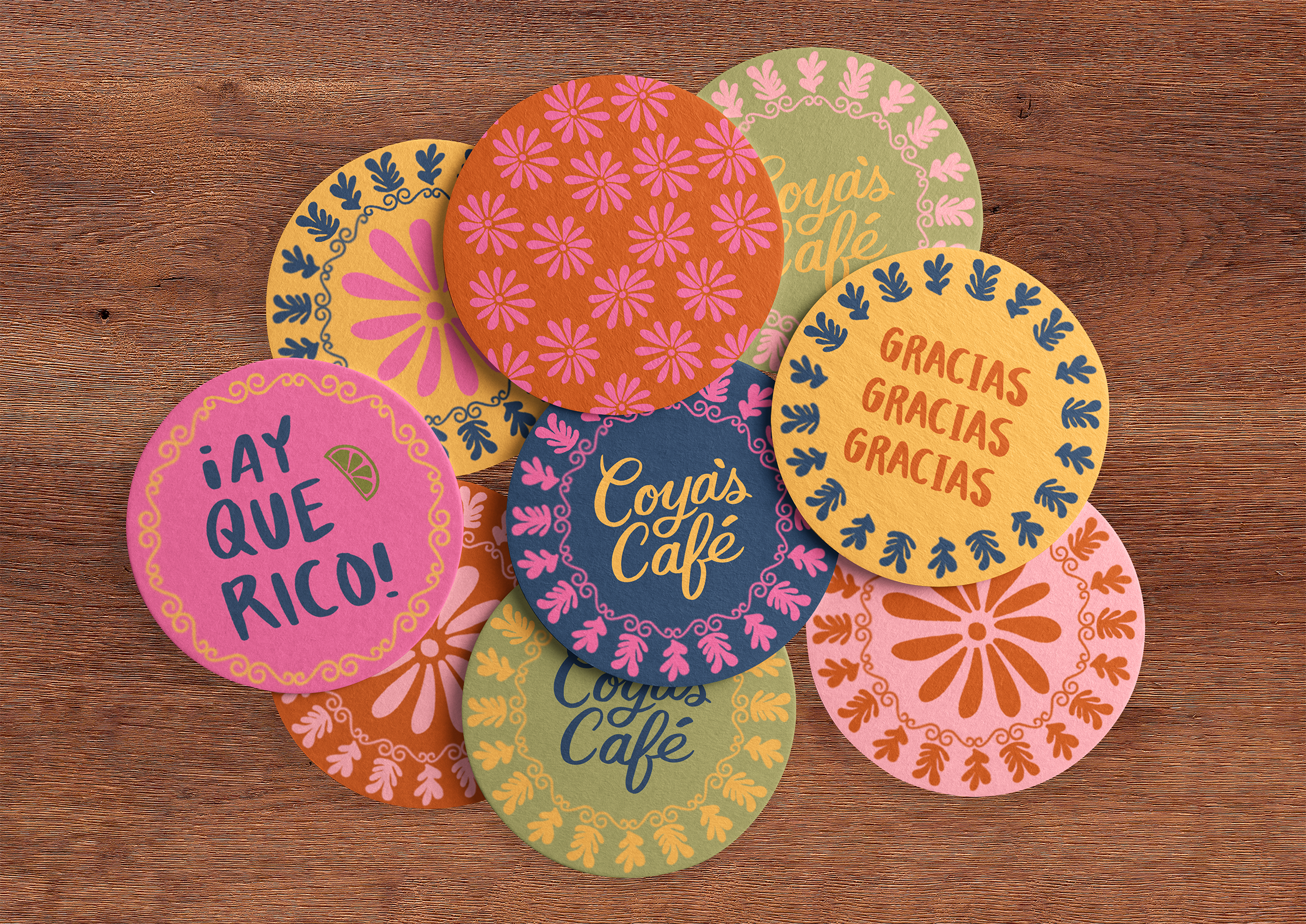
“With Mexican doilies as visual inspiration, I illustrated and designed patterns that embody and modernize Coya’s Café.”
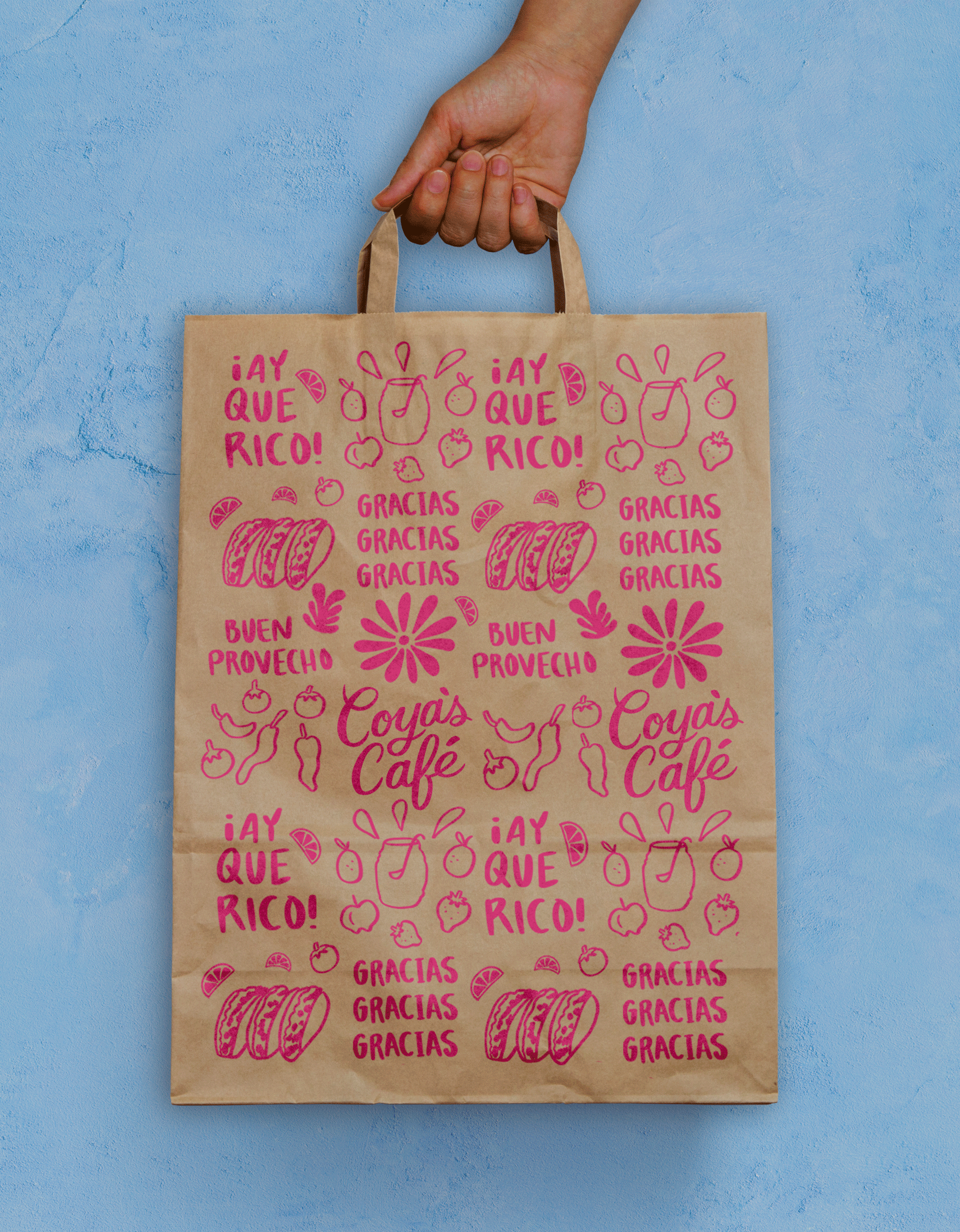
“Cooking Con Amor”
Before:
![]()
︎︎︎
After:
![]()
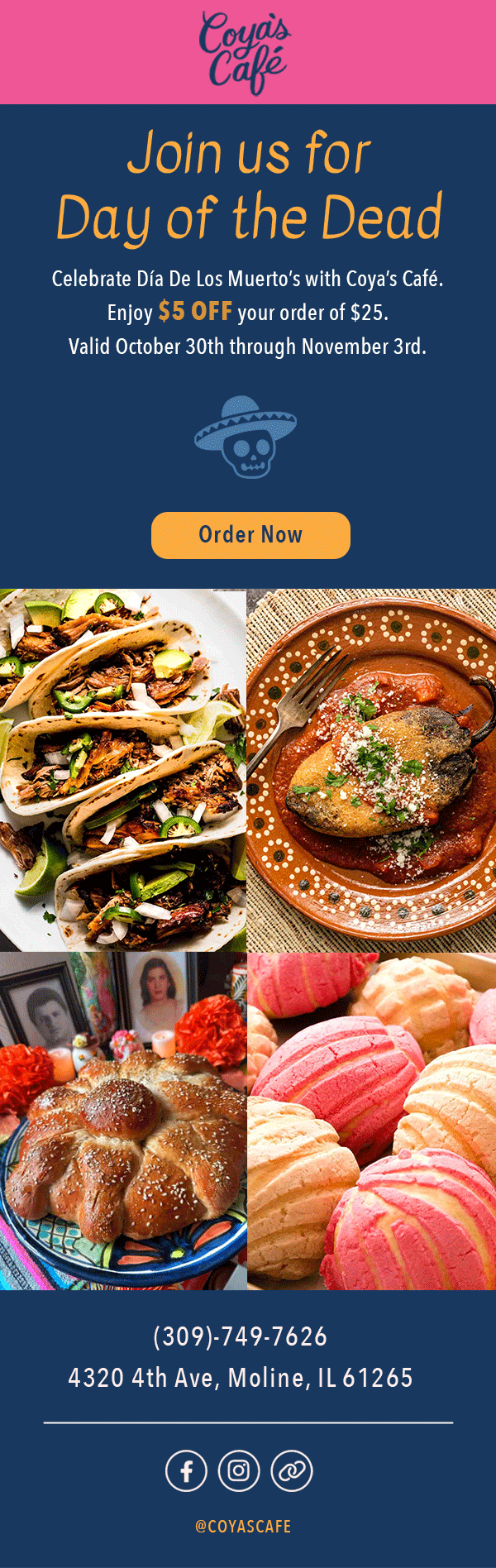
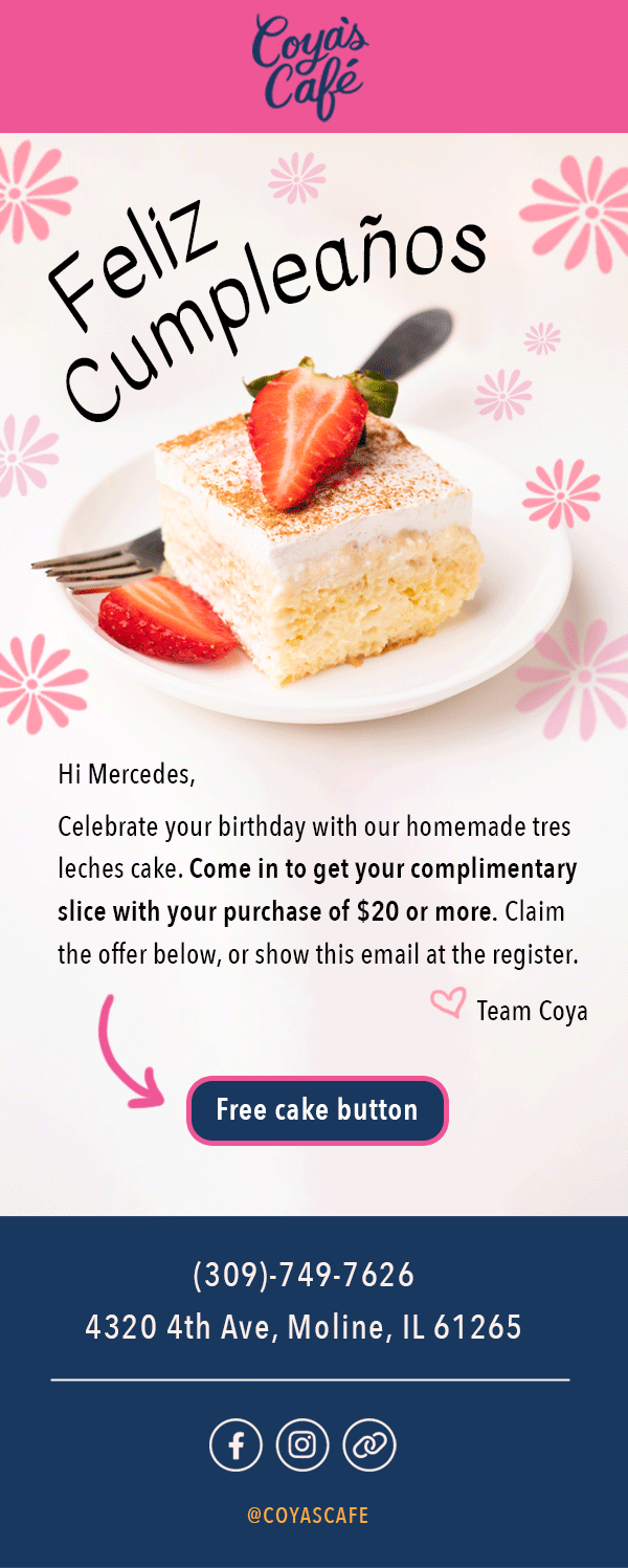
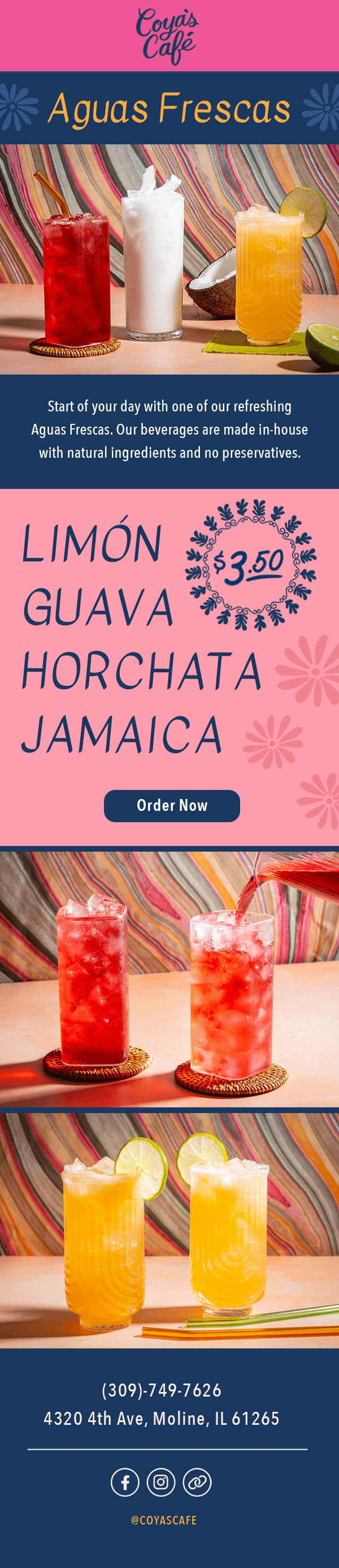
Email design:

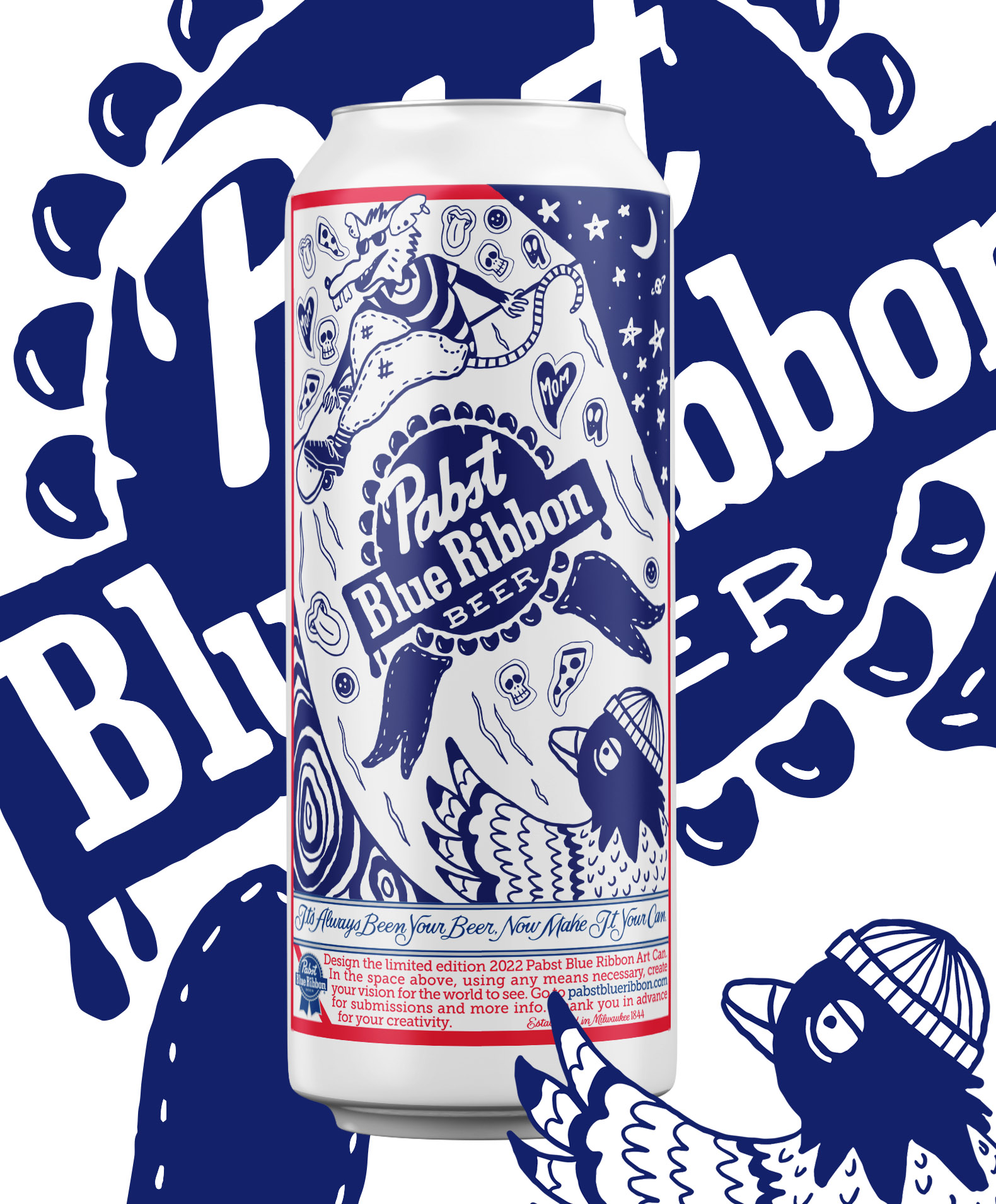
Pabst Blue Ribbon | beer packaging
Brief:
I conceptualized and illustrated a unique submission for the annual Pabst Blue Ribbon packaging contest. My design aimed to seamlessly blend the dynamic energy of skate culture with the iconic PBR brand, creating a visual narrative that captures the spirit of both worlds. The goal was to infuse the packaging with bold, urban aesthetics, while paying homage to the rebellious and creative essence of skateboarding.
Client:
Pabst Blue Ribbon
Role:
Freelance Packaging Designer & Illustrator
Skills:
Packaging design, character design, illustration, beverage design

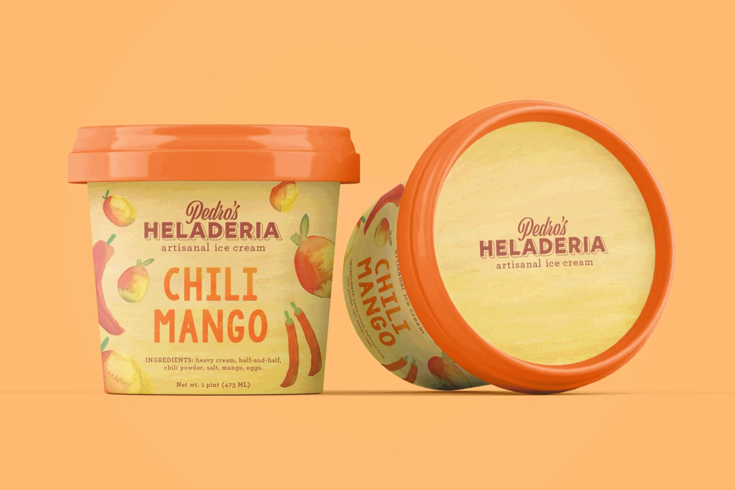
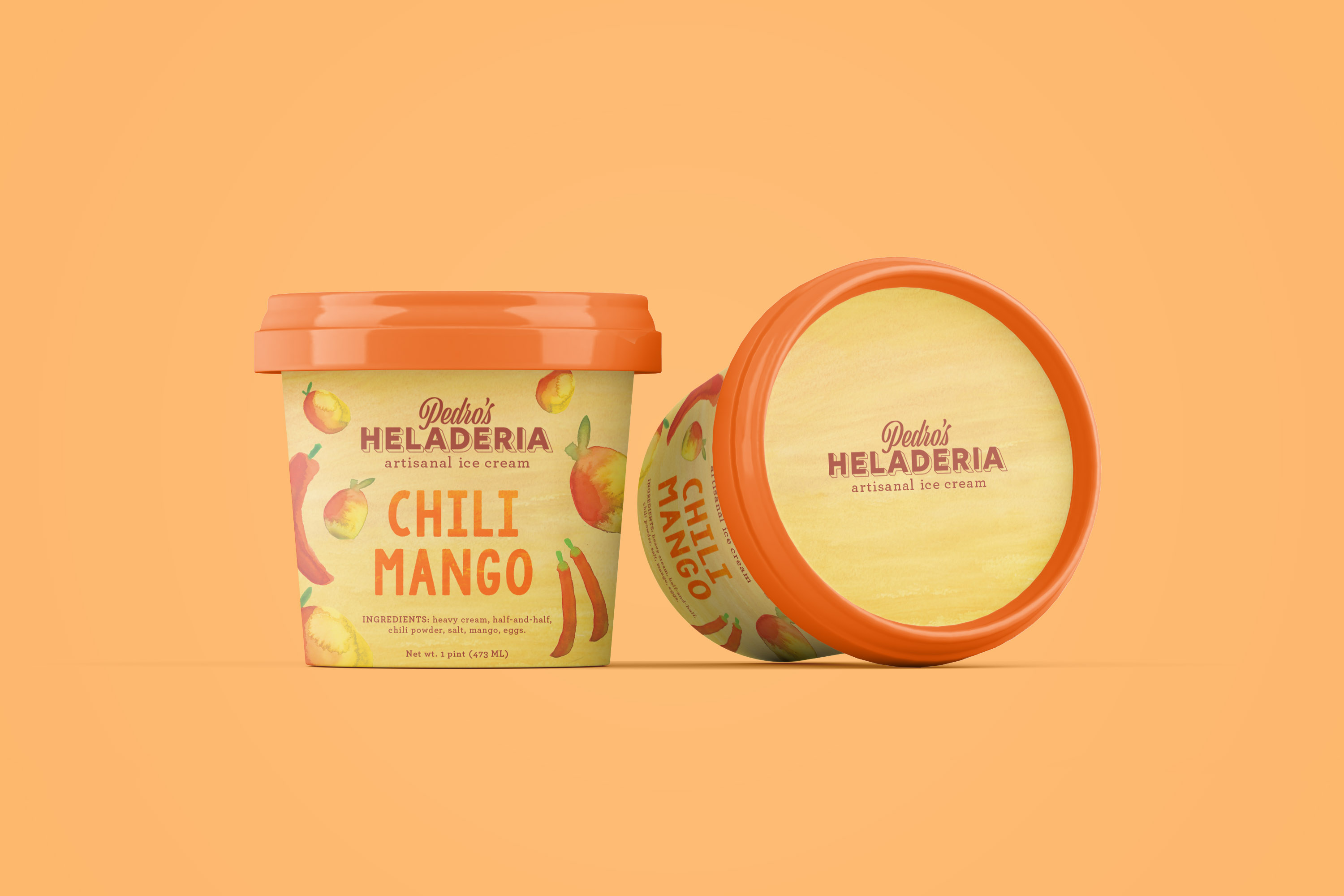
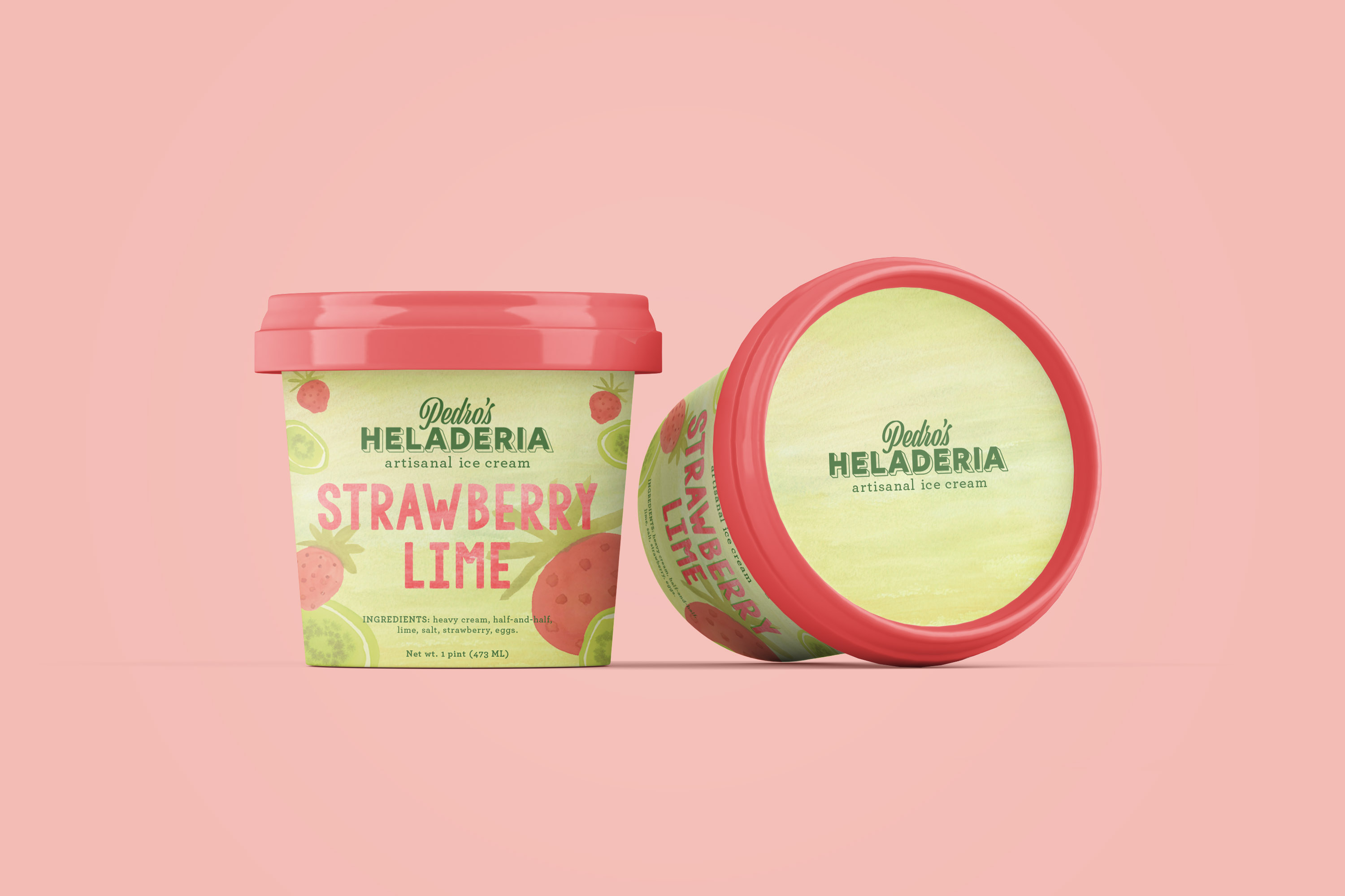
Pedro’s Heladería | packaging design
Brief:
Conceptual ice cream brand developed during an intensive one-day workshop, Typography for the Senses, led by Ellen Lupton at Cooper Design School. The project explored the intersection of typography, sensory perception, and brand identity. Through experimental type treatments, color, and packaging design, the brand aimed to evoke flavor, texture, and emotion, translating taste into a visual experience.
Client:
Pedro’s Heladería
Role:
Freelance Graphic Designer & Illustrator
Skills:
Branding & Identity, logo design, packaging design, illustration


Licensed Brands | product design

Brief:
I developed product concepts and designs for children within the framework of licensed brands, thoughtfully balancing creativity with brand guidelines. By taking full ownership of each assigned brand, I worked closely with licensor-provided style guides to ensure consistency, while also finding opportunities to bring fresh, engaging ideas that strengthen the respective brand’s identity.
Client:
Scholastic, Abrams
Role:
Packaging Graphic Designer
Skills: Branding and Identity, logo design, hand-lettering, pattern design, packaging design, illustration, book design, typography
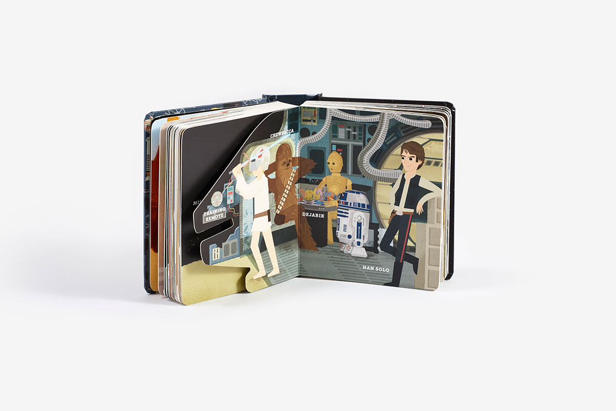
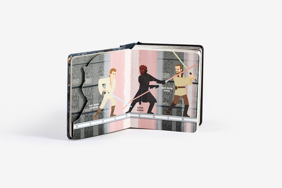
“I familiarized myself with the Star Wars brand t0 design the cover and interior of the ‘Star Wars Block.’”
Designing the interior included creating and maintaining complex die-lines while remaining legible to the next generation of Star Wars enthusiasts. Art is by Peski Studio.

Scholastic | Disney’s Stitch
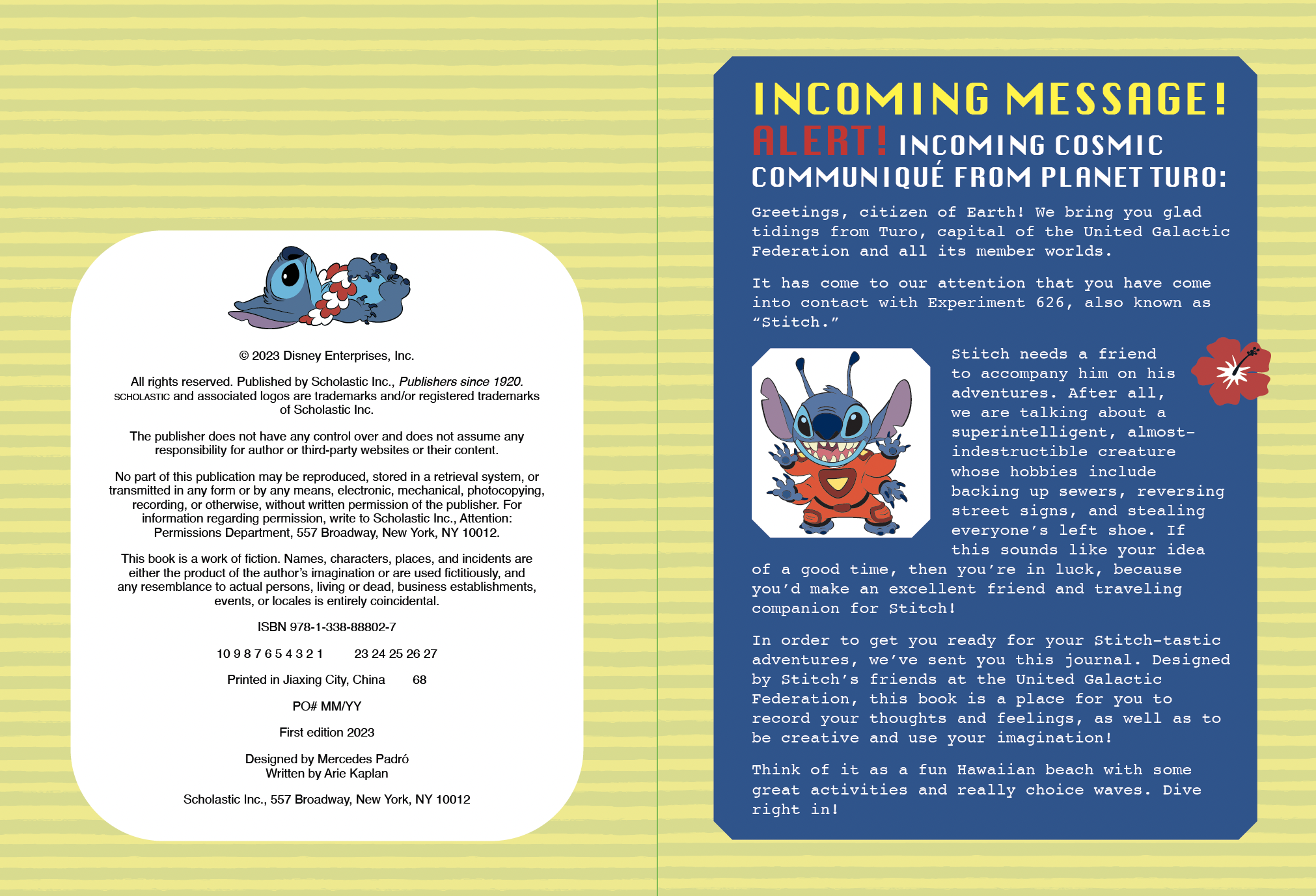
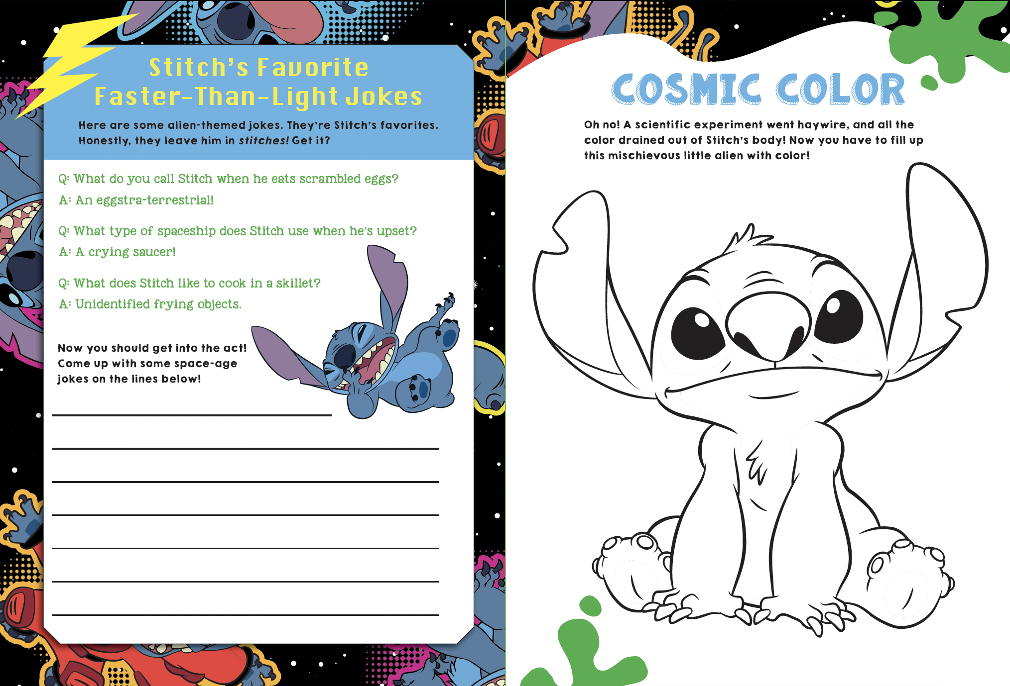
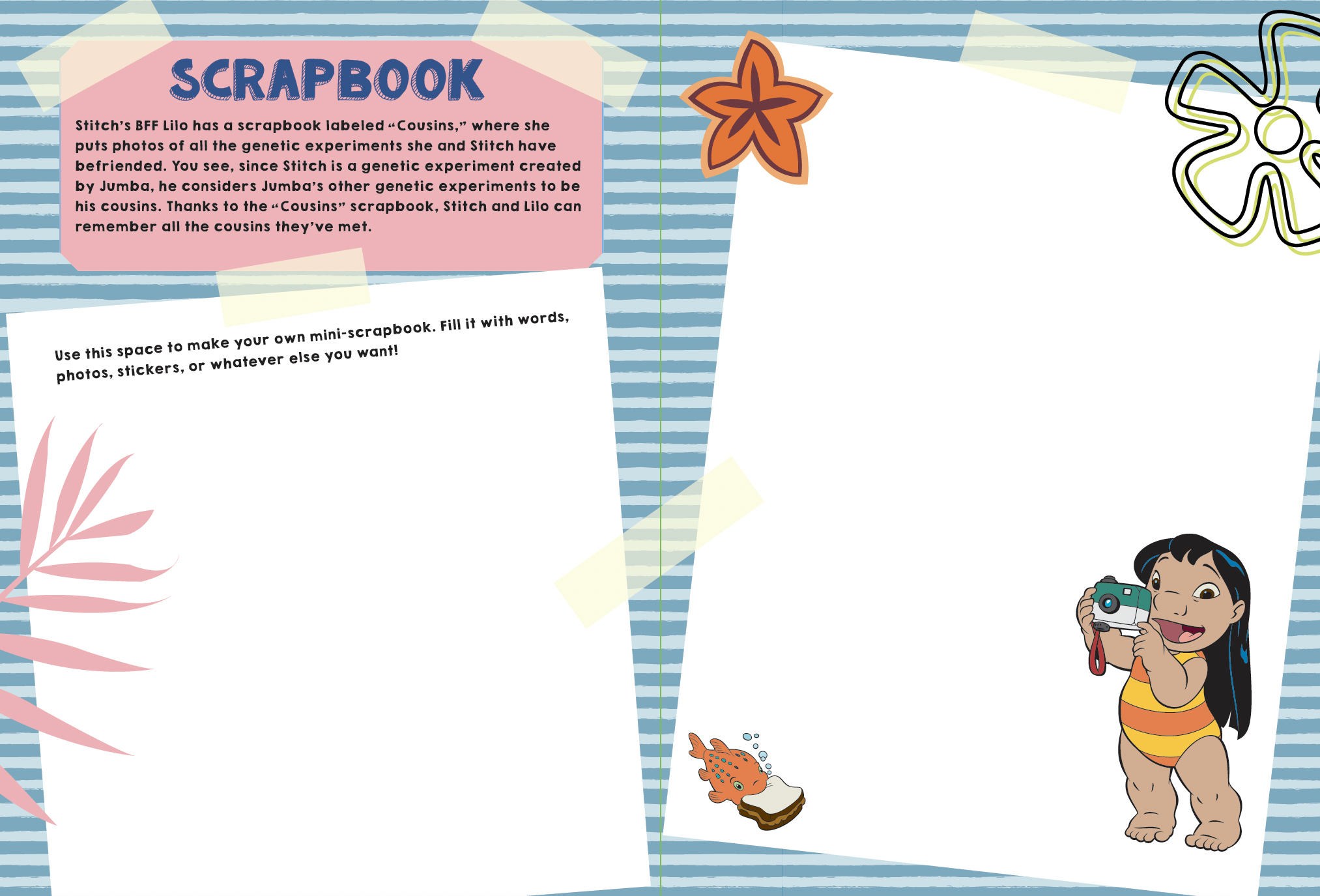
I became an expert on Stitch branding guidelines and designed the interior of a Stitch activity book. I’m well-versed in Stitch’s brand including illustrations, pattern assets, fonts, typography, logo treatment, and the server Disney uses to store these files. This was a fun experience for me to bring one of my favorite childhood brands, Stitch, to life for kids in an interactive and engaging format.

Scholastic | Gabby’s Doll House
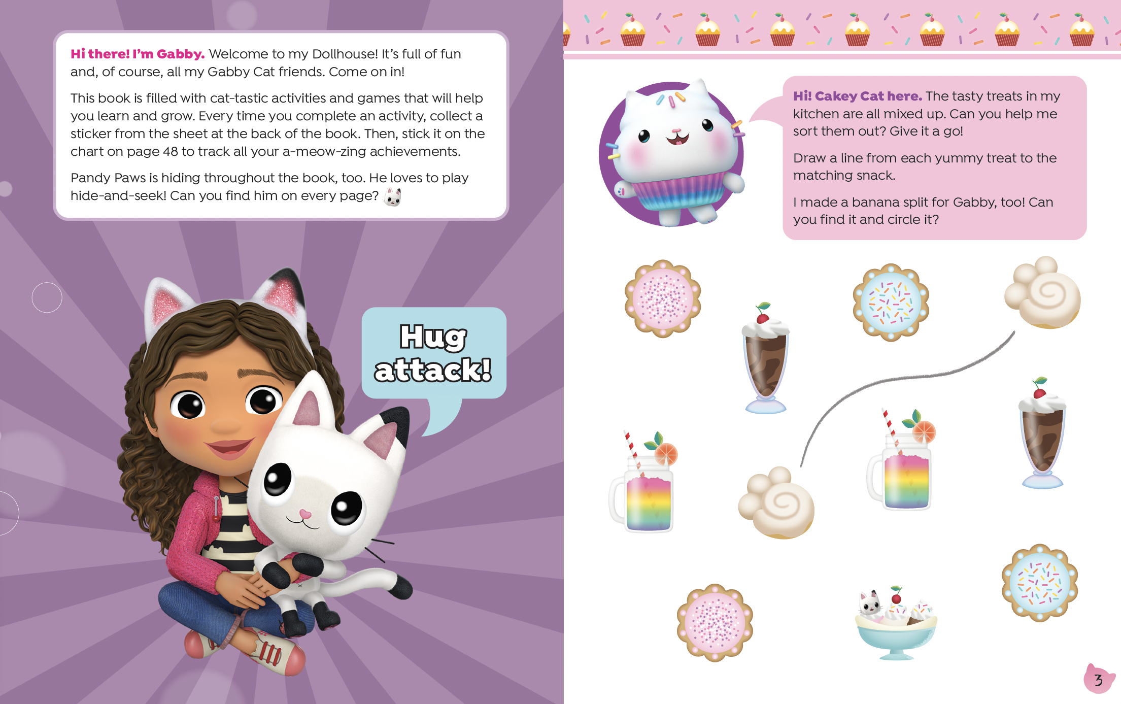
I designed both the cover and interior of a Gabby’s Dollhouse Activity Book for children, a project that allowed me to merge brand assets with fresh, trend-forward design solutions. I enjoy creating for children’s markets, where I can push creative boundaries while still honoring the integrity of the brand. Below are samples of the cover and interior layouts I developed, which showcase a balance of playful engagement and brand consistency. In education design there’s an emphasize on legibility, so ensuring usability for the children was an important aspect of the design process.


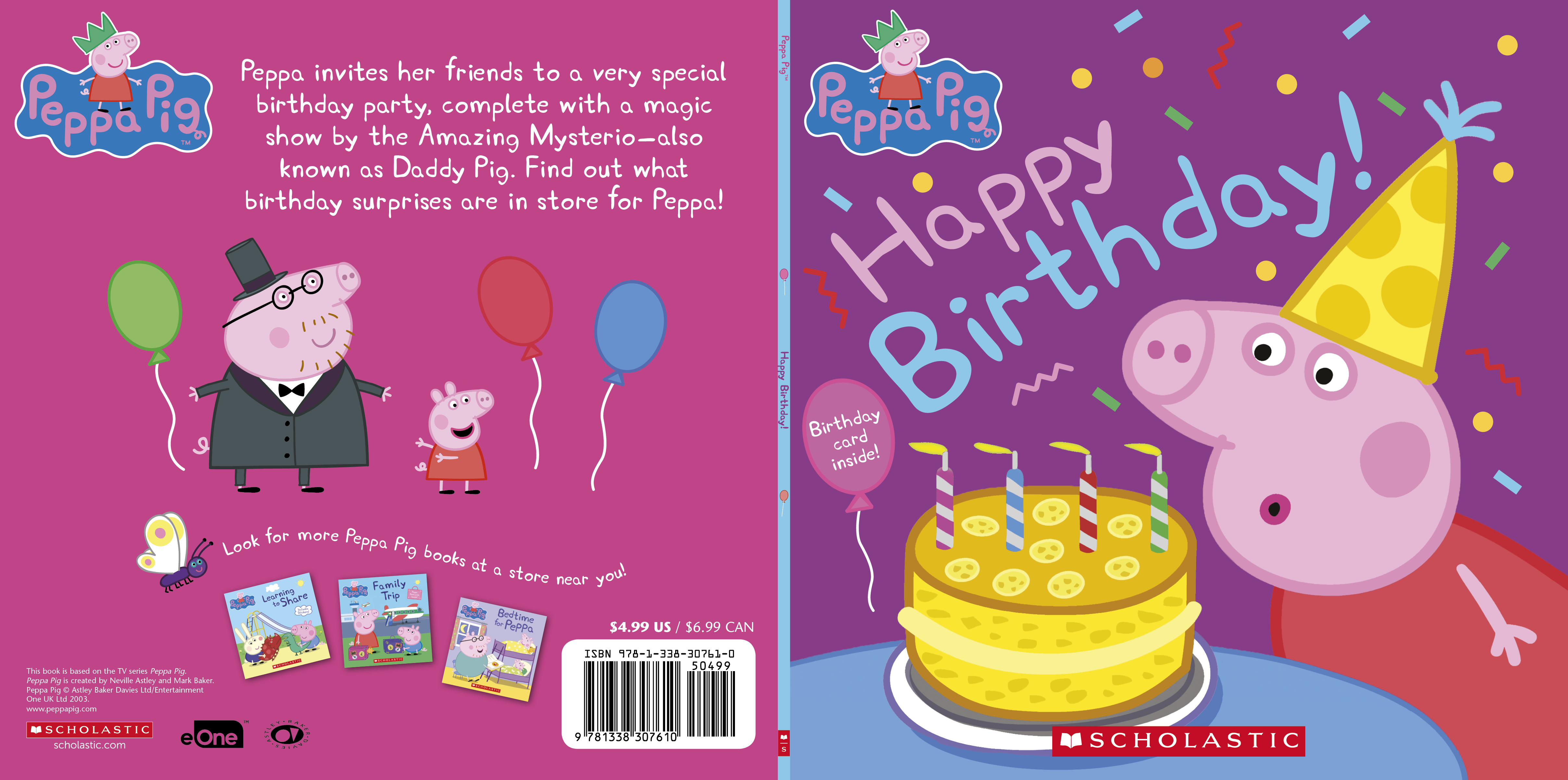
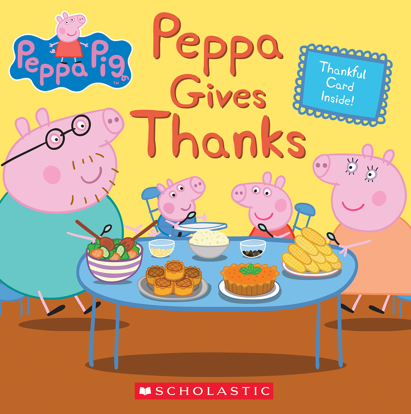
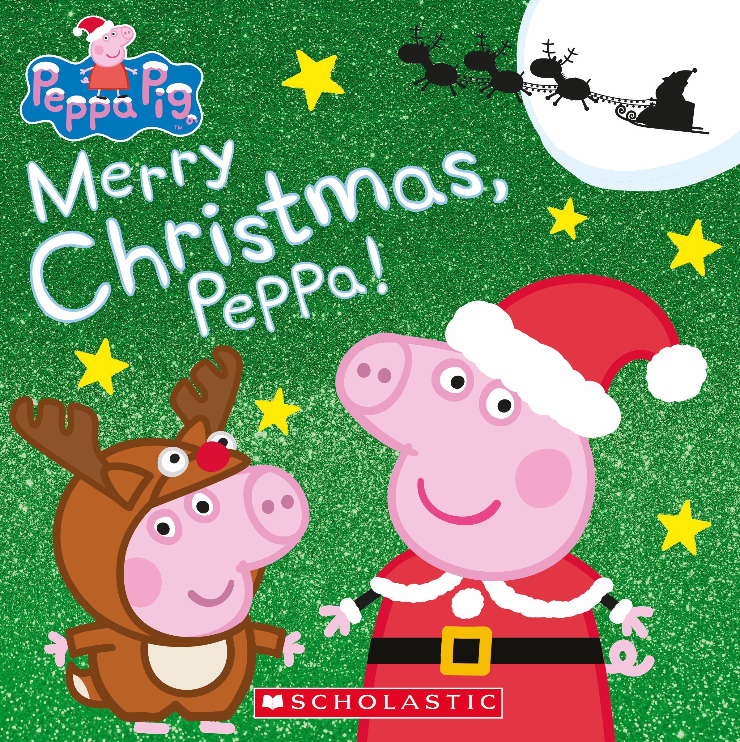
Scholastic | Peppa Pig
At Scholastic, I served as the designer for all Peppa Pig titles, gaining an in-depth understanding of the brand’s guidelines as well as the EOne server system used to manage assets. In addition to designing, I contributed original illustrations that seamlessly matched Peppa’s distinct visual style, ensuring consistency across each projects including the covers and interiors.